Schedule Graphics & Brand Consistency
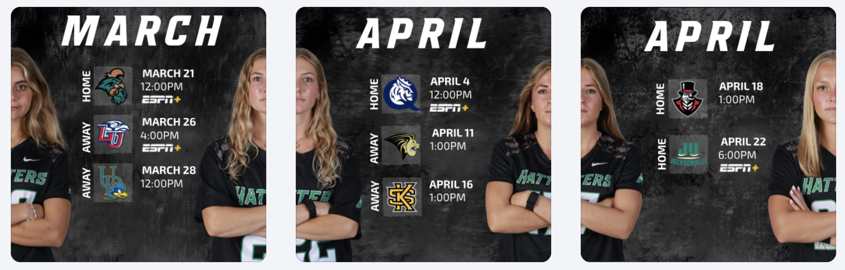
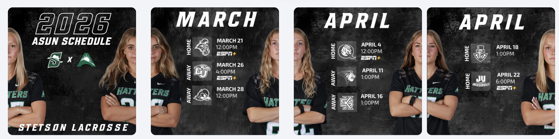
During these weeks, I worked on creating April schedule graphics for multiple spring teams, as well as an ASUN women’s lacrosse schedule post. One of the biggest design decisions I made was switching the opposing team logos from their original colors to all white. While the original versions added more color, I realized that using white logos created a cleaner look and kept the overall graphic more consistent with Stetson’s brand. It also helped the feed feel more cohesive when viewed as a whole.
Reworking the Lacrosse Hype Video
I also had the opportunity to rework a lacrosse hype video. The original version did not include actual game footage, so I took it apart and rebuilt it by adding game clips and other details to better represent our team.
This process helped me think more critically about storytelling through video. Instead of just creating something visually appealing, I focused on making sure the content felt authentic to our team and captured the energy of real gameplay. It showed me how important it is for hype content to reflect actual performance, not just aesthetics.
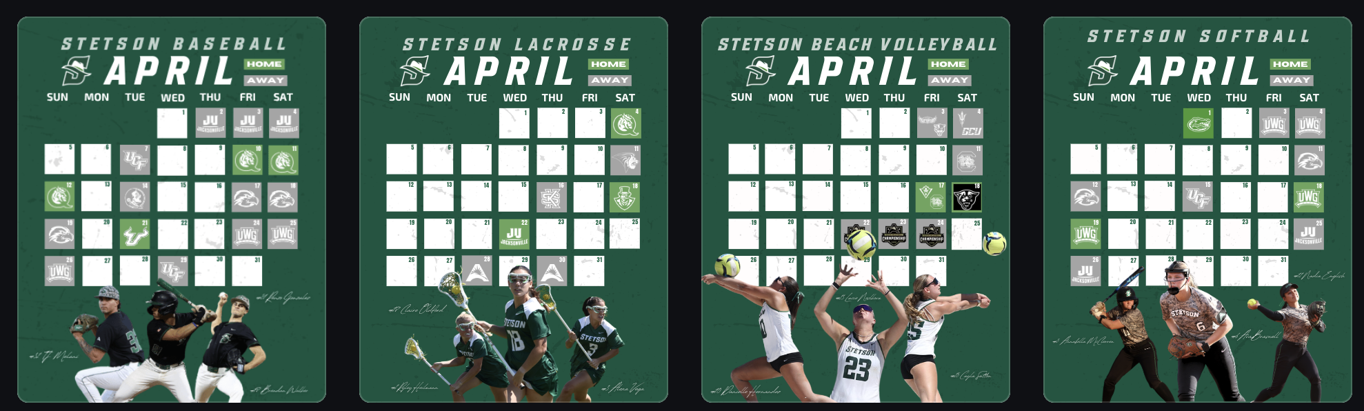
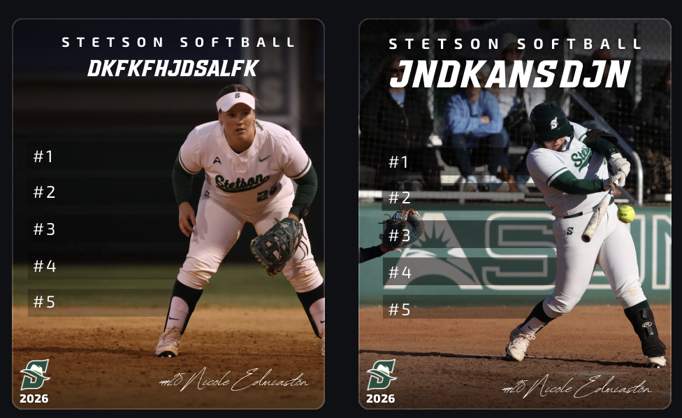
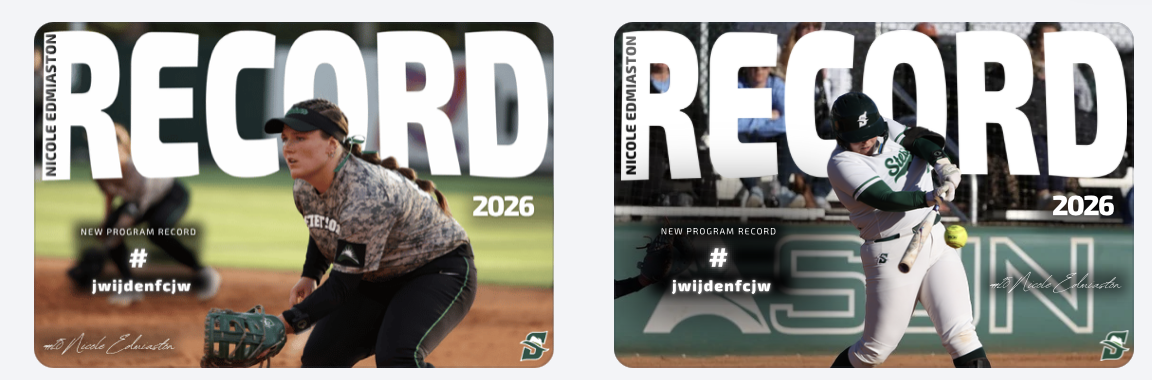
Record Graphics Templates
Another major project was creating record post templates, primarily using softball as my base. I took inspiration from record graphics I created last year for lacrosse, but this time I had to strictly follow Stetson’s official fonts and branding guidelines.
This was something I struggled with creatively. I personally felt that some non-Stetson fonts looked stronger, especially in the horizontal designs, but I had to prioritize brand consistency over personal preference. It was a good reminder that working in sports design isn’t just about what looks best individually, but what aligns best with the overall brand.
Even with that challenge, I built these templates so they can be reused across teams, allowing other designers to easily plug in new photos and update information. This made the project not just creative, but also functional for long-term use.
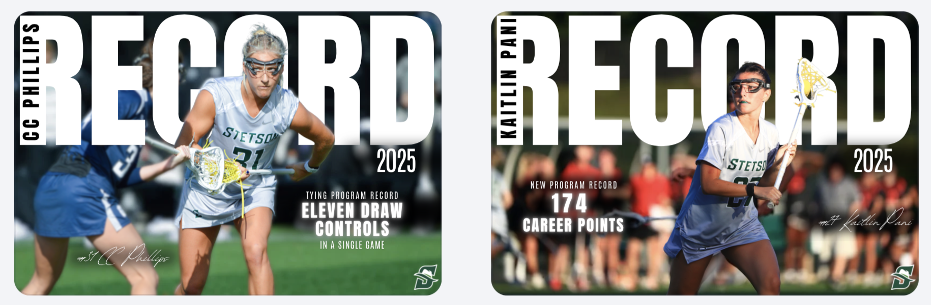
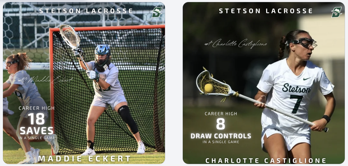
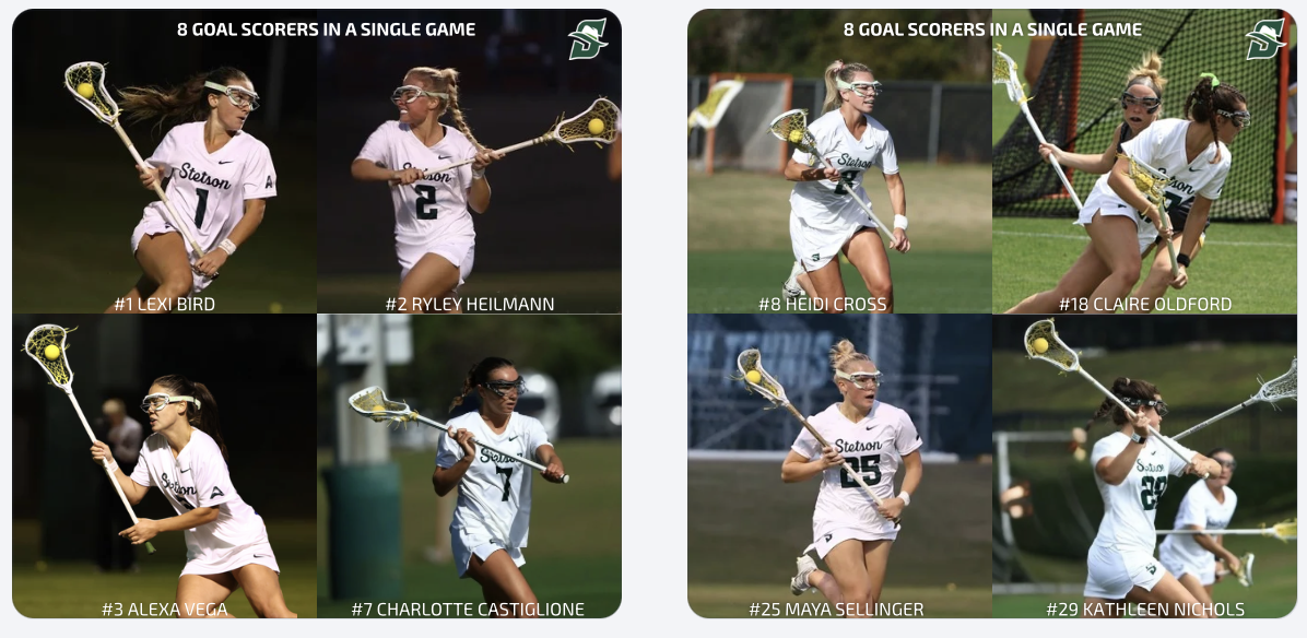
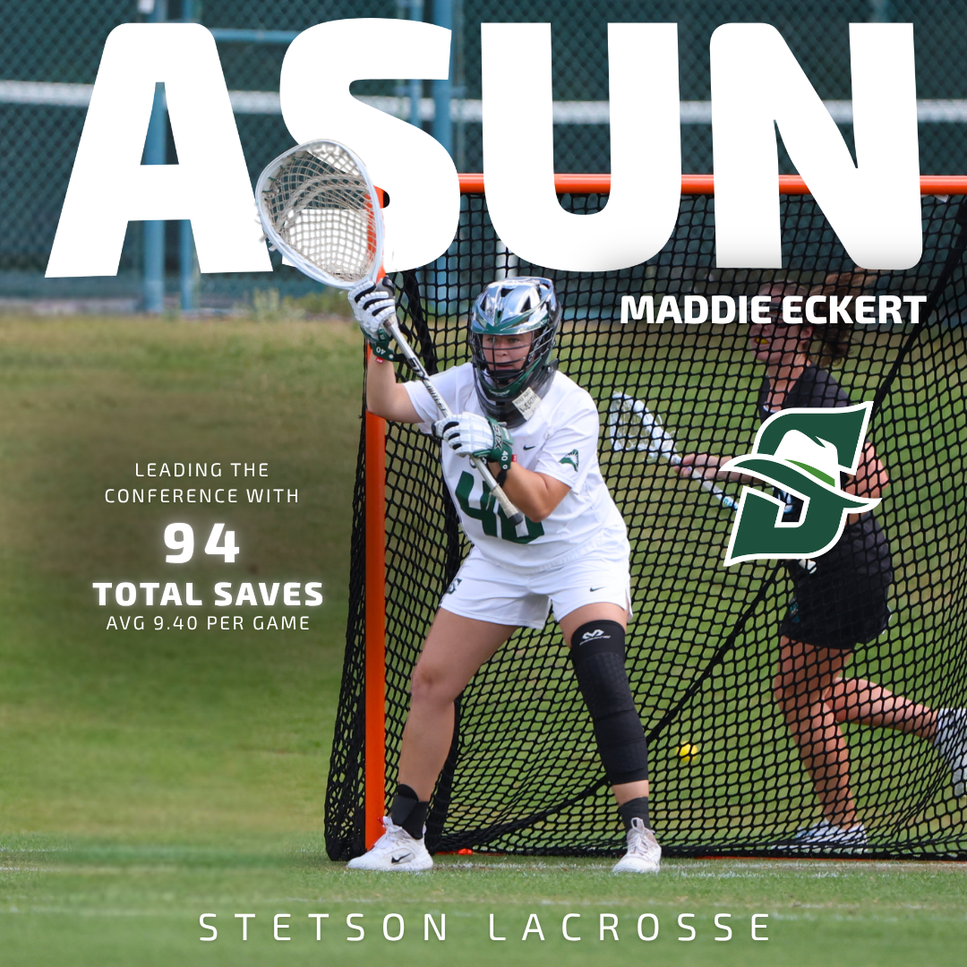
Player Feature Content
In addition to creating templates, I designed and posted multiple record and milestone graphics for lacrosse, including career-high performances and a team post highlighting eight different goal scorers in a single game. These posts help recognize player achievements, build team hype, and give fans shareable moments from games.
Game Day Content & Engagement
In addition to graphics, we received a lot of strong game photos and videos from two recent wins, so I focused on posting more photo-based content. These posts help capture real moments and keep the audience engaged in a more immediate and authentic way compared to only using designed graphics.
Balancing polished graphics with real game content showed me how important variety is in maintaining an engaging social media presence.
Lacrosse Instagram Example Post: https://www.instagram.com/p/DWaJMLCESBn/?img_index=1
Conclusion
These two weeks challenged me to balance creativity and brand consistency. Whether it was adjusting logo colors, working within font guidelines, or building reusable templates and emphasizing that strong design in sports marketing is about more than just visuals, it’s about creating content that fits within a larger system while still telling a compelling story.
It’s hard to have video stand next to still photos and graphics. Good that you are thinking about these distinct sources for content, and how they work together to tell a story. You certainly want to make sure the visual identity remains consistent.