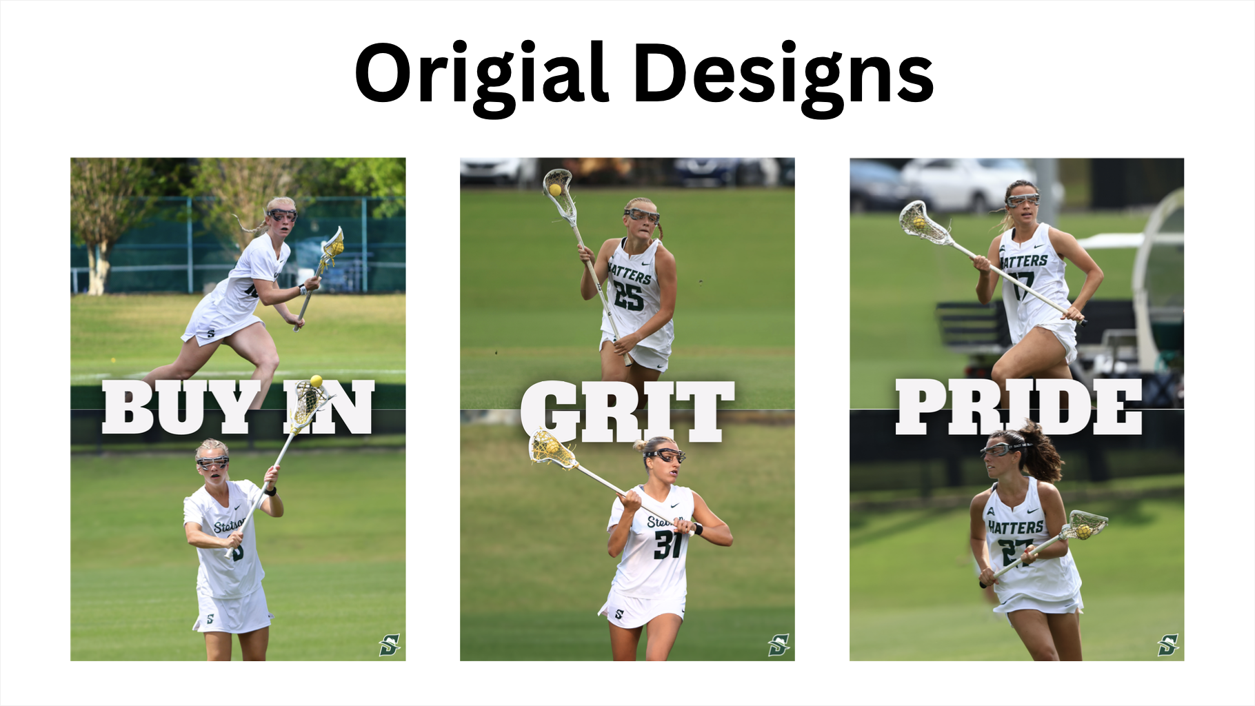
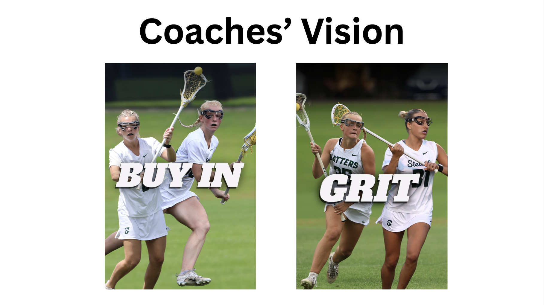
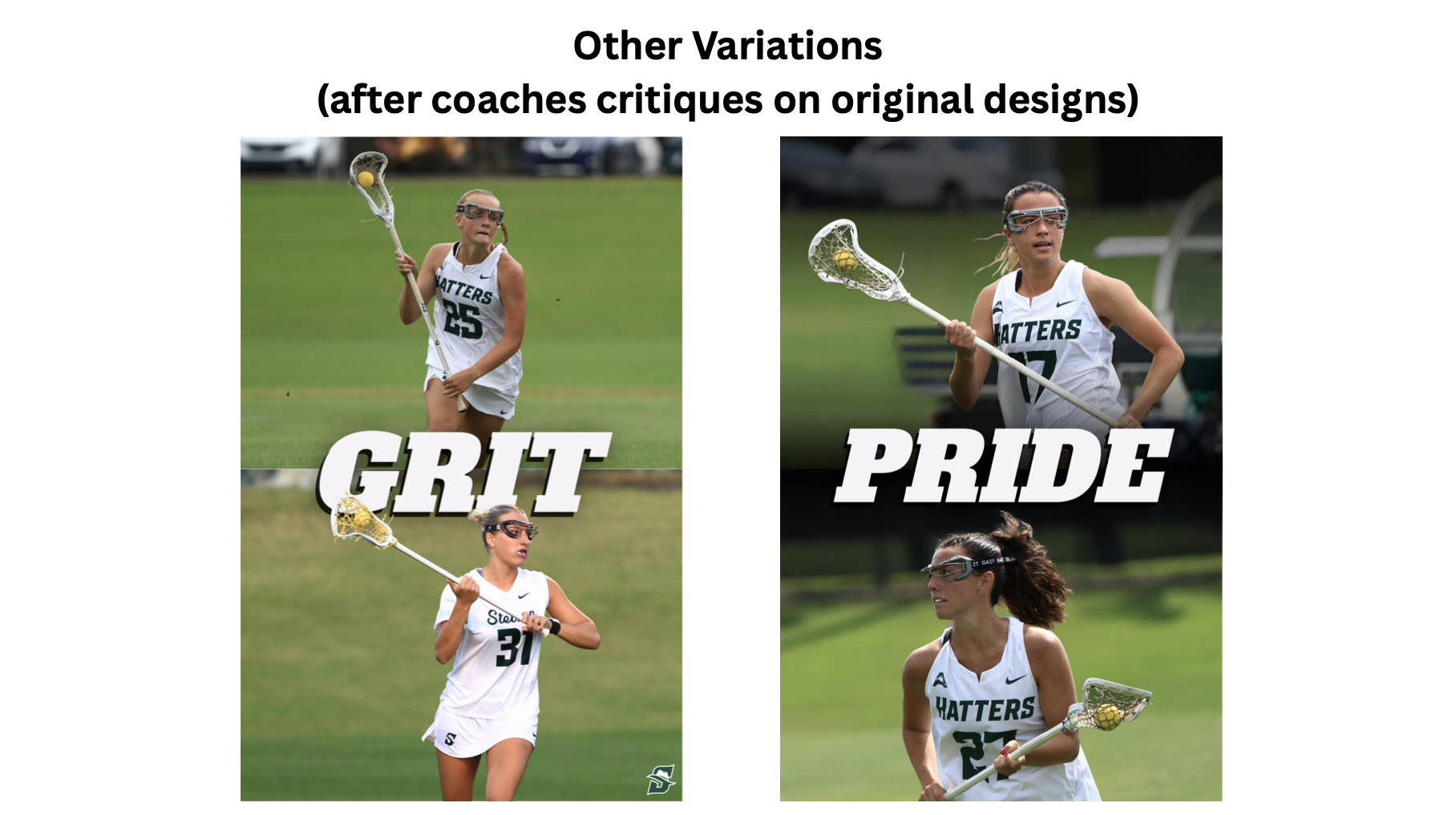
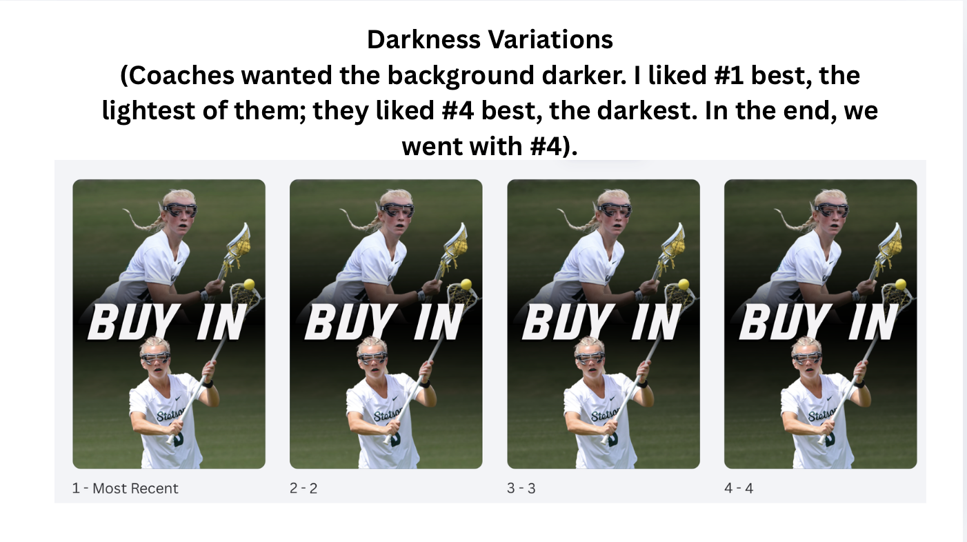
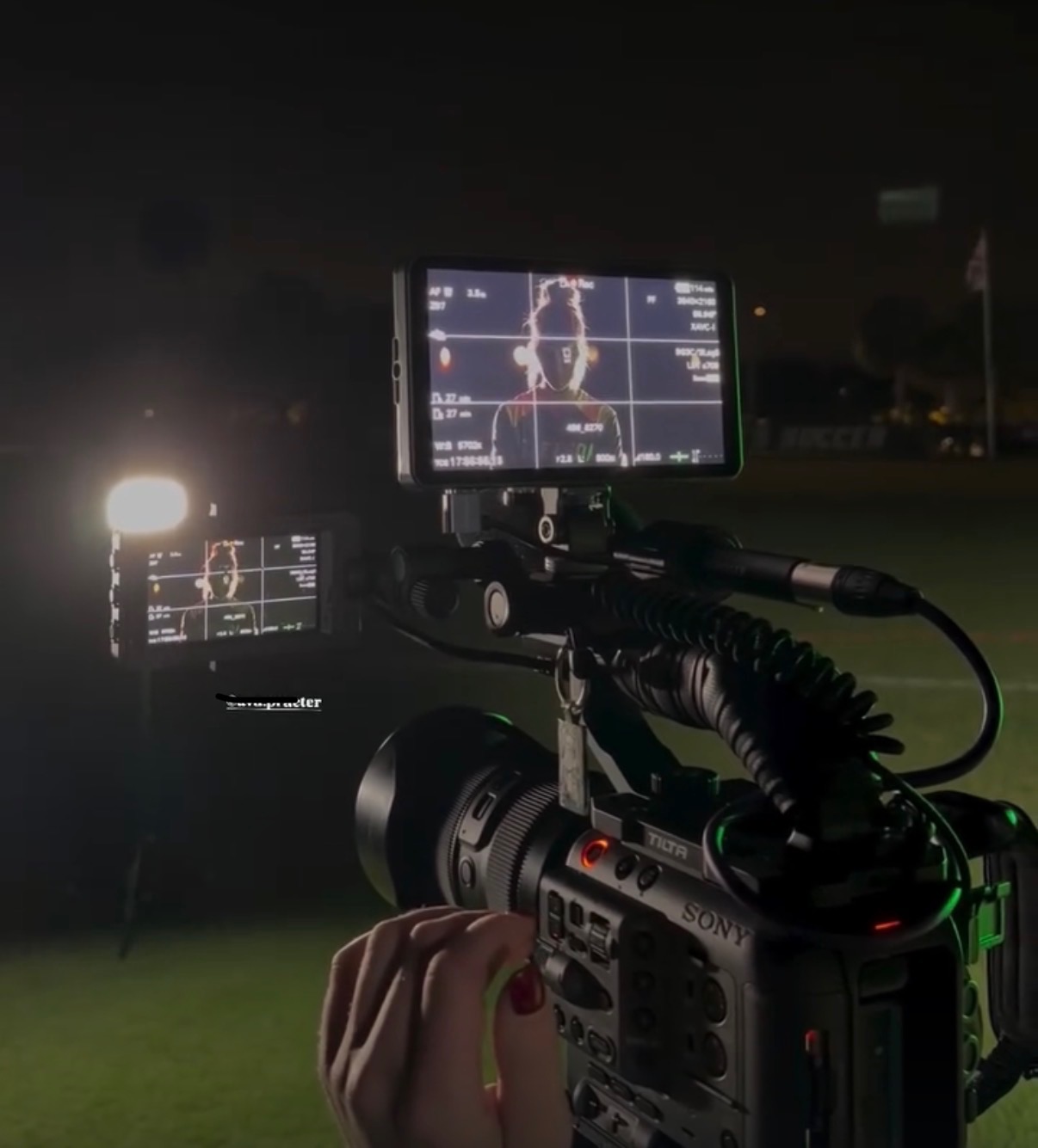
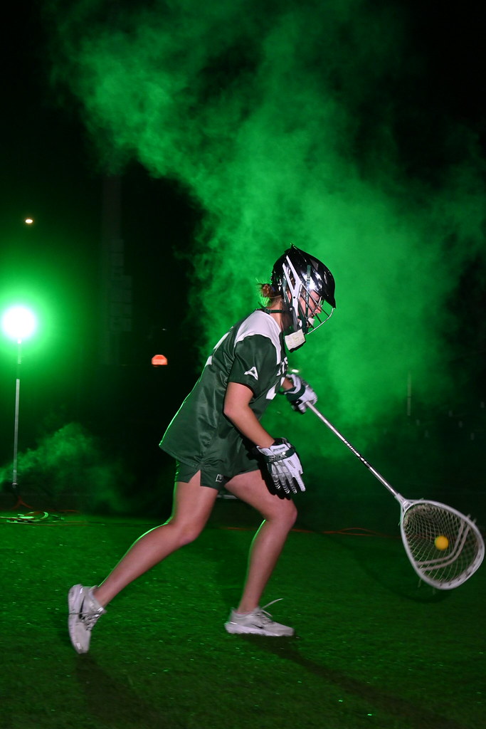
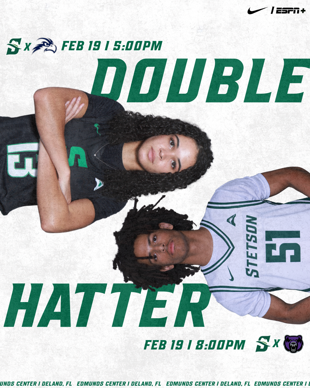
Double Header Post & Creative Brainstorming
This week, I worked on a double header post and spent time brainstorming additional graphic and photography ideas to support the spring sports marketing plan. This process helped me think more strategically about how individual posts fit into a larger campaign, rather than designing just singular graphics. I had to consider consistency, timing, and how visuals work together across a full season and athletics account.
The Importance of Brand Fonts
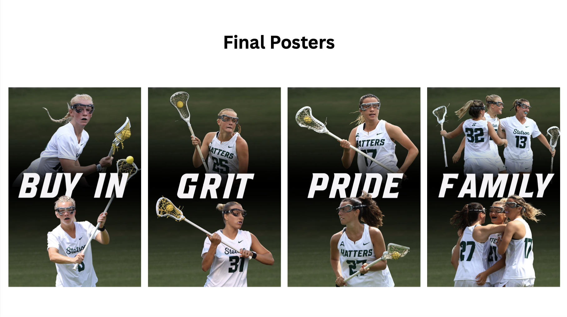
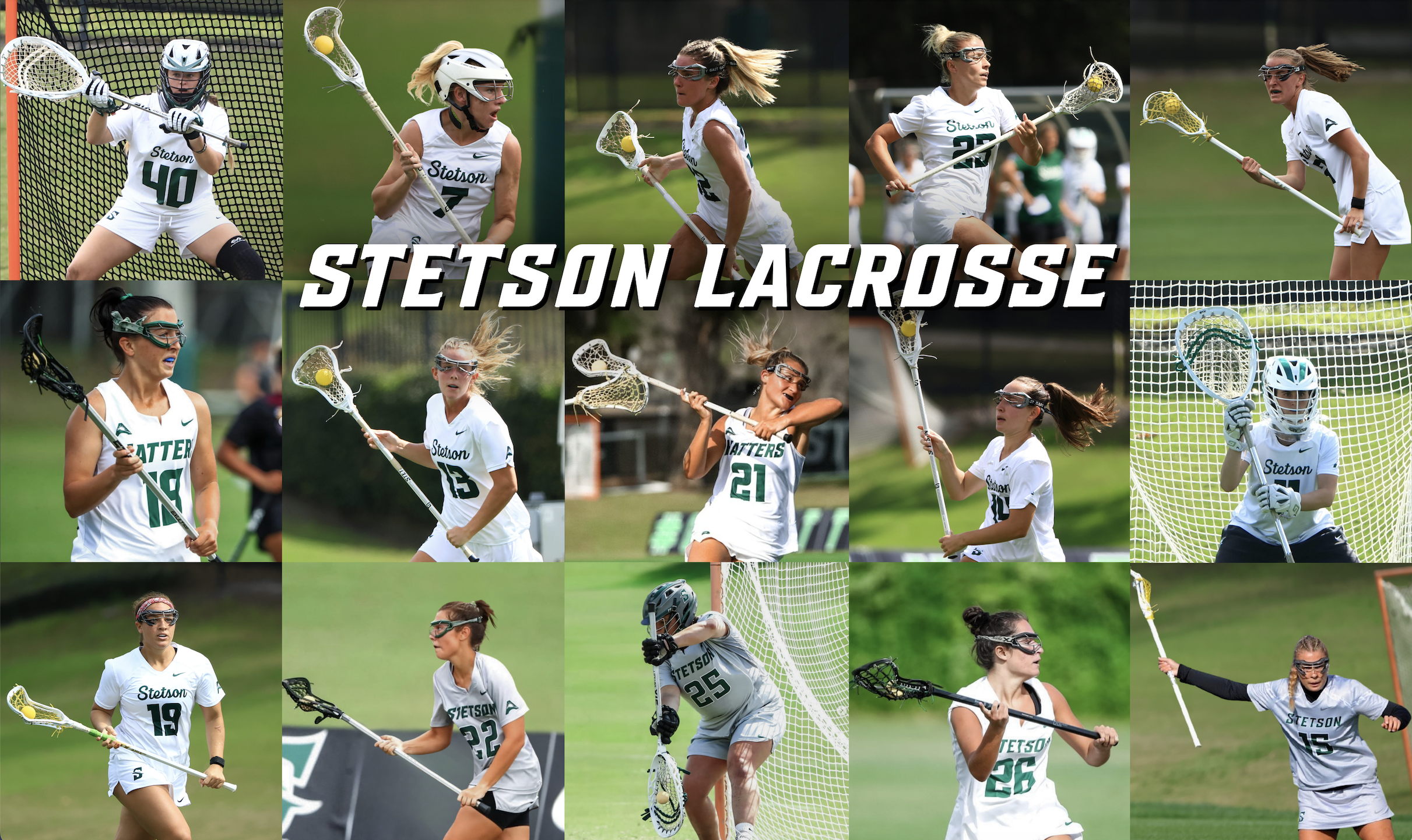
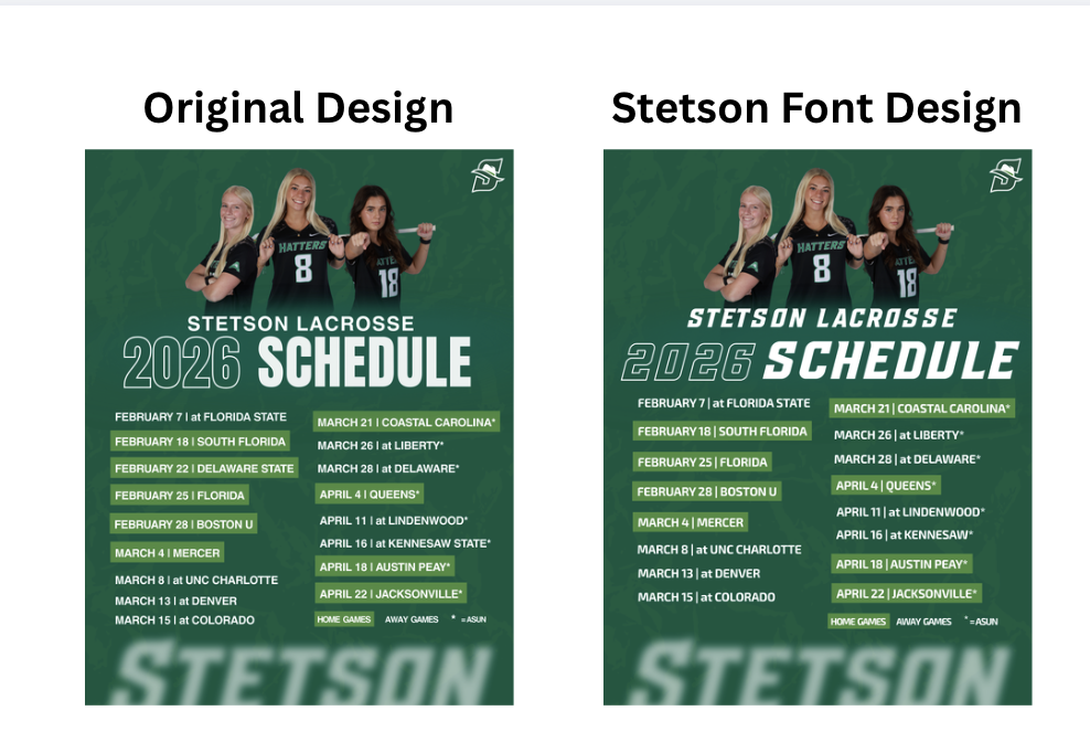
One of the biggest lessons I learned this week was how important it is to use the correct fonts. When graphics are shared or reposted on the main Stetson Athletics account, any inconsistency becomes much more noticeable. I created multiple versions of a lacrosse schedule graphic, one using a non-Stetson font that I personally liked more, and another using the official Stetson font. While I still prefer the first version from a design standpoint, the second version clearly fits better within the Stetson Athletics feed and looks more cohesive alongside other athletic graphics.
This became especially clear when I saw the captains lacrosse post & 13 Days coundown post I designed was reposted on the Stetson athletics account, I immediately noticed how much it stood out in a negative way due to the font difference. Seeing my work in that context made me more aware of how brand identity plays a huge role in perception.
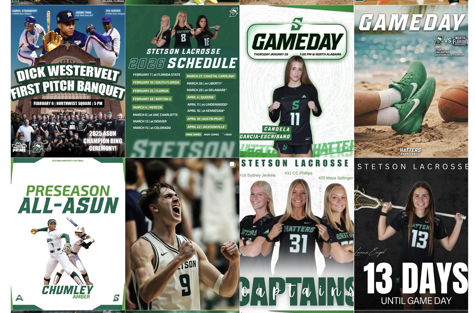
Access to the Stetson Athletics Style Guide
One reason some of the earlier posts, including the captains and countdown graphics (the “13 Days” post), did not use the correct fonts was simply because I did not have access to them yet. This week, Athletics finally shared the official Stetson Athletics style guide with me. Having access to this now I know it will make a huge positive difference in my future designs. I am glad I learned / realized this early on as I shift from strictly stetson lacrosse related graphics to all and any stetson athletics team as I continue this internship. Moving forward, I plan to focus more intentionally on maintaining consistent brand identity so that my graphics feel seamless when posted across any Stetson Athletics platform.
Overall, Week 3 helped me better understand the importance of branding, consistency, and thinking beyond personal design preferences.