The New Look for Athletics
![]() The secret is out. And the big reveal now has become the rich reward — with a new energetic look and feel for Stetson Athletics and Hatter Nation.
The secret is out. And the big reveal now has become the rich reward — with a new energetic look and feel for Stetson Athletics and Hatter Nation.
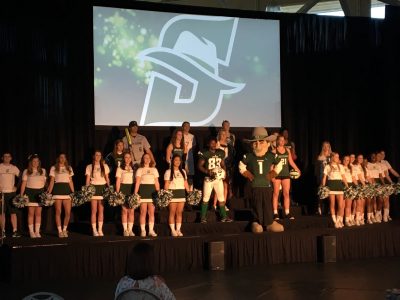
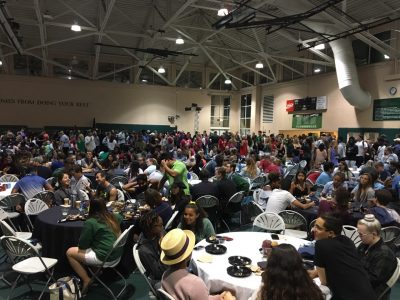
During the Late Night Breakfast Wednesday night, athletes took to the stage in the Rinker Field House for a “fashion show,” wearing new Nike uniforms that sported freshly restyled Athletics’ logo/brand marks designed to capture both historic Hatters spirit and progressive movement into the future.
Judging by the reaction of the crowd, the new looks are a winner. Students said they like the design of the new hat, embedded in the “S,” which conveys a more youthful image for the university.
“I love it,” said Ashley Soto, a first-year student and a music education major. “It gives us a little spark that says, ‘Okay, this is Stetson.’ ”
Added first-year student Lesline Charles, a communication and media studies major. “It’s nice that we have a new logo that represents Stetson well. It’s not like something you’d see every day. It’s different, unique, compared to other universities.”
A day earlier, Stetson Athletics Director Jeff Altier saluted the diligence of a committee that had spent two years in research and development, encompassing all sectors of the Stetson community – students, faculty, alumni, Trustees, former athletes, coaches and others.
“I am very proud of the work they did,” said Altier. “This group took a great deal of time and effort to solicit input from many, many focus groups, allowing students, faculty, staff and alumni the opportunity to influence the final result.
“The logos and marks acknowledge the unique qualities of the Stetson experience, modernizing the images while honoring the history of John B. Stetson. I am thrilled!”
“The new Stetson logos and branding give the entire Stetson University community a set of icons to be proud of,” commented Ricky Hazel, associate director of Athletics. “The logos honor the long history of Hatters Athletics while at the same time reflecting a clean, modern feel that will carry well into the future.”
Inside the Redesign
The highlight of the logo redesign is a warm embrace of the Stetson “S” in place of “SU.” Also gone is the hat sitting tilted atop the SU. Instead, a new centered, tilted hat is introduced and neatly incorporated into the Stetson “S” to infuse “energy” and “excitement.” The hat comes with a lively accent band.
Notably, the lone S is a return to Stetson’s past, when it was the standard-bearer for Hatters Athletics for nearly a century. In the late 1990s, a transition away from the “S” brought “SU.” Lately, however, Altier had said that “people saw the ‘SU’ and they saw the hat, and they immediately thought West. So, they were thinking Stetson was in Texas.”
To further strengthen ties to tradition, the existing Stetson Athletics’ Hatter Green (Pantone 363) and the university’s Stetson Green (Pantone 343) are the lone predominate colors, accompanied only by white, black and gray — with their use strictly outlined in a Stetson Athletics brand identity book.
The signature use of two different greens is “very uncommon” in intercollegiate athletics, noted Joel Jones, assistant vice president of University Marketing. He called their use “distinctive” and “ownable.”
“We purposefully brought in the brighter university green and married it with Athletics green, because we didn’t want to lose any of our history, tradition and nostalgia,” Jones explained.
The decision on the new hat was characteristic of the details surrounding the entire design process, Jones added. He cited that among the fundamental questions was, is the Hatter a person or is it a thing? And what is a Hatter? Gender was an issue, too, meaning the Hatter couldn’t be male or female, he said.
As for the use of brand marks such as STETSON and HATTERS, there are similar one- and two-color applications. STETSON and HATTERS (always uppercase) are in custom art typography.
‘Continuity and Consistency’
Along with addressing marketplace confusion, the move to the new looks was prompted by an increasing lack of brand “continuity and consistency” — with many variations among Stetson’s 19 intercollegiate sports. Additionally, the need for great brand unity was heightened by an Athletics expansion initiative that began in 2011.
Research for a new Athletics brand commenced in 2016, with preliminary proposals from six agencies being pared to one. The selected agency, Joe Bosack & Co., based in Pottsville, Pennsylvania, was given the mandate to develop a brand mark that “was true to who we are but also distinctive,” Jones said.
Bosack, the agency’s founder and creative director, began his career in the creative services department of the National Hockey League before becoming the art director for Fila U.S.A., where he helped to launch a successful new addition to the Fila product line. In 1998, Bosack founded his firm, which now is recognized as a leading sports-branding expert with dozens of universities, colleges, leagues and sports associations as clients. Most recently, the agency worked with the National Collegiate Athletic Association (NCAA) to reimagine and redesign the comprehensive NCAA Championships brand — 90 championships across 24 sports and three divisions, including the Final Four, Frozen Four and College World Series.
“The nickname, Hatters, is one of the most unique monikers in all of college sports,” said Bosack. “It was a thrill to work with Stetson to reimagine and refresh the visual identity of this most iconic brand.”
So, a new era beckons for Stetson Athletics.
“I am excited for the Stetson community to see the unveiling of our new logos and marks,” said Alicia Queally, deputy athletic director and senior woman administrator. “It is an exciting time for Stetson, and I believe our new marks integrates the uniqueness that comes with being a Hatter. The positive energy from the focus groups has been great. I love the input that has come from our coaches and staff as to the creativity behind incorporating ‘the hat’ into the ‘S’ logo. I can’t wait to see everyone wearing the new Stetson gear!’”
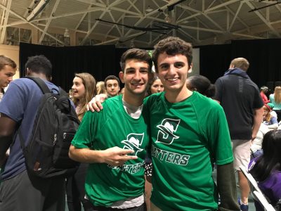
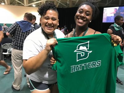
Students Arye Beck and Nick Nweeia, both members of Stetson’s Cross Country team, managed to get free T-shirts with the new logo, as the shirts were tossed into the crowd Wednesday night, and they immediately pulled them on.
“It’s just newer,” Beck said of the logo. “It’s just a younger thing, a new generation thing.”
Altier concluded that the new look is perfect.
His exact words: “When considering the long hard work of the University Marketing team, Joe Bosack and his company, and the logos/marks committee, the image created is perfect.”
-Michael Candelaria and Cory Lancaster