Week 8 (March 2–8, 2026) & Week 9 (March 9–15, 2026)

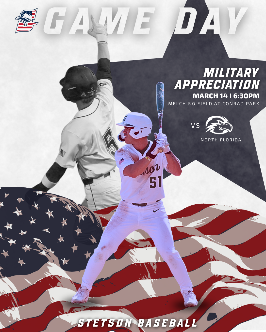
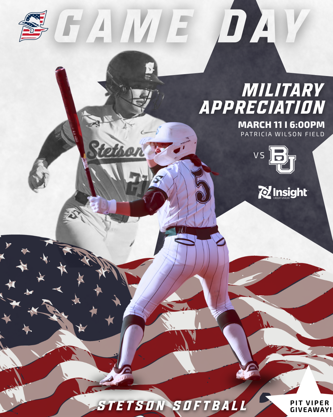
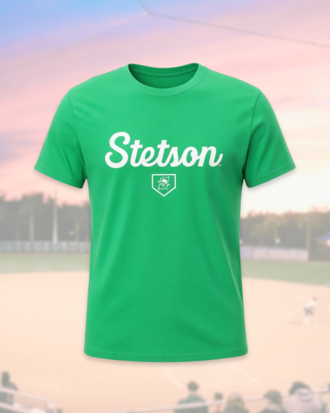
Military Appreciation Game Graphics

During these weeks I worked on creating Military Appreciation game graphics for both Stetson softball and baseball. This project took a little longer than some of the others because I could not find many strong inspiration graphics to reference beforehand. When I have a clear visual reference, the design process tends to move faster, but when I have to build something more from scratch it requires a lot more experimenting.

Because of that, I spent time testing different layouts, colors, and composition options before settling on the final design. I also sometimes second guess myself during the design process, but this project reminded me that it is important to trust the process and wait until the full design comes together before judging it too early.

One thing that helped was designing both the baseball and softball versions. Once I developed a direction for one sport, I could adapt similar elements for the other while still keeping the designs unique to each team. Using the American flag, muted background imagery, and the star shape helped highlight the Military Appreciation theme while still fitting within the Stetson Athletics style.

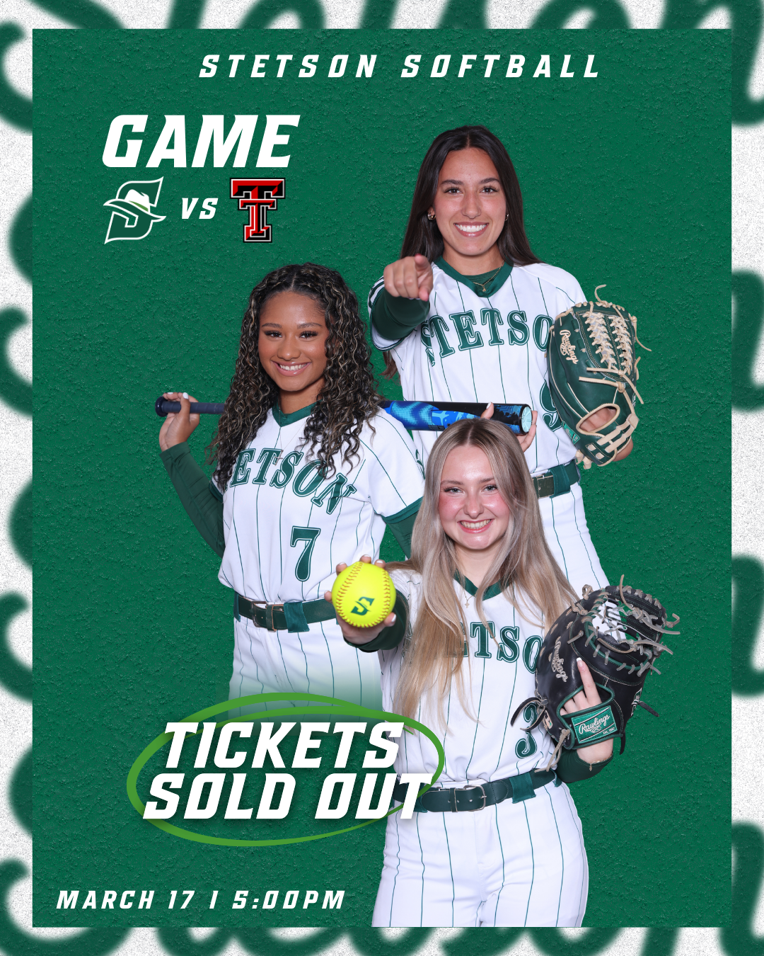
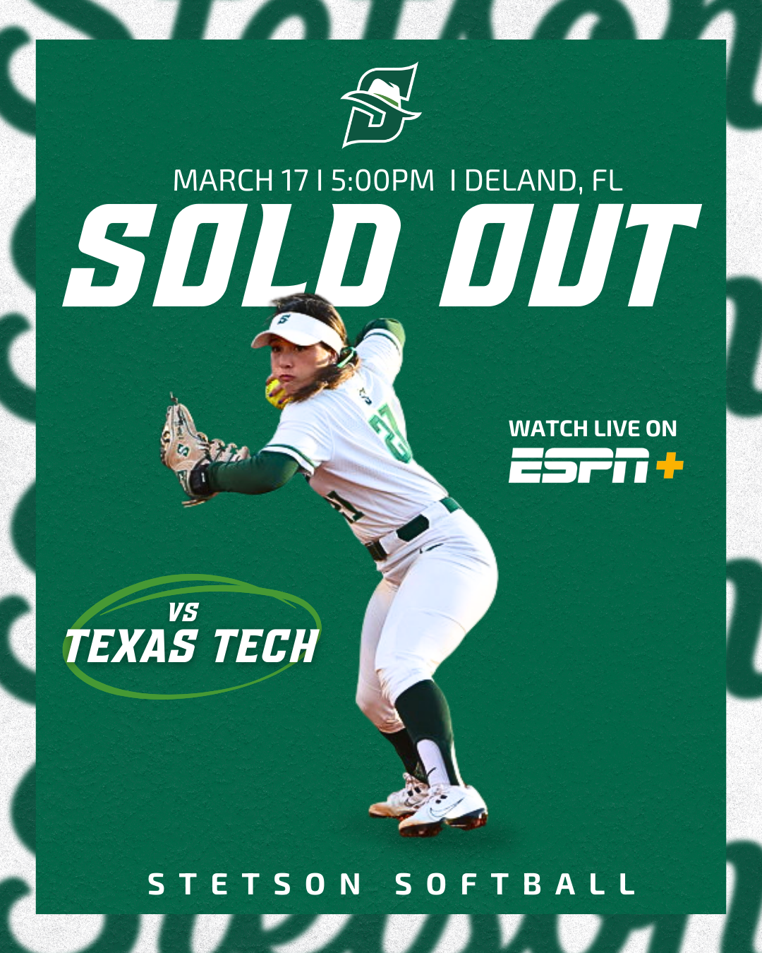
Sold Out Softball Graphic

Another graphic I created during these weeks was the sold-out announcement for the Stetson softball game against Texas Tech. At first, both versions of the graphic were designed without borders, but the overall result looked a little too plain.

To improve the design, I added the same border style that we often use on our lacrosse game day posts. This small adjustment added another visual layer to the graphic without making it feel overly busy. I liked that the border helped frame the design and made the post feel more polished while still keeping the focus on the “Sold Out” message.

Overall, I was really happy with how these graphics turned out. They are simple but effective, and the added border detail helped elevate the final look.

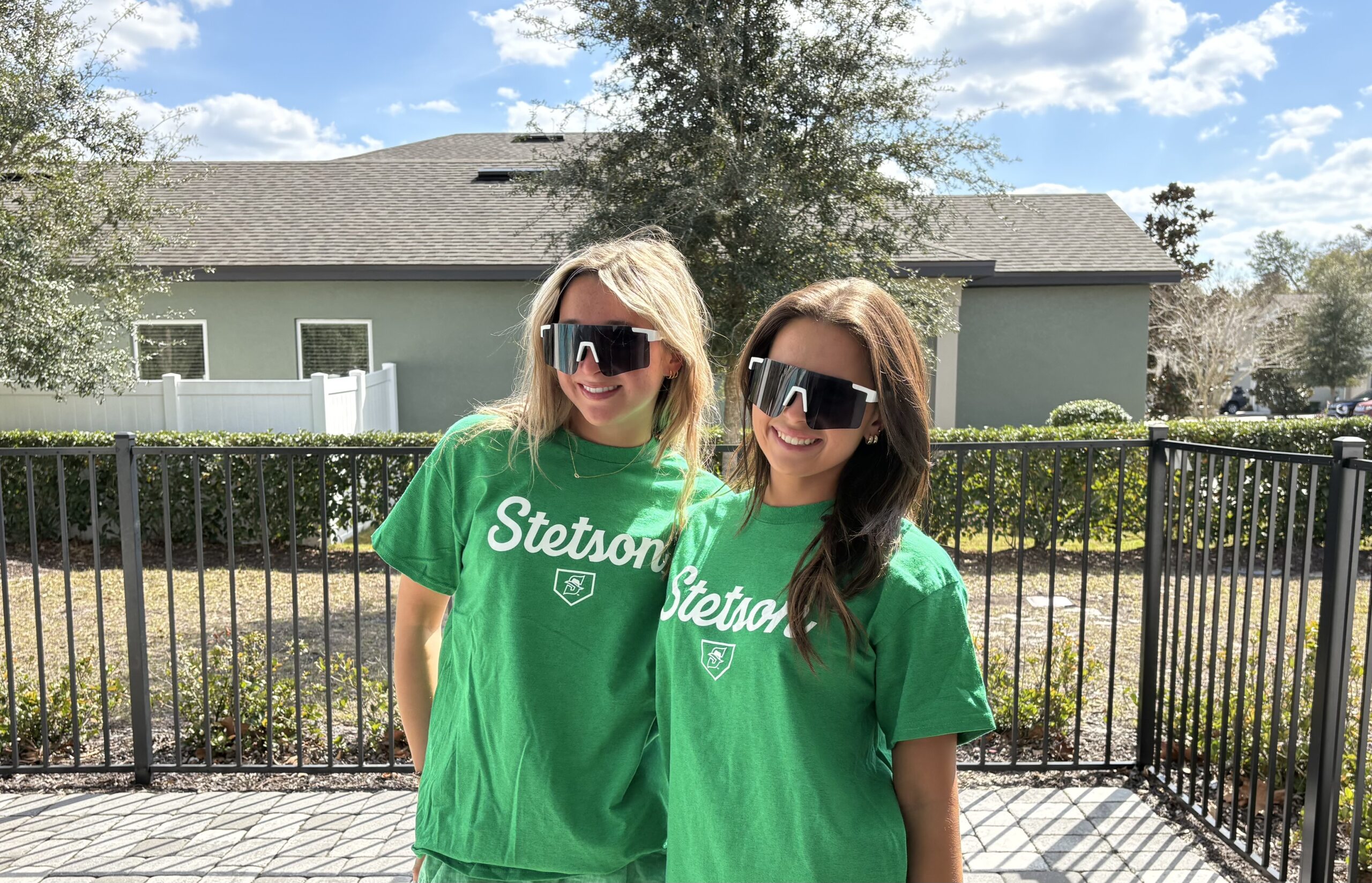
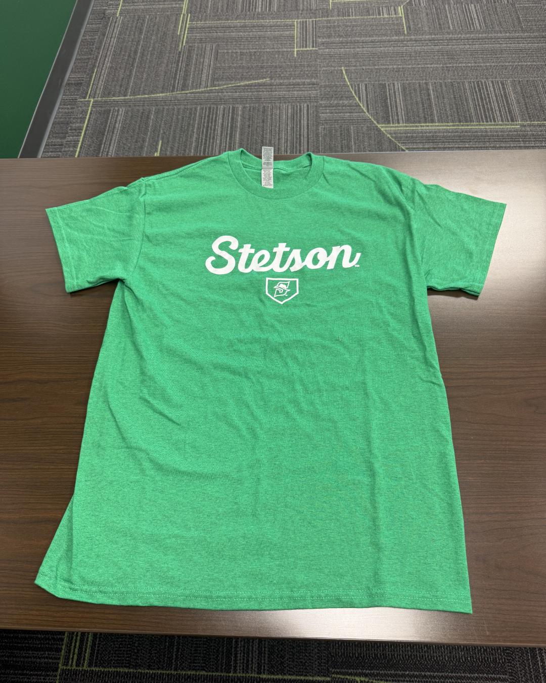
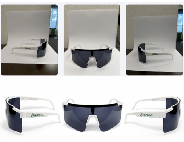
Giveaway Photos: Pit Vipers & T-Shirts

For softball giveaways, I also helped take photos of friends modeling the Pit Viper sunglasses and the Stetson giveaway t-shirts. Similar to the basketball shirt photos I took earlier in the semester, the goal was to capture images that show the giveaway items being worn rather than just photographed on their own.

Having real people model the giveaways helps the posts feel more engaging and gives fans a better sense of what the items actually look like. It also makes the content feel more natural and lifestyle-focused rather than purely promotional.

Learning AI Editing Techniques

One of the most interesting parts of these weeks was learning how another member of the social media team edits giveaway photos using AI tools. I did not take or edit the final photos myself, but I followed along as he showed me the process.

He demonstrated how he uploads the original images into ChatGPT and other AI editing platforms and then uses extremely specific prompts to transform the photos into polished promotional edits. Seeing this process was really interesting because the original images were fairly simple, but with the right prompts the AI could generate very professional-looking visuals.

It was helpful to see how detailed the prompts need to be in order to get the results you want. This showed me how AI tools can be used as another creative resource in the design process rather than replacing creativity entirely.

Conclusion

Weeks 8 and 9 helped me continue developing my design process and understanding of sports marketing content through projects like Military Appreciation graphics, sold-out posts, and photographing giveaways. I also gained insight into how tools like AI and different creative approaches from the team can enhance content creation and shape my future work.

Week 7 (February 23–March 1, 2026)

Bark in the Park Photo Editing & Posting

This week I finished editing and posting the photos we took for the Bark in the Park promotion. The dogs wearing the green bandanas in the stadium setting helped make the promotion feel authentic and exciting rather than just another graphic post.

If you want to see more pictures from Bark in the Park, you can view the full gallery here:
https://flic.kr/s/aHBqjCMHr2

Bark in the Park Promotional Graphic

In addition to the first Bark in the Park announcement graphic and the photos, I also created a day of Bark in the Park promotional graphic. For this design, I pulled inspiration from a few different ideas I found on Pinterest. In one post, I saw a layout using photo frames lined up across the graphic, which I thought would work well for showcasing multiple dogs. In a separate design, I found inspiration for the way the stadium image was used as the background. 

One part of the design that took some extra time to figure out was the bottom section of the graphic. I had the text written but I could tell that something still felt missing. I experimented with a few different sticker-style elements and decorative details until I finally came up with the idea of adding a line of paw prints along both the sides of the design. Once I added those, the graphic felt much more complete and visually balanced.

I am really happy with how the final design turned out, especially because it combined multiple ideas and went through a few rounds of creative problem solving before reaching the final version.

March Spring Schedule Graphics

Another project I worked on this week was creating the March schedule graphics for several Stetson teams. We have been using a consistent template for monthly schedule graphics, which makes the process much more efficient while still keeping everything visually cohesive across sports.

First Career Goal Graphics

I also created graphics celebrating players’ first career goals for the lacrosse team. Design-wise, I pulled the idea from a graphic I made last year that I really liked. I definitely do not like this design with just the “1” as much as I liked the “100” design. I wish I would have had more time to mess with it more before it became a template for other people’s 1st career goal posts. 

Breast Cancer Awareness Story Graphic

For our Breast Cancer Awareness game, I created a special Instagram story graphic to post the night before the game. I wanted the design to highlight breast cancer awareness while still fitting within the Stetson Lacrosse brand.

We decided to post this graphic the night before instead of the same day as the game-day post so that both pieces of content could have their own purpose. The story graphic focused more on awareness and the cause, while the official game-day post the next day focused more on the matchup while still including the awareness elements.

Breast Cancer Awareness Game Day Post Development

For the official game-day post, I experimented with several versions of the design to find the right balance between a traditional game-day graphic and a breast cancer awareness theme. I tried subtle changes at first, such as smaller pink accents and ribbon elements, but eventually experimented with a fully pink version of the graphic.

After reviewing the options with my coaches, we decided that the full pink design was the strongest because it clearly communicated the purpose of the game while still keeping the structure of the original game-day layout. This process helped me understand how design experimentation and feedback play an important role in creating the final product.

Conclusion

Week 7 focused a lot on the full lifecycle of sports marketing content, from photographing and editing event photos to creating graphics that promote games, celebrate players, and highlight important causes. It was rewarding to see how each piece of content serves a different role, whether it is promoting fan engagement, recognizing athletes, or supporting a larger awareness campaign. Working on these projects continues to help me better understand how these postings all work together to build the Stetson Athletics brand and enhance the fan experience.

Museum of Art Deland

Thursday March 12 – Documented a visit by a school group from Maitland – visit lasted several hours

Monday March 16 – Spent several hours to redesign a tri-fold flyer for the museum. The flyer was laid out in Canva, unfortunately, that program does not export to Photoshop so I had to recreate some of the design elements manually.

This week March 26 – looking forward to documenting interviews both video and sound. Also, March 27 first meeting to create a new parking guide for the museum.