All posts by Heidi Cross

Week 15 (April 20–26, 2026) & Week 16 (April 27–May 3, 2026)

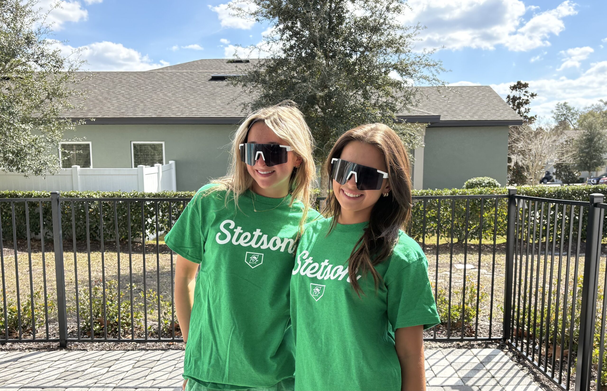
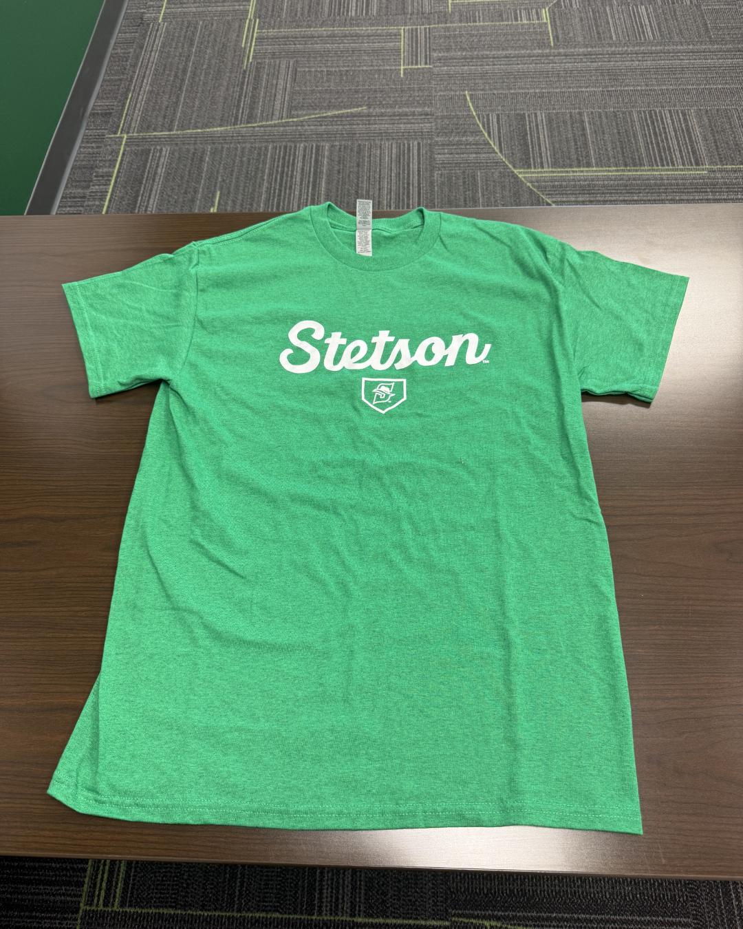
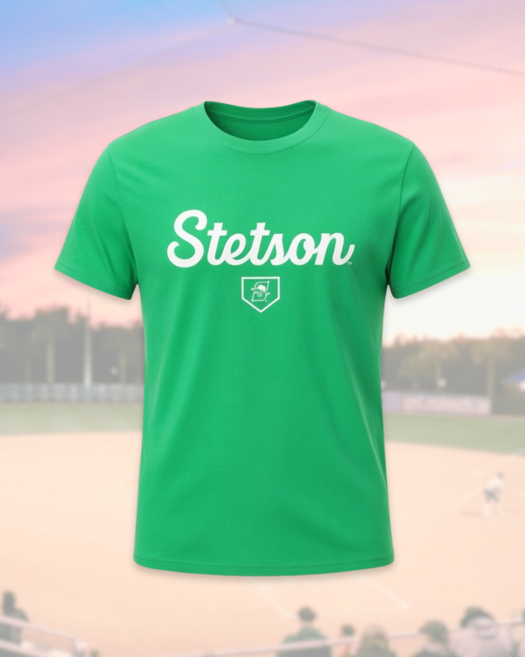
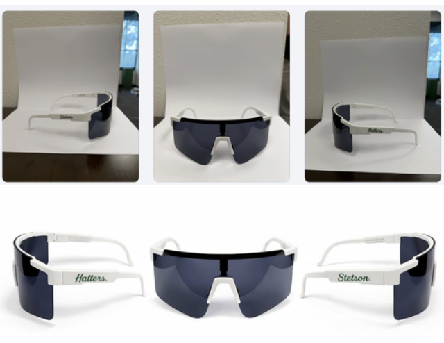
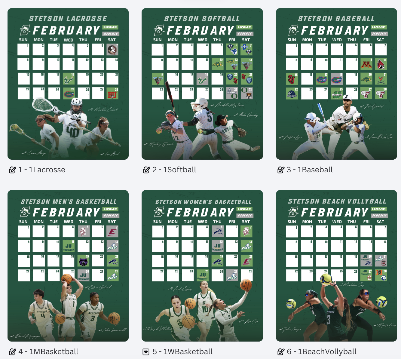
Creating a Custom Player of the Week Graphic

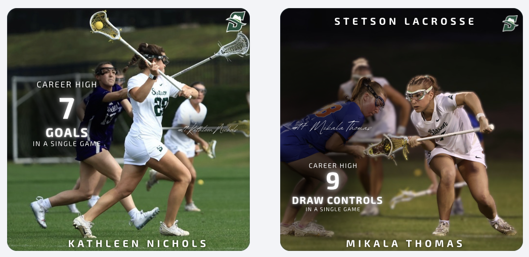
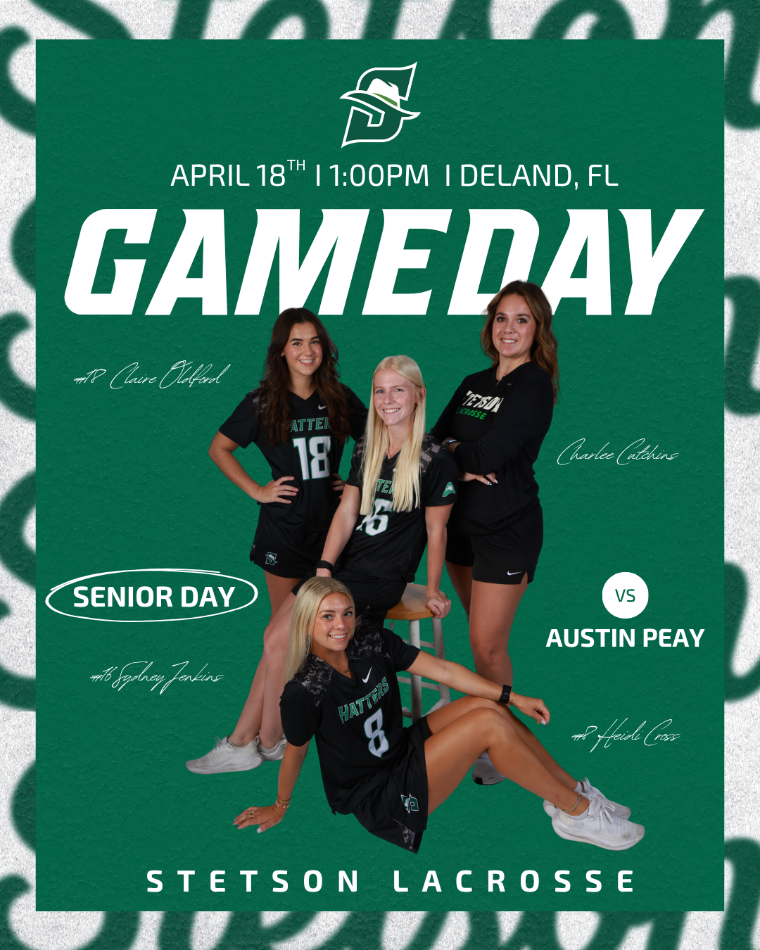
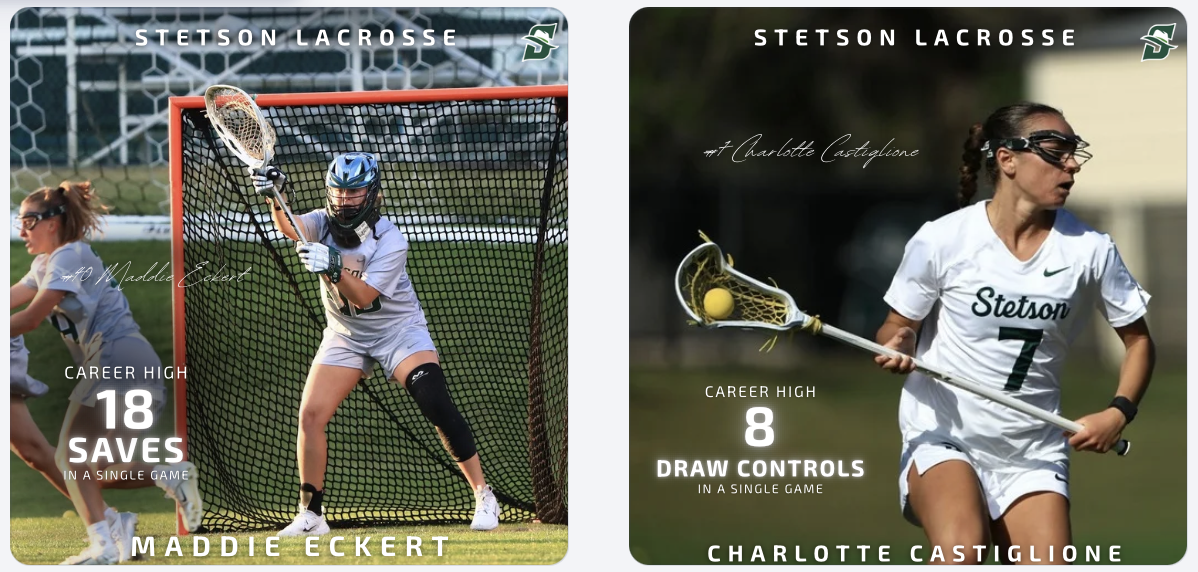
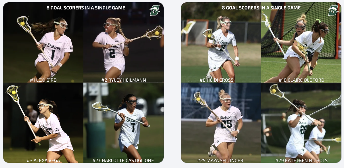
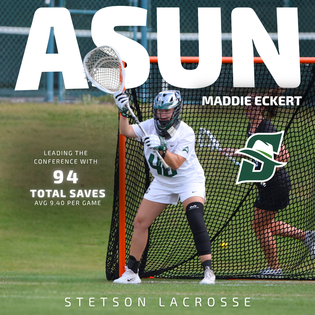
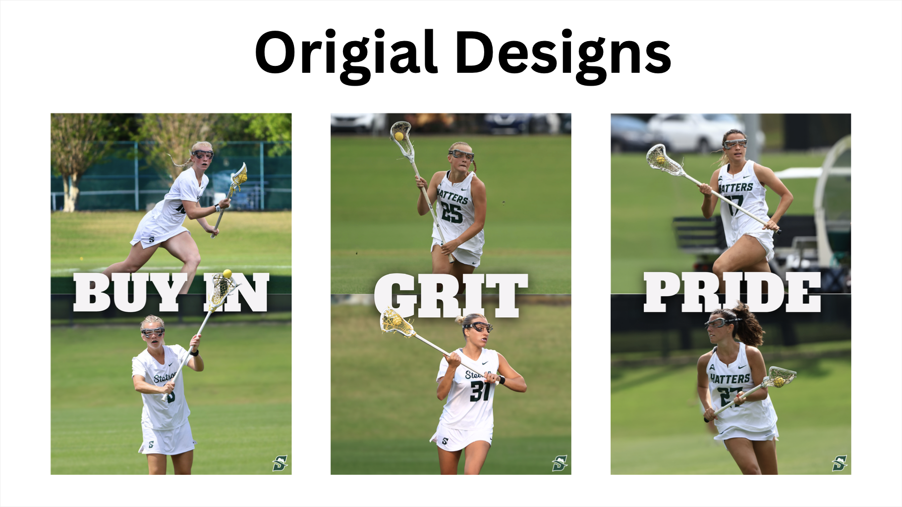
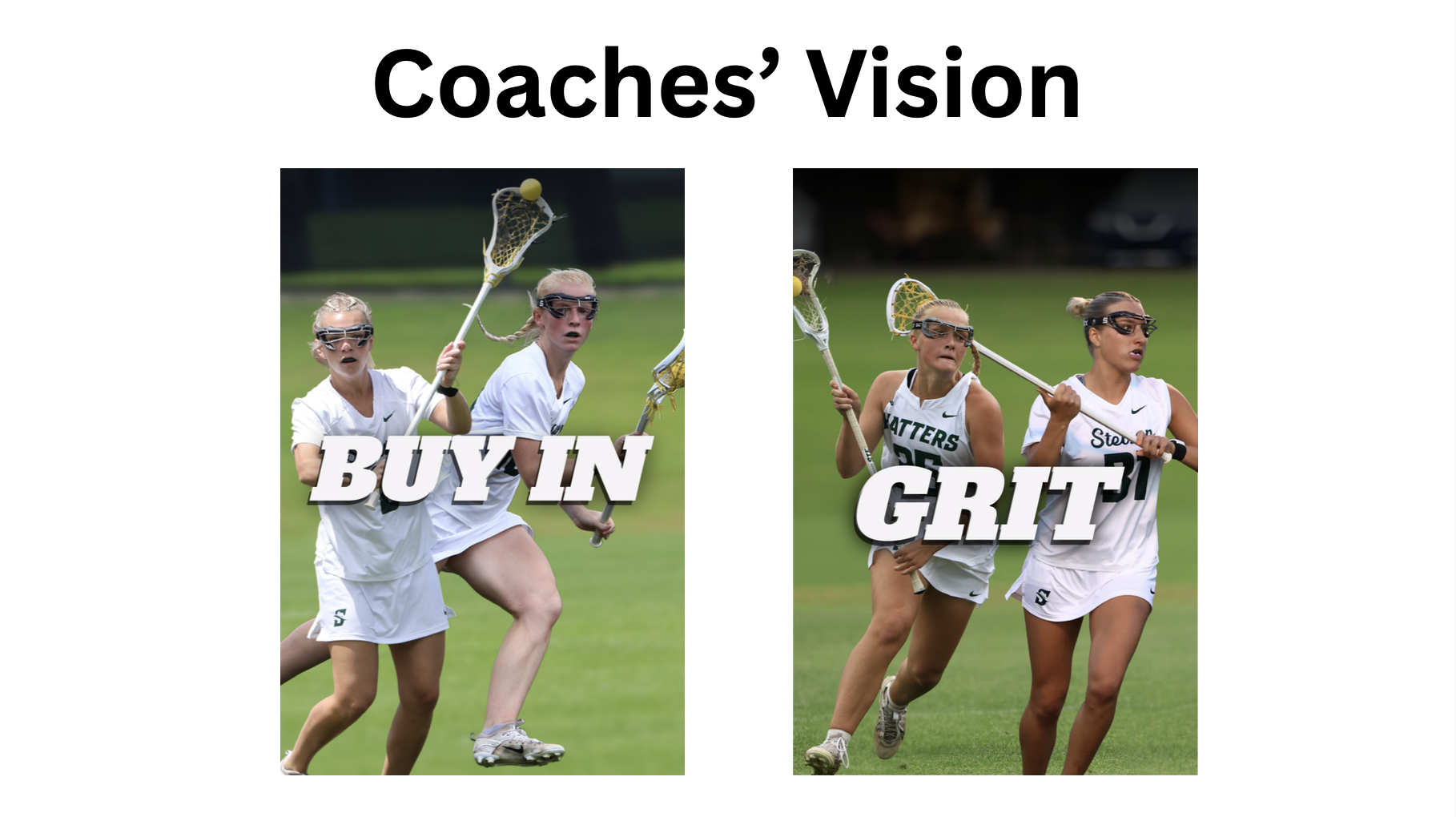
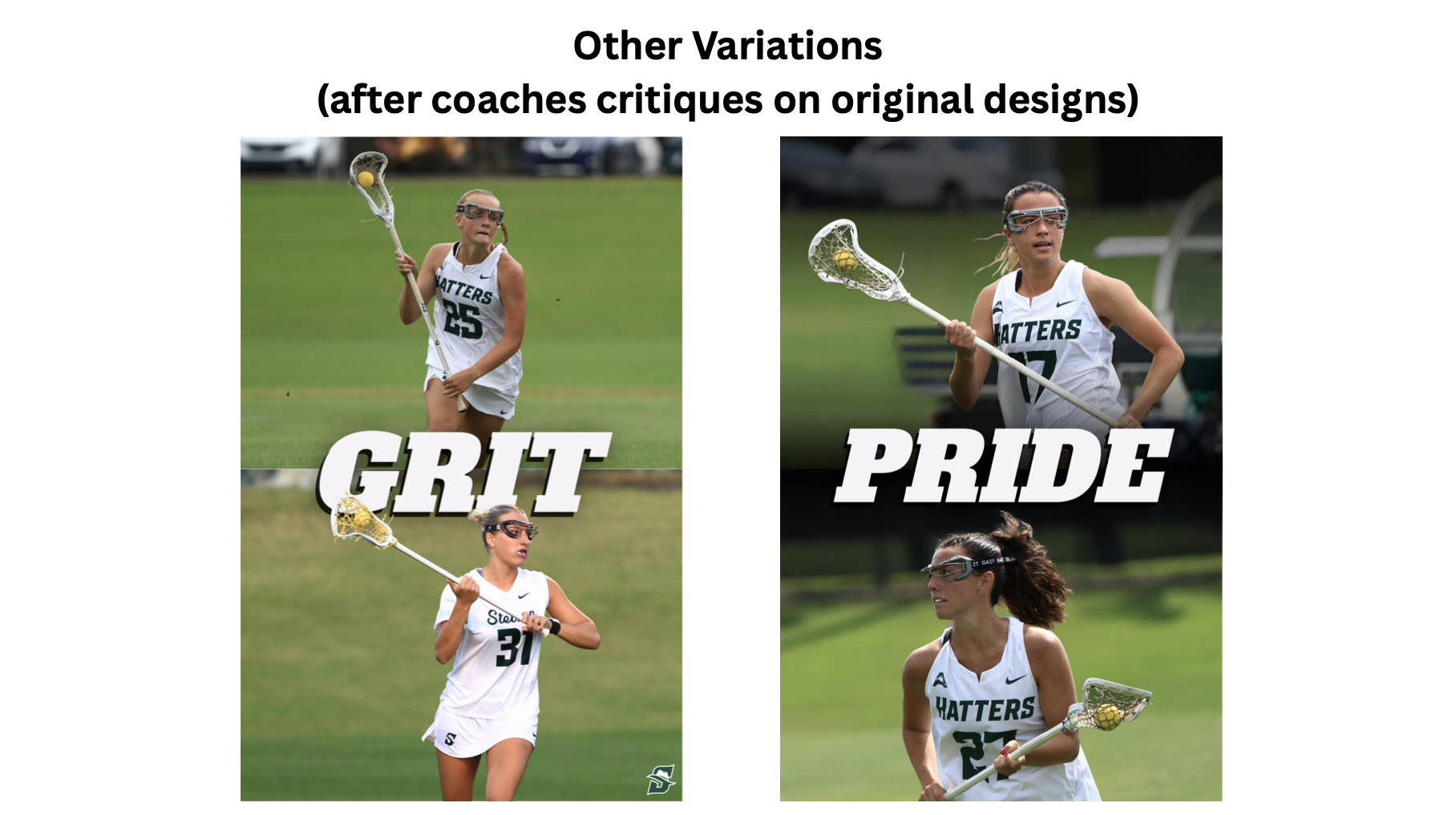
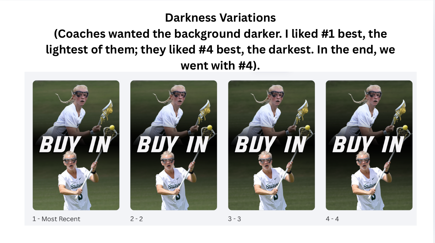
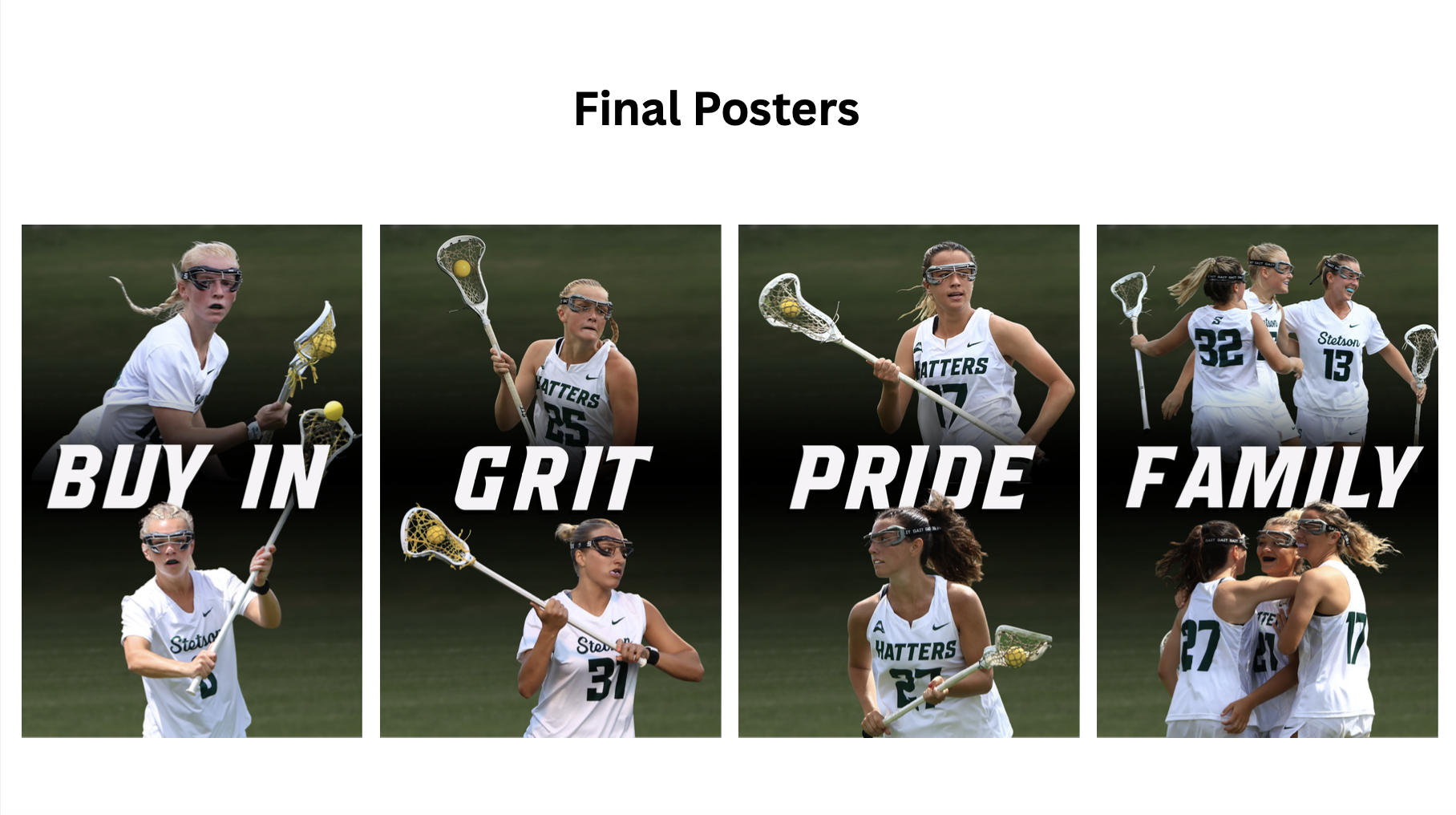
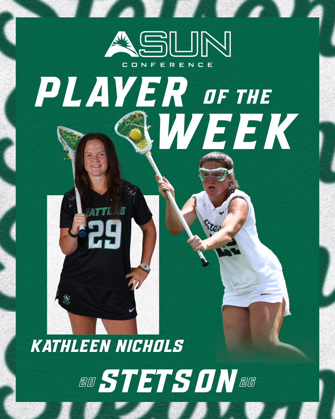
One of the main projects during these weeks was designing a new ASUN Player of the Week graphic for lacrosse. While the athletic department already has a standard template for these posts, they reached out to see if I wanted to create a version that better matched the Stetson lacrosse Instagram theme and overall visual style.

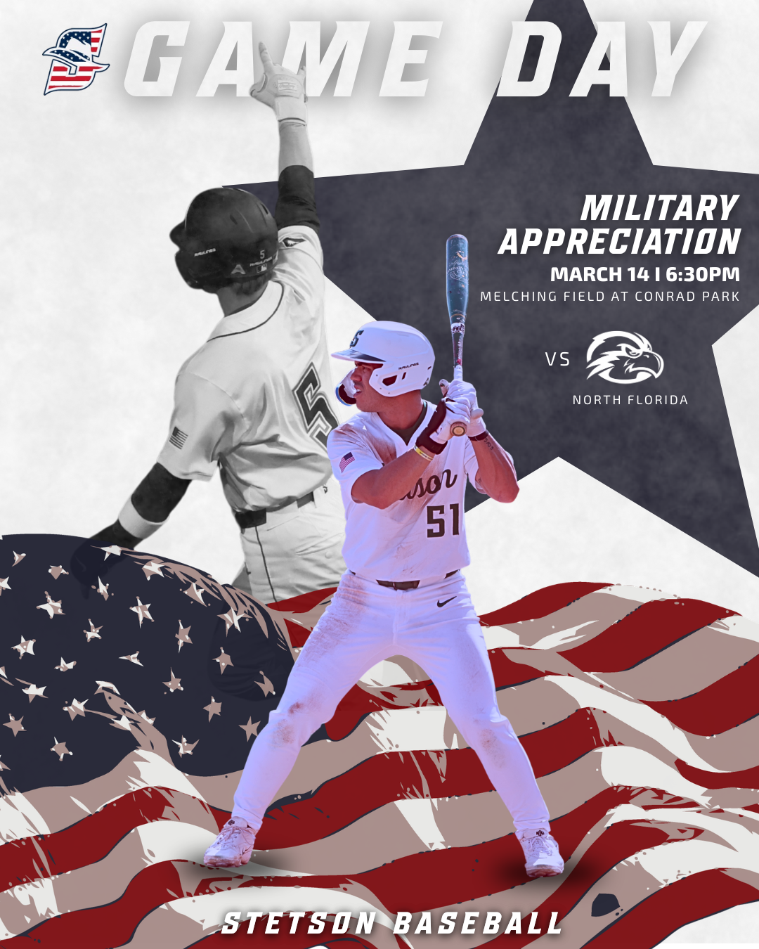
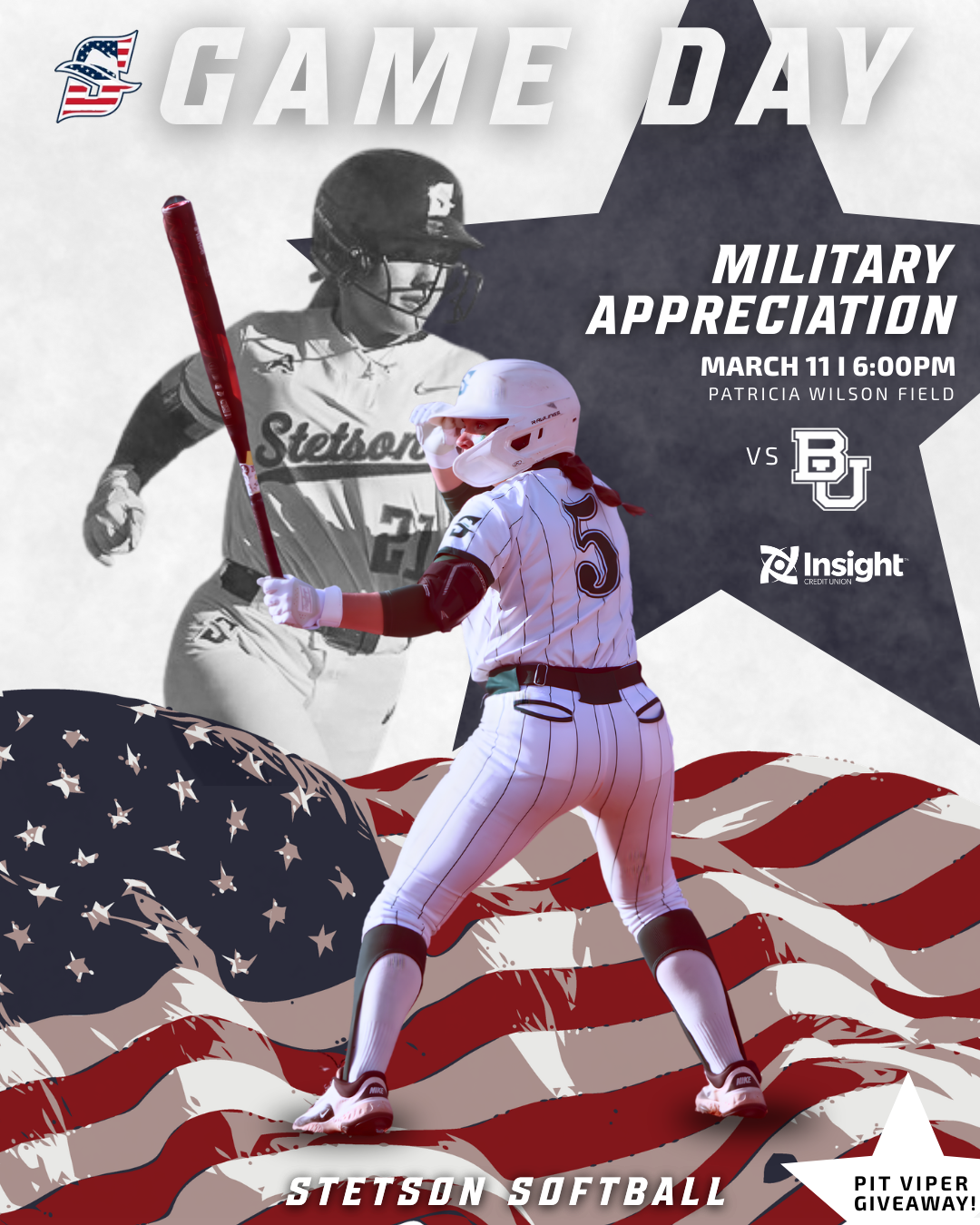
When designing this, I pulled inspiration from other graphics I had already created this season, including senior day, takeover, and game day posts. Using those as a reference helped me keep the design cohesive with the rest of our content while still making it feel elevated and specific to the award. This project reinforced how important it is to design within an established brand style, but also how you can build on that to make something feel more tailored to a specific team.

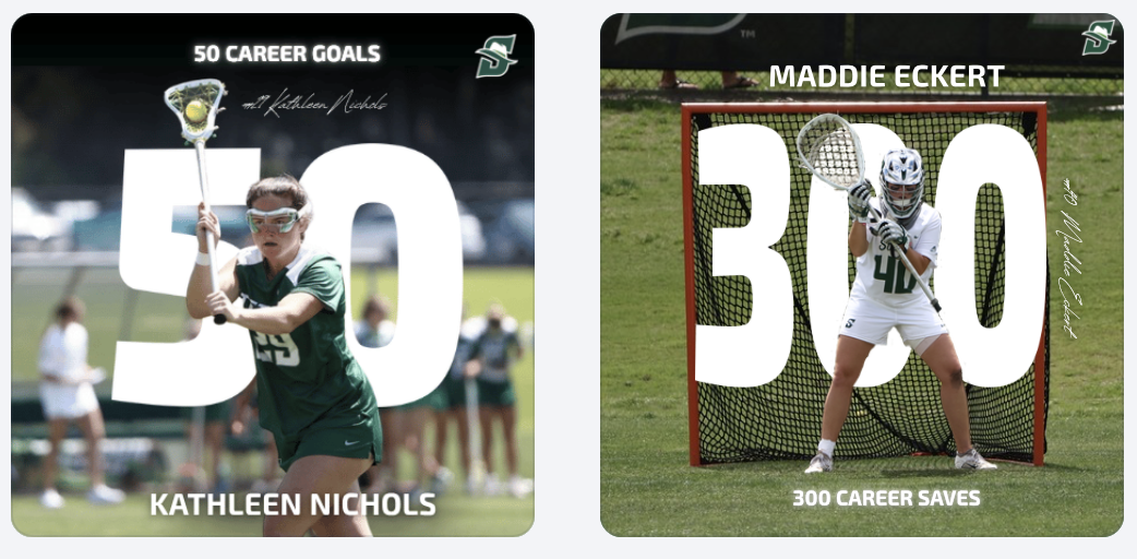
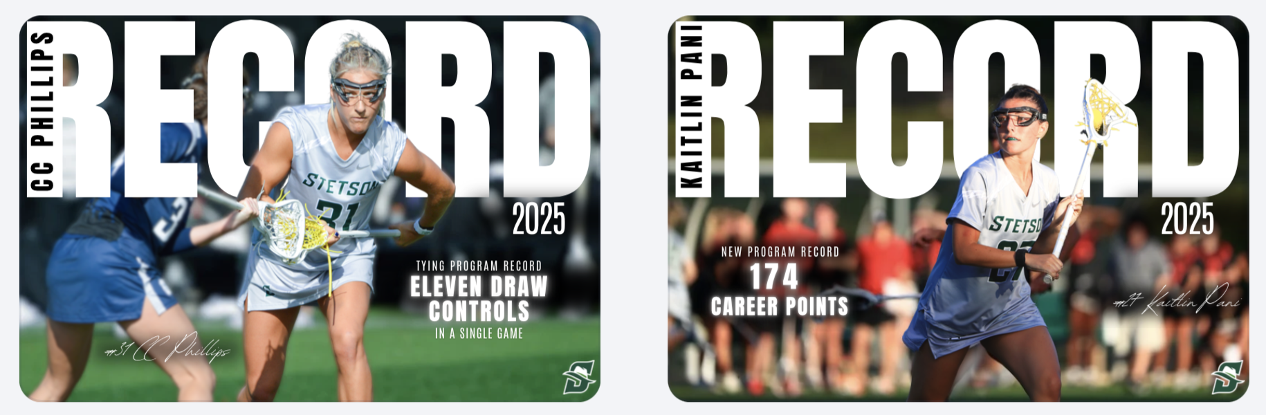
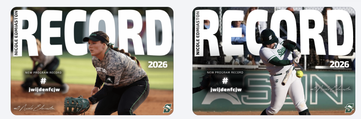
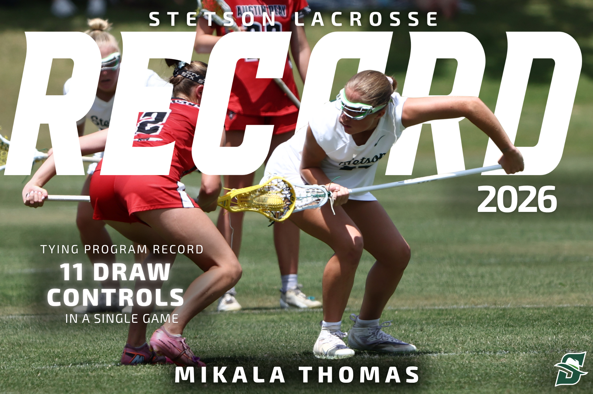
Record Graphic Adjustments

I also worked on a record graphic using the template I created earlier in the season. Instead of completely redesigning it, I made small adjustments, especially with fonts and layout details. Even though I stayed within Stetson branding, these subtle changes made the graphic feel more refined and aligned with the direction my designs have been moving in.

This showed me how design is often about iteration rather than starting over. Small changes can make a big difference in the overall look, and it’s important to keep improving even when working from an existing template.

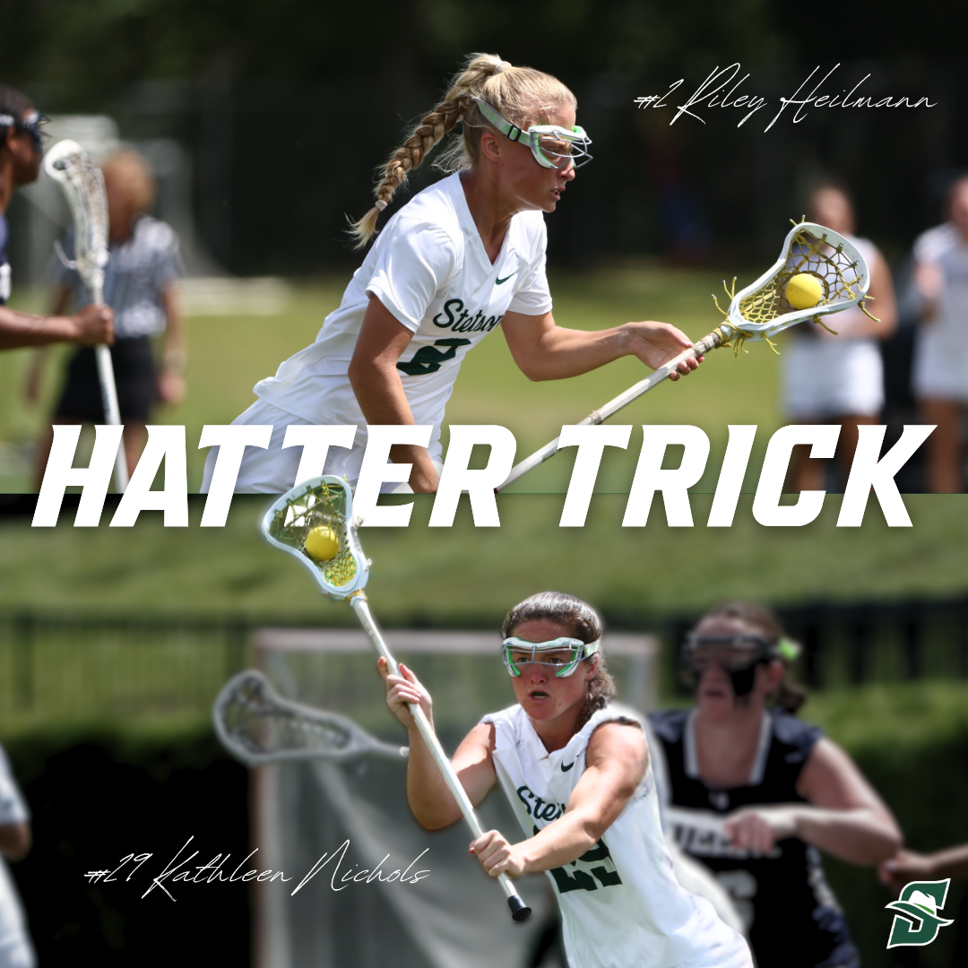
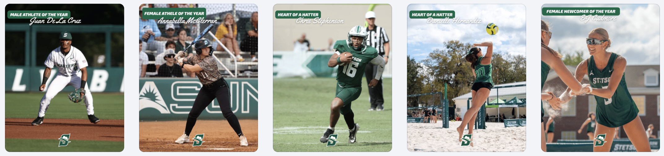
Hattermy’s Award Posts

Another set of graphics I worked on were for the Hattermy’s, which is the athletic department’s end-of-year awards ceremony. Because there were a large number of winners to post, these graphics were designed using a much more simple and efficient template style.

The focus here was less on creating highly detailed designs and more on consistency and speed. Even though the templates were basic, they still needed to look clean, on-brand, and professional when posted together. This experience highlighted the balance between creativity and efficiency, especially when working on high-volume content.

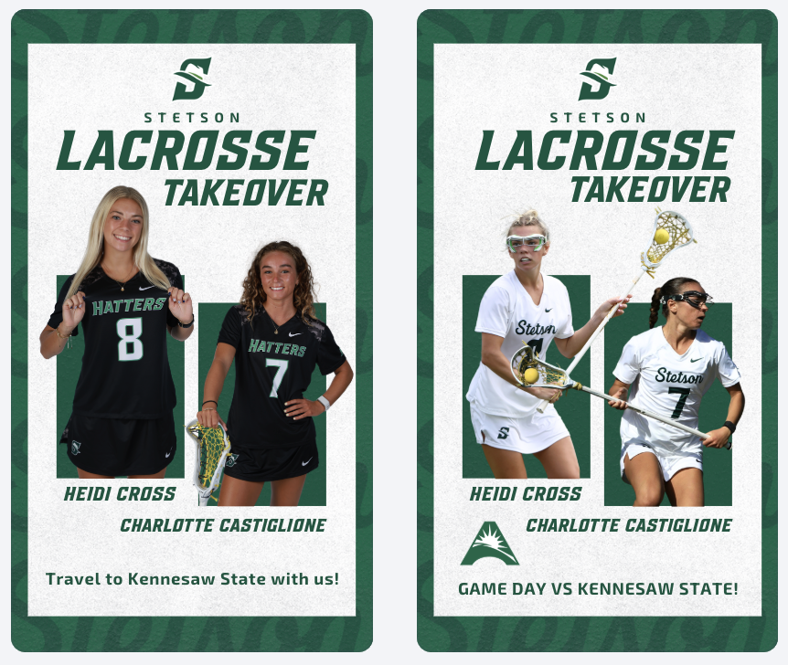
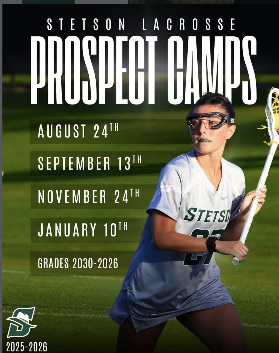
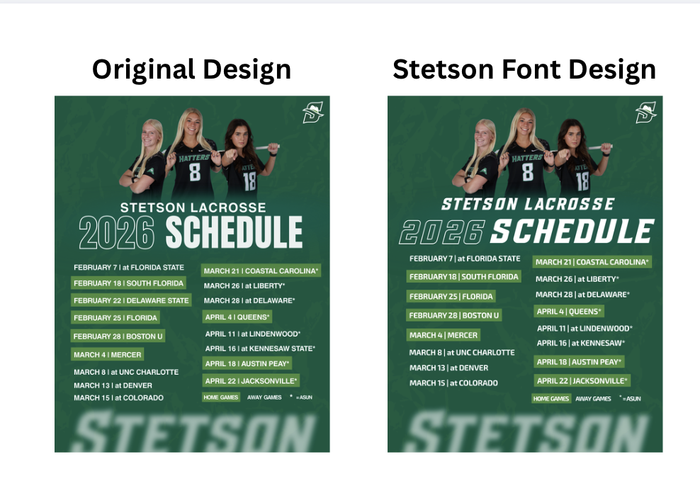
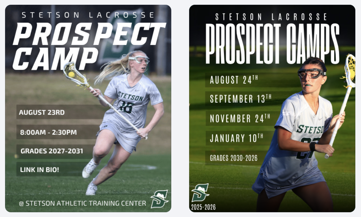
Lacrosse Prospect Camp Graphics

I also revisited a previous lacrosse prospect camp graphic and updated it to better align with current Stetson branding. The original version used fonts that are no longer part of the athletic department’s brand standards, so I adjusted the typography and layout to match what we use now.

Even though the updated version is more on-brand, I still think the older design had some stylistic elements that I liked more. This was an interesting challenge because it showed the trade-off between personal design preference and maintaining brand consistency. In a professional setting, staying consistent with the brand is always the priority, even if it means adjusting elements you personally prefer.

Conclusion

These weeks focused on refining and adapting my designs rather than starting from scratch. I continued improving my ability to work within a system while balancing creativity with consistency, which is key in sports marketing.

Week 14 (April 13–19, 2026)

More Individual Achievement Posts

This week, I continued creating individual achievement graphics like the “hattertrick” post and career achievements. These focus on highlighting player performance while still staying within the team’s branding. I used strong action photos, bold typography, and multiple images to make the designs feel more dynamic and impactful.

Win Graphic Template

I also created and used a reusable win graphic template that allows me to quickly switch out the player, opponent, and final score. The design is simple but strong, using a large “WIN” text and clean layout to clearly communicate the result. This made the process much faster on game days while still keeping posts consistent and visually engaging.

Lacrosse Instagram Takeover

One of the most unique projects I worked on during this week was an Instagram takeover for Stetson University’s main social media account. Their social media team had been trying to expand takeovers across different areas of campus, including study abroad, music, and business programs, but they had not yet featured athletics. Because I am involved in both Stetson Athletics and the lacrosse team, they reached out to me to lead the first athletics takeover.

For this, I decided to make the content a “day in the life” style takeover while traveling to an away game. I also asked one of my teammates who is very comfortable on camera to co-host with me, which helped make the content more engaging and natural. While I was given some general guidelines, the creative direction was completely up to me, which made this project very different from my usual graphic design work.

To organize the takeover, I created intro/cover slides for each day to keep everything structured and cohesive. Instead of posting a high volume of short clips, I was asked to focus on creating longer videos or photo collages, which resulted in about 6–8 posts per day. This approach would help tell a more complete story and make the content feel more intentional rather than random.

This project challenged me in a new way because I had to handle every part of the process including, coming up with creative ideas, filming, editing, and posting. Unlike graphics where I usually start with a clear visual direction or templates, there was very little prior inspiration for this, especially since it was the first athletics takeover. I did look at other schools and teams for general ideas, but nothing directly matched what I was trying to do, so a lot of it came down to experimenting and figuring it out as I went.

One of the biggest challenges was balancing this project with being an athlete at the same time. I was responsible for filming and posting in real time while also attending practice, watching film, preparing for the game, and competing. Because this was meant to be a live, ongoing story, timing was important; however, on game day, I was away from my phone for several hours.

This created a gap in posting, where there was little to no content during the game and then a large amount of content afterward once I had time to edit and post everything. Even though the Stetson social media team understood this limitation, it still felt slightly off from a content flow perspective and showed me how challenging real-time content creation can be in sports.

Another challenge was editing. I used Instagram Reels to edit everything because I thought it would be the easiest option, but it ended up being time-consuming and limiting. It also did not produce as polished of a final product as I had hoped. Looking back, I would have used a more advanced editing platform to improve both efficiency and quality.

Overall, I was really happy with how the takeover turned out. I received a lot of positive feedback, and the Stetson social media team was very pleased with the final result. It was a completely different type of project compared to my usual design work, and it pushed me to think more about storytelling, content flow, and audience engagement.

If I were to do it again, I would focus on using a better editing platform and planning content more strategically around game-day timing. This experience showed me how much work goes into social media beyond just graphics, especially when it involves real-time content and balancing multiple roles at once.

Video Links:

Conclusion

This week helped me grow both creatively and professionally by balancing graphic design with real-time content creation. From building efficient templates to leading the lacrosse takeover, I gained a better understanding of how important planning, adaptability, and storytelling are in sports marketing. It showed me how much goes into creating engaging content, especially when working in a fast-paced, live environment.

Week 12 (March 30 – April 5, 2026) & Week 13 (April 6 – 12, 2026)

Building on Templates & Expanding Content

During these two weeks, a lot of my work focused on building off templates I had already created and turning them into finished posts. For record and milestone graphics, I used the templates I designed earlier in the season and filled them out with updated player stats and photos. This made the process more efficient while still keeping everything consistent with Stetson Athletics’ branding.

Athletic Training Month Post

I also created a post for Athletic Training Month. With this design, I intentionally kept it simple while still making it visually strong. Instead of overcomplicating it, I focused on clean typography, a strong photo, and clear messaging. This helped highlight the importance of athletic trainers while keeping the graphic professional and easy to read.

Lacrosse Senior Day Graphics

Another key project was designing senior day graphics for lacrosse. These posts are more meaningful than typical game content because they highlight individual athletes and their time with the program. I focused on making each graphic feel personal while still keeping a consistent layout across all seniors so the set looked cohesive when posted together.

Tournament Template Creation

I also created a tournament template that will be used by both men’s and women’s tennis, as well as men’s and women’s golf. Even though the current version uses placeholder athletes, the goal was to build something flexible and reusable across multiple teams. This project made me think more about designing for long-term use rather than just a one-time post.

All-Academic Template

Lastly, I designed an All-Academic template that can be used by all spring teams at the end of the season. Similar to the tournament template, this was built with adaptability in mind so different teams can easily plug in their athletes. It reinforced how important it is to create designs that are not only visually appealing but also practical for others to use.

Conclusion

These weeks helped me continue improving my efficiency while designing within a system. Reusing templates, creating versatile designs, and knowing when to keep things simple all played a big role in my workflow. It showed me that strong sports design isn’t always about starting from scratch, but about building resources that can be used across an entire program.

Week 10 (March 16–22, 2026) & Week 11 (March 23–29, 2026)

Schedule Graphics & Brand Consistency

During these weeks, I worked on creating April schedule graphics for multiple spring teams, as well as an ASUN women’s lacrosse schedule post. One of the biggest design decisions I made was switching the opposing team logos from their original colors to all white. While the original versions added more color, I realized that using white logos created a cleaner look and kept the overall graphic more consistent with Stetson’s brand. It also helped the feed feel more cohesive when viewed as a whole. 

Reworking the Lacrosse Hype Video

I also had the opportunity to rework a lacrosse hype video. The original version did not include actual game footage, so I took it apart and rebuilt it by adding game clips and other details to better represent our team.

This process helped me think more critically about storytelling through video. Instead of just creating something visually appealing, I focused on making sure the content felt authentic to our team and captured the energy of real gameplay. It showed me how important it is for hype content to reflect actual performance, not just aesthetics.

Record Graphics Templates

Another major project was creating record post templates, primarily using softball as my base. I took inspiration from record graphics I created last year for lacrosse, but this time I had to strictly follow Stetson’s official fonts and branding guidelines.

This was something I struggled with creatively. I personally felt that some non-Stetson fonts looked stronger, especially in the horizontal designs, but I had to prioritize brand consistency over personal preference. It was a good reminder that working in sports design isn’t just about what looks best individually, but what aligns best with the overall brand.

Even with that challenge, I built these templates so they can be reused across teams, allowing other designers to easily plug in new photos and update information. This made the project not just creative, but also functional for long-term use.

Player Feature Content

In addition to creating templates, I designed and posted multiple record and milestone graphics for lacrosse, including career-high performances and a team post highlighting eight different goal scorers in a single game. These posts help recognize player achievements, build team hype, and give fans shareable moments from games.

Game Day Content & Engagement

In addition to graphics, we received a lot of strong game photos and videos from two recent wins, so I focused on posting more photo-based content. These posts help capture real moments and keep the audience engaged in a more immediate and authentic way compared to only using designed graphics.

Balancing polished graphics with real game content showed me how important variety is in maintaining an engaging social media presence.

Lacrosse Instagram Example Post: https://www.instagram.com/p/DWaJMLCESBn/?img_index=1

Conclusion

These two weeks challenged me to balance creativity and brand consistency. Whether it was adjusting logo colors, working within font guidelines, or building reusable templates and emphasizing that strong design in sports marketing is about more than just visuals, it’s about creating content that fits within a larger system while still telling a compelling story.

Week 8 (March 2–8, 2026) & Week 9 (March 9–15, 2026)

Military Appreciation Game Graphics

During these weeks I worked on creating Military Appreciation game graphics for both Stetson softball and baseball. This project took a little longer than some of the others because I could not find many strong inspiration graphics to reference beforehand. When I have a clear visual reference, the design process tends to move faster, but when I have to build something more from scratch it requires a lot more experimenting.

Because of that, I spent time testing different layouts, colors, and composition options before settling on the final design. I also sometimes second guess myself during the design process, but this project reminded me that it is important to trust the process and wait until the full design comes together before judging it too early.

One thing that helped was designing both the baseball and softball versions. Once I developed a direction for one sport, I could adapt similar elements for the other while still keeping the designs unique to each team. Using the American flag, muted background imagery, and the star shape helped highlight the Military Appreciation theme while still fitting within the Stetson Athletics style.

Sold Out Softball Graphic

Another graphic I created during these weeks was the sold-out announcement for the Stetson softball game against Texas Tech. At first, both versions of the graphic were designed without borders, but the overall result looked a little too plain.

To improve the design, I added the same border style that we often use on our lacrosse game day posts. This small adjustment added another visual layer to the graphic without making it feel overly busy. I liked that the border helped frame the design and made the post feel more polished while still keeping the focus on the “Sold Out” message.

Overall, I was really happy with how these graphics turned out. They are simple but effective, and the added border detail helped elevate the final look.

Giveaway Photos: Pit Vipers & T-Shirts

For softball giveaways, I also helped take photos of friends modeling the Pit Viper sunglasses and the Stetson giveaway t-shirts. Similar to the basketball shirt photos I took earlier in the semester, the goal was to capture images that show the giveaway items being worn rather than just photographed on their own.

Having real people model the giveaways helps the posts feel more engaging and gives fans a better sense of what the items actually look like. It also makes the content feel more natural and lifestyle-focused rather than purely promotional.

Learning AI Editing Techniques

One of the most interesting parts of these weeks was learning how another member of the social media team edits giveaway photos using AI tools. I did not take or edit the final photos myself, but I followed along as he showed me the process.

He demonstrated how he uploads the original images into ChatGPT and other AI editing platforms and then uses extremely specific prompts to transform the photos into polished promotional edits. Seeing this process was really interesting because the original images were fairly simple, but with the right prompts the AI could generate very professional-looking visuals.

It was helpful to see how detailed the prompts need to be in order to get the results you want. This showed me how AI tools can be used as another creative resource in the design process rather than replacing creativity entirely.

Conclusion

Weeks 8 and 9 helped me continue developing my design process and understanding of sports marketing content through projects like Military Appreciation graphics, sold-out posts, and photographing giveaways. I also gained insight into how tools like AI and different creative approaches from the team can enhance content creation and shape my future work.

Week 7 (February 23–March 1, 2026)

Bark in the Park Photo Editing & Posting

This week I finished editing and posting the photos we took for the Bark in the Park promotion. The dogs wearing the green bandanas in the stadium setting helped make the promotion feel authentic and exciting rather than just another graphic post.

If you want to see more pictures from Bark in the Park, you can view the full gallery here:
https://flic.kr/s/aHBqjCMHr2

Bark in the Park Promotional Graphic

In addition to the first Bark in the Park announcement graphic and the photos, I also created a day of Bark in the Park promotional graphic. For this design, I pulled inspiration from a few different ideas I found on Pinterest. In one post, I saw a layout using photo frames lined up across the graphic, which I thought would work well for showcasing multiple dogs. In a separate design, I found inspiration for the way the stadium image was used as the background. 

One part of the design that took some extra time to figure out was the bottom section of the graphic. I had the text written but I could tell that something still felt missing. I experimented with a few different sticker-style elements and decorative details until I finally came up with the idea of adding a line of paw prints along both the sides of the design. Once I added those, the graphic felt much more complete and visually balanced.

I am really happy with how the final design turned out, especially because it combined multiple ideas and went through a few rounds of creative problem solving before reaching the final version.

March Spring Schedule Graphics

Another project I worked on this week was creating the March schedule graphics for several Stetson teams. We have been using a consistent template for monthly schedule graphics, which makes the process much more efficient while still keeping everything visually cohesive across sports.

First Career Goal Graphics

I also created graphics celebrating players’ first career goals for the lacrosse team. Design-wise, I pulled the idea from a graphic I made last year that I really liked. I definitely do not like this design with just the “1” as much as I liked the “100” design. I wish I would have had more time to mess with it more before it became a template for other people’s 1st career goal posts. 

Breast Cancer Awareness Story Graphic

For our Breast Cancer Awareness game, I created a special Instagram story graphic to post the night before the game. I wanted the design to highlight breast cancer awareness while still fitting within the Stetson Lacrosse brand.

We decided to post this graphic the night before instead of the same day as the game-day post so that both pieces of content could have their own purpose. The story graphic focused more on awareness and the cause, while the official game-day post the next day focused more on the matchup while still including the awareness elements.

Breast Cancer Awareness Game Day Post Development

For the official game-day post, I experimented with several versions of the design to find the right balance between a traditional game-day graphic and a breast cancer awareness theme. I tried subtle changes at first, such as smaller pink accents and ribbon elements, but eventually experimented with a fully pink version of the graphic.

After reviewing the options with my coaches, we decided that the full pink design was the strongest because it clearly communicated the purpose of the game while still keeping the structure of the original game-day layout. This process helped me understand how design experimentation and feedback play an important role in creating the final product.

Conclusion

Week 7 focused a lot on the full lifecycle of sports marketing content, from photographing and editing event photos to creating graphics that promote games, celebrate players, and highlight important causes. It was rewarding to see how each piece of content serves a different role, whether it is promoting fan engagement, recognizing athletes, or supporting a larger awareness campaign. Working on these projects continues to help me better understand how these postings all work together to build the Stetson Athletics brand and enhance the fan experience.

Week 6 (February 16-22, 2026)

White Out Game & Sponsorship Integration

For the White Out game, I created a promotional graphic and gained deeper insight into how sponsorships directly influence design decisions. I had to carefully consider sponsor placement, logo sizing, and overall composition to ensure partner recognition was clear while still aligning with Stetson Athletics’ visual identity. It required balancing brand consistency with contractual visibility obligations.

Becoming more aware of sponsorship integration made me realize how much responsibility social media carries in fulfilling partnership agreements. These posts are not just for fans but also serve as deliverables that provide value to sponsors. Every logo placement and tag has a strategic purpose behind it.

To promote the White Out theme and shirt giveaway, I photographed and edited images of the giveaway shirts as well as fans wearing them. Being involved in both the digital promotion and the in-game execution allowed me to see how pre-game content translates into real-life activation. It was rewarding to watch something I helped promote online become a visible part of the fan experience at the event.

Seeing My Work on Larger Platforms

One of the most exciting parts of this internship has been seeing my graphics posted beyond just the lacrosse account, especially on the main Stetson Athletics page and the Stetson Baseball account, which has a much larger following. Knowing that my designs are now reaching a broader audience has made the work feel more impactful and professional.

It has also made me more conscious of detail. With larger audiences comes greater visibility, and that pushes me to be even more intentional with branding, alignment, spacing, and overall look.

Promotional Event Graphics

This week, I created promotional schedule graphics for both baseball and softball highlighting their themed games and giveaways. These graphics give fans a clear overview of the season’s promotional calendar and help build anticipation in advance rather than promoting events one at a time. 

Preparing for Bark in the Park

I also created a “save the date” style graphic for Bark in the Park to begin building early awareness. In addition, we planned a throwback collage post using photos from previous years to highlight the atmosphere and encourage attendance. This approach shifts the promotion from simply announcing a date to selling the experience.

Bark in the Park Photography & Giveaway Promotion

This year’s giveaway is dog bandanas, so to help promote that announcement, my friend and I brought my roommate’s dogs and my own dog to the baseball field to model the bandanas. Photographing them in the stadium setting made the content feel more authentic and engaging than a simple product image. (I haven’t edited those photos yet, so stay tuned. I’ll be sharing them in next week’s post!)

Conclusion 

This week really showed me how much thought goes into everything we post, from sponsor logos to hyping up events before they even happen. Seeing my work on bigger accounts and then watching it come to life on game day made everything feel way more real and rewarding.

Week 4 (February 2–8, 2026) & Week 5 (February 9–15, 2026)

Strategic Planning & Understanding the “Why”

Over the past two weeks, our workflow has felt especially organized. We have been working off structured schedules for graphics and broader marketing initiatives, which has helped me better understand not just what we are posting, but why we are posting it. Instead of approaching each graphic as a standalone design, I have started thinking more intentionally about the purpose, whether that goal is ticket promotion, engagement, sponsorship visibility, or overall brand awareness.

Fan Engagement Graphics

One of the projects I worked on was creating walk-up song graphics for softball and baseball. These posts are a great example of engagement-driven content. They allow fans to connect with players on a more personal level. I also created a broadcasting graphic to clearly communicate where fans could watch games. This graphic will hopefully help drive viewership. 

Learning That Not Every Graphic Is Needed

I spent several hours creating variations of a “This Weekend in Stetson Athletics” graphic. I experimented with layout, spacing, and color balance to make it visually strong and informative. After reviewing it with my supervisor, he decided the graphic was ultimately unnecessary. At first, it was slightly frustrating because of the time invested. However, it was an important lesson in efficiency and strategy. Not every idea, even if well-designed, aligns with the overall marketing plan, and the number of posts and information being pushed at once needs to be balanced. 

Template Designs Across Spring Sports

One of the larger projects over these two weeks was creating schedule graphics for all spring sports. It was time-consuming but manageable because I was able to build off the lacrosse schedule template I had already created. Adjusting layouts, sport-specific colors, and details while maintaining brand consistency. This project reinforced the importance of creating adaptable templates. When working within an athletics department that supports multiple teams, efficiency and consistency go hand in hand.

Conclusion

Weeks 4 and 5 helped me grow in areas beyond just design skills. I strengthened my understanding of strategic planning, sponsor integration, template content systems, and evaluating the necessity of content before investing time into it. I am beginning to think more like a digital marketer within collegiate athletics, rather than just a graphic designer.

Week 3 (January 26–February 1, 2026)

Double Header Post & Creative Brainstorming
This week, I worked on a double header post and spent time brainstorming additional graphic and photography ideas to support the spring sports marketing plan. This process helped me think more strategically about how individual posts fit into a larger campaign, rather than designing just singular graphics. I had to consider consistency, timing, and how visuals work together across a full season and athletics account.

The Importance of Brand Fonts
One of the biggest lessons I learned this week was how important it is to use the correct fonts. When graphics are shared or reposted on the main Stetson Athletics account, any inconsistency becomes much more noticeable. I created multiple versions of a lacrosse schedule graphic, one using a non-Stetson font that I personally liked more, and another using the official Stetson font. While I still prefer the first version from a design standpoint, the second version clearly fits better within the Stetson Athletics feed and looks more cohesive alongside other athletic graphics.

This became especially clear when I saw the captains lacrosse post & 13 Days coundown post I designed was reposted on the Stetson athletics account, I immediately noticed how much it stood out in a negative way due to the font difference. Seeing my work in that context made me more aware of how brand identity plays a huge role in perception. 

Access to the Stetson Athletics Style Guide
One reason some of the earlier posts, including the captains and countdown graphics (the “13 Days” post), did not use the correct fonts was simply because I did not have access to them yet. This week, Athletics finally shared the official Stetson Athletics style guide with me. Having access to this now I know it will make a huge positive difference in my future designs. I am glad I learned / realized this early on as I shift from strictly stetson lacrosse related graphics to all and any stetson athletics team as I continue this internship. Moving forward, I plan to focus more intentionally on maintaining consistent brand identity so that my graphics feel seamless when posted across any Stetson Athletics platform.

Overall, Week 3 helped me better understand the importance of branding, consistency, and thinking beyond personal design preferences. 

Week 2 (January 19–January 25, 2026)

Learning to Work With Clients
This week, a big focus of my internship was learning how to work with “clients” and balance their ideas with my creative ideas. I learned that sometimes you have to put the client’s vision first, even if it is not exactly what you think is best creatively. At the same time, I also learned that part of being a designer is knowing when full creative control from a client could hurt the final product and when it is important to guide them toward a stronger visual outcome.

One of the main projects I worked on this week was designing lacrosse posters for outside the coaches’ offices. These use the Stetson Lacrosse “Culture Words.” I created multiple versions, including my original design, a version based on the coaches’ vision, feedback and ideas from others, and the final approved design. Seeing all of the variations side by side was helpful in understanding how designs evolve through collaboration and feedback. The final product is the compromise; however, I still personally like my original version the best. 

I also worked on a collage style poster, which came with its own set of challenges. I had a limited number of photos and athletes I was allowed to use, and the images came from different photographers over several years. Because each photographer edited their photos differently, it was difficult to create a cohesive look across the entire poster. To fix this, I had to individually adjust nearly every photo’s exposure, contrast, saturation, and overall tone to create a more consistent “filter” and visual style. This process was time-consuming, but it taught me a lot about color correction and how small adjustments can help unify a design.

Overall, Week 2 pushed me to think more critically about collaboration, creative decision making, and consistency in design.