Submitted my class schedule to the internship advisor.
Leaving for a Study Abroad trip to Greece tomorrow for a week with the International Business class but when I come back, this internship will become fast and furious!
Submitted my class schedule to the internship advisor.
Leaving for a Study Abroad trip to Greece tomorrow for a week with the International Business class but when I come back, this internship will become fast and furious!
(delayed posting for project confidentiality)

Last week, I officially started my internship at ImageWorks, a print and graphics shop in Orange City. When I applied, the position was listed as a “Printing Production Internship”. The role included prepping files, running printers and cutters, quality checking products, and helping with packaging and shipping.
When I met with Sherri (the CEO and manager of ImageWorks), she explained that my role would be more flexible than the listing. ImageWorks is run by Sherri and a team of four employees. She thoroughly described to me the different roles and tasks that take place at the shop and encouraged me to personally assess the skills I wanted to learn, based on how helpful they would be to my future career. My work has not only felt meaningful for the business, but essential to bringing me closer to my career goals post-graduation.
On my first day, Sherri gave me a tour of the shop and walked me through the roles of the employees that work there, including:
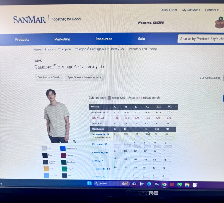
On the first day, Sherri showed me the desk I’d be working at. She had set up an Outlook account for me with the ImageWorks domain name. Sherri explained that ImageWorks had been around for 26 years and was well established as a business in Orange City; however, she mentioned the company’s online presence was not as optimized as it could be. She asked of me to set up business listings for the company on platforms like TripAdvisor, YellowPages, LinkedIn, and other major review sites. She sent a list of 150 directories and platforms to claim and standardize business listings to my new email. I was instructed to chip away at them over time, 3 or 4 listings a day, in order to increase the reach of the company. I kept my progress in a shared Excel spreadsheet that she had created in order to organize account names, passwords, and status on each website. I completed 3 listings (Open Street Map, HERE Map, MapQuest) on my first day. After completing the registration for those websites, I asked if I should wear a specific uniform to the office. She guided me to a website used for bulk ordering blank clothing. Sherri told me that she had chosen gray for the company shirts, but that I could select my own style of shirt and add however many that I needed to the company cart. I selected 2 heavy cotton shirts and one crewneck sweatshirt in heather gray and added them to the cart. She told me that when they arrived, I would learn to use the large industrial embroidery machine for the first time by embroidering the company logo onto my selected shirts.
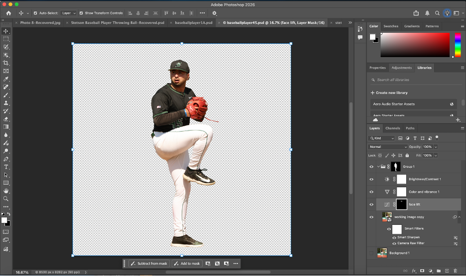
On my second day with ImageWorks, I was introduced to Bridget, the team’s lead graphic designer. Sherri told me that my task for the day would be working with Bridget on a project for the Stetson Baseball team. A few years ago, Stetson Baseball had ordered a large wall wrap (a huge sticker) for the men’s locker room. The wrap had a sepia filter over photos of Stetson baseball players in various action shots, with a background of a drone shot of the stadium. Motivational words in different fonts and sizes were added on the top of the graphic.
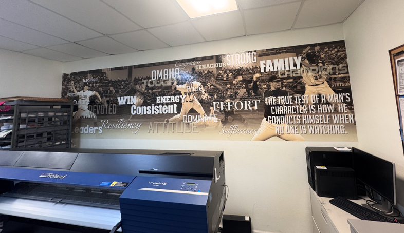
Stetson Baseball had recently ordered another wrap, in the same style, with current players to replace the old ones. They had sent 30 photos of the players for use in the wrap. Since the wrap was going to be very large (about 36 feet by 10 feet), I needed the players to be in very high resolution. I went through the photos and checked the sizes on each in Adobe Photoshop to determine the largest ones. Since there weren’t strict instructions for the editing and masking, I created my own process to accomplish the task. It’s best described through the following bullet points:

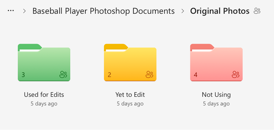
On the third day (1/27), I realized that I needed a better system to organize the files for the wrap project. Previously, I had been saving each photoshop document and emailing them individually to Bridget, but that was turning into too many emails as I revised each document; I wanted to have a shared folder where I could upload the final versions and replace the files if I returned to them and cleaned them up further.
I created a shared folder in OneDrive with many subfolders that held the original photos sorted into categories and my completed photoshop documents. I went through the 30 original photos and checked each one for print suitability based on resolution, sharpness, lighting, motion blur, and whether there was enough usable space for a full body cutout. I sorted the photos into three categories (Approved/Use, Secondary/Conditional, and Do Not Use), flagged anything that would require heavy upscaling, and separated duplicates or near-duplicates of the same player so the final wrap would have more variety. Then I reorganized the OneDrive project folder, so unedited originals were separated from already used originals, created additional folders for images we weren’t using (too small, redundant, or low quality), and standardized the naming so it was consistent. I also color-coded the folders. Once I had cleaned everything up, I shared the folder to Bridget’s email.
Though this process sounds simple, it took almost 3 hours. I am not an organized person by any measure, and the task of sorting and color coding was monotonous and exhausting. It was necessary though, and the new file organizing system makes it very easy to see how much of the project remains.
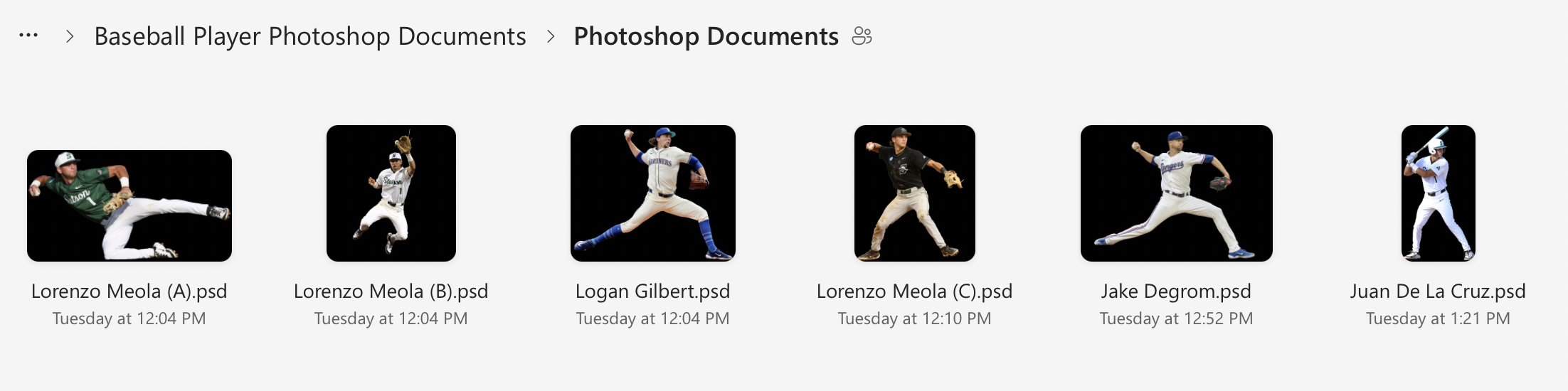
Here is a visual I made to show the organization system in more detail:
And here are some screenshots of the actual file system itself:
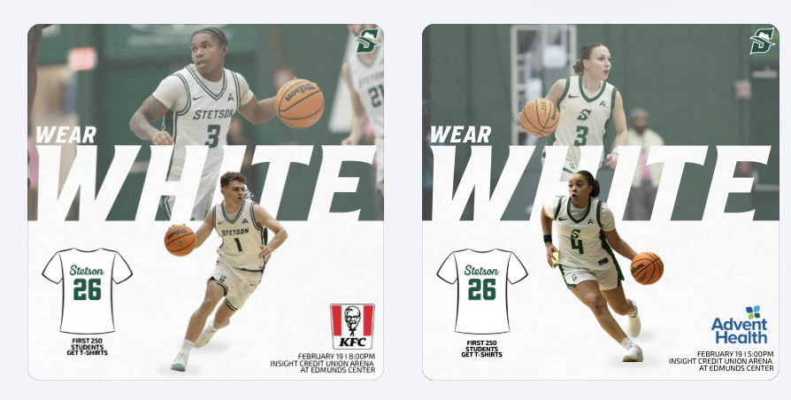
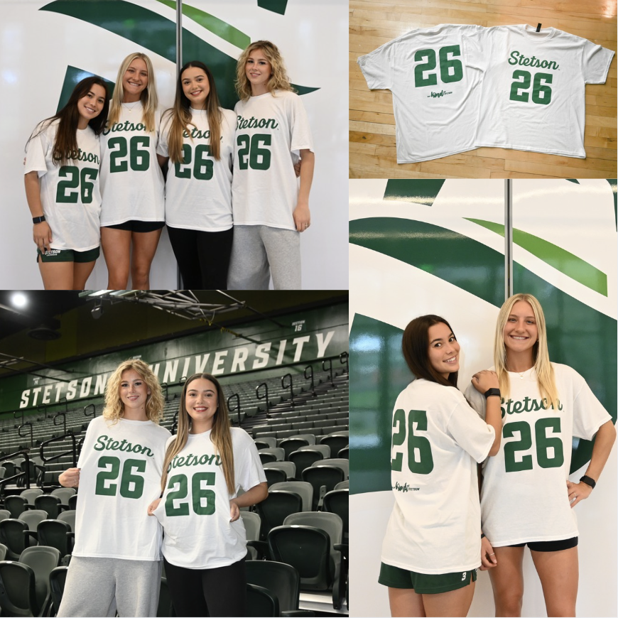
White Out Game & Sponsorship Integration
For the White Out game, I created a promotional graphic and gained deeper insight into how sponsorships directly influence design decisions. I had to carefully consider sponsor placement, logo sizing, and overall composition to ensure partner recognition was clear while still aligning with Stetson Athletics’ visual identity. It required balancing brand consistency with contractual visibility obligations.
Becoming more aware of sponsorship integration made me realize how much responsibility social media carries in fulfilling partnership agreements. These posts are not just for fans but also serve as deliverables that provide value to sponsors. Every logo placement and tag has a strategic purpose behind it.
To promote the White Out theme and shirt giveaway, I photographed and edited images of the giveaway shirts as well as fans wearing them. Being involved in both the digital promotion and the in-game execution allowed me to see how pre-game content translates into real-life activation. It was rewarding to watch something I helped promote online become a visible part of the fan experience at the event.
Seeing My Work on Larger Platforms
One of the most exciting parts of this internship has been seeing my graphics posted beyond just the lacrosse account, especially on the main Stetson Athletics page and the Stetson Baseball account, which has a much larger following. Knowing that my designs are now reaching a broader audience has made the work feel more impactful and professional.
It has also made me more conscious of detail. With larger audiences comes greater visibility, and that pushes me to be even more intentional with branding, alignment, spacing, and overall look.
Promotional Event Graphics
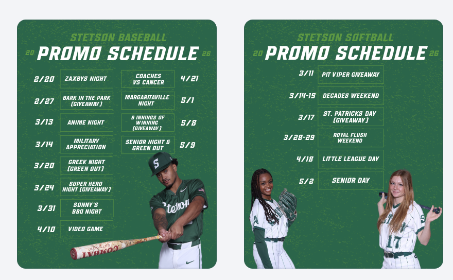
This week, I created promotional schedule graphics for both baseball and softball highlighting their themed games and giveaways. These graphics give fans a clear overview of the season’s promotional calendar and help build anticipation in advance rather than promoting events one at a time.
Preparing for Bark in the Park
I also created a “save the date” style graphic for Bark in the Park to begin building early awareness. In addition, we planned a throwback collage post using photos from previous years to highlight the atmosphere and encourage attendance. This approach shifts the promotion from simply announcing a date to selling the experience.
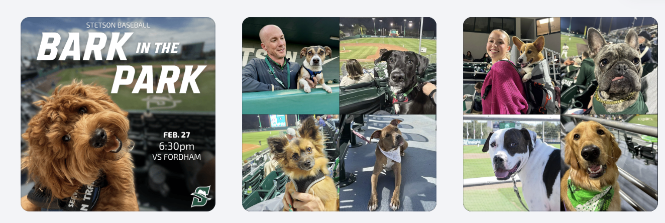
Bark in the Park Photography & Giveaway Promotion
This year’s giveaway is dog bandanas, so to help promote that announcement, my friend and I brought my roommate’s dogs and my own dog to the baseball field to model the bandanas. Photographing them in the stadium setting made the content feel more authentic and engaging than a simple product image. (I haven’t edited those photos yet, so stay tuned. I’ll be sharing them in next week’s post!)
Conclusion
This week really showed me how much thought goes into everything we post, from sponsor logos to hyping up events before they even happen. Seeing my work on bigger accounts and then watching it come to life on game day made everything feel way more real and rewarding.
Strategic Planning & Understanding the “Why”
Over the past two weeks, our workflow has felt especially organized. We have been working off structured schedules for graphics and broader marketing initiatives, which has helped me better understand not just what we are posting, but why we are posting it. Instead of approaching each graphic as a standalone design, I have started thinking more intentionally about the purpose, whether that goal is ticket promotion, engagement, sponsorship visibility, or overall brand awareness.
Fan Engagement Graphics
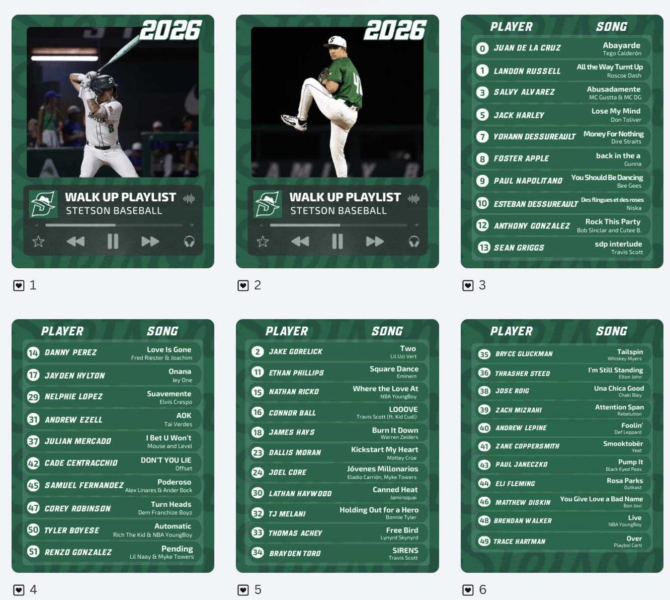
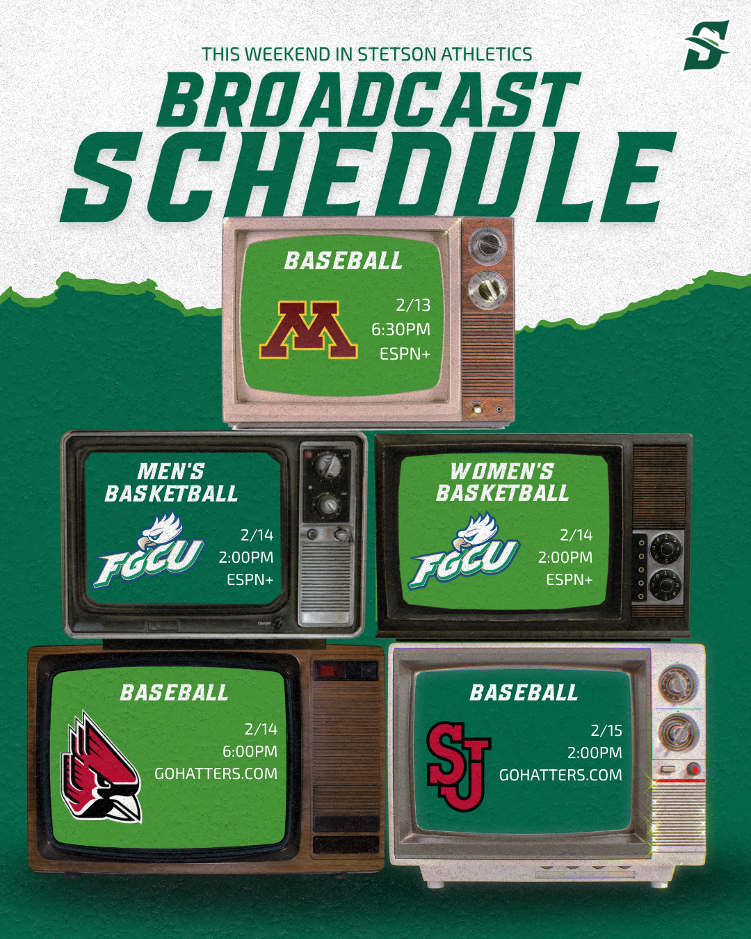
One of the projects I worked on was creating walk-up song graphics for softball and baseball. These posts are a great example of engagement-driven content. They allow fans to connect with players on a more personal level. I also created a broadcasting graphic to clearly communicate where fans could watch games. This graphic will hopefully help drive viewership.
Learning That Not Every Graphic Is Needed
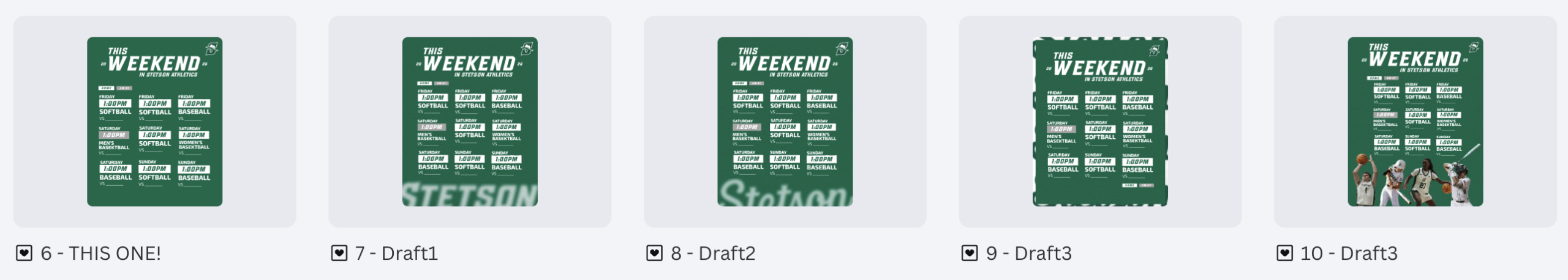
I spent several hours creating variations of a “This Weekend in Stetson Athletics” graphic. I experimented with layout, spacing, and color balance to make it visually strong and informative. After reviewing it with my supervisor, he decided the graphic was ultimately unnecessary. At first, it was slightly frustrating because of the time invested. However, it was an important lesson in efficiency and strategy. Not every idea, even if well-designed, aligns with the overall marketing plan, and the number of posts and information being pushed at once needs to be balanced.
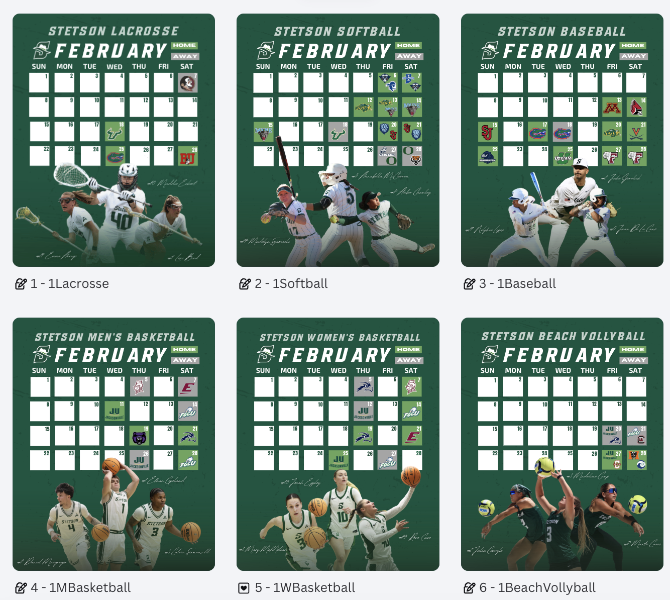
Template Designs Across Spring Sports
One of the larger projects over these two weeks was creating schedule graphics for all spring sports. It was time-consuming but manageable because I was able to build off the lacrosse schedule template I had already created. Adjusting layouts, sport-specific colors, and details while maintaining brand consistency. This project reinforced the importance of creating adaptable templates. When working within an athletics department that supports multiple teams, efficiency and consistency go hand in hand.
Conclusion
Weeks 4 and 5 helped me grow in areas beyond just design skills. I strengthened my understanding of strategic planning, sponsor integration, template content systems, and evaluating the necessity of content before investing time into it. I am beginning to think more like a digital marketer within collegiate athletics, rather than just a graphic designer.
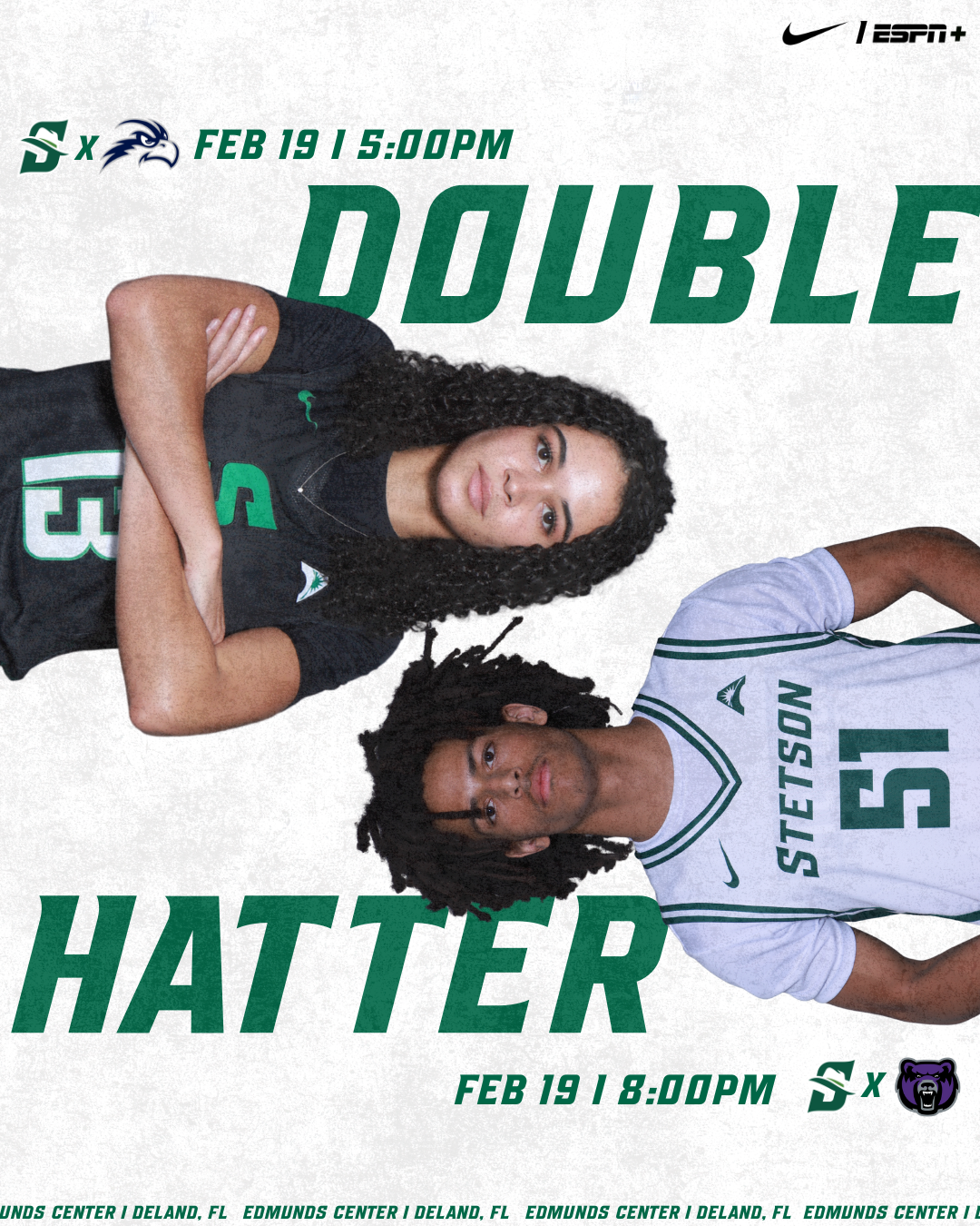
Double Header Post & Creative Brainstorming
This week, I worked on a double header post and spent time brainstorming additional graphic and photography ideas to support the spring sports marketing plan. This process helped me think more strategically about how individual posts fit into a larger campaign, rather than designing just singular graphics. I had to consider consistency, timing, and how visuals work together across a full season and athletics account.
The Importance of Brand Fonts
One of the biggest lessons I learned this week was how important it is to use the correct fonts. When graphics are shared or reposted on the main Stetson Athletics account, any inconsistency becomes much more noticeable. I created multiple versions of a lacrosse schedule graphic, one using a non-Stetson font that I personally liked more, and another using the official Stetson font. While I still prefer the first version from a design standpoint, the second version clearly fits better within the Stetson Athletics feed and looks more cohesive alongside other athletic graphics.
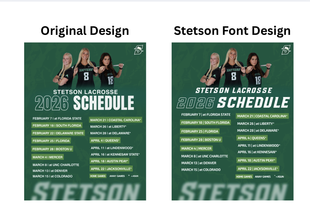
This became especially clear when I saw the captains lacrosse post & 13 Days coundown post I designed was reposted on the Stetson athletics account, I immediately noticed how much it stood out in a negative way due to the font difference. Seeing my work in that context made me more aware of how brand identity plays a huge role in perception.
Access to the Stetson Athletics Style Guide
One reason some of the earlier posts, including the captains and countdown graphics (the “13 Days” post), did not use the correct fonts was simply because I did not have access to them yet. This week, Athletics finally shared the official Stetson Athletics style guide with me. Having access to this now I know it will make a huge positive difference in my future designs. I am glad I learned / realized this early on as I shift from strictly stetson lacrosse related graphics to all and any stetson athletics team as I continue this internship. Moving forward, I plan to focus more intentionally on maintaining consistent brand identity so that my graphics feel seamless when posted across any Stetson Athletics platform.
Overall, Week 3 helped me better understand the importance of branding, consistency, and thinking beyond personal design preferences.
Learning to Work With Clients
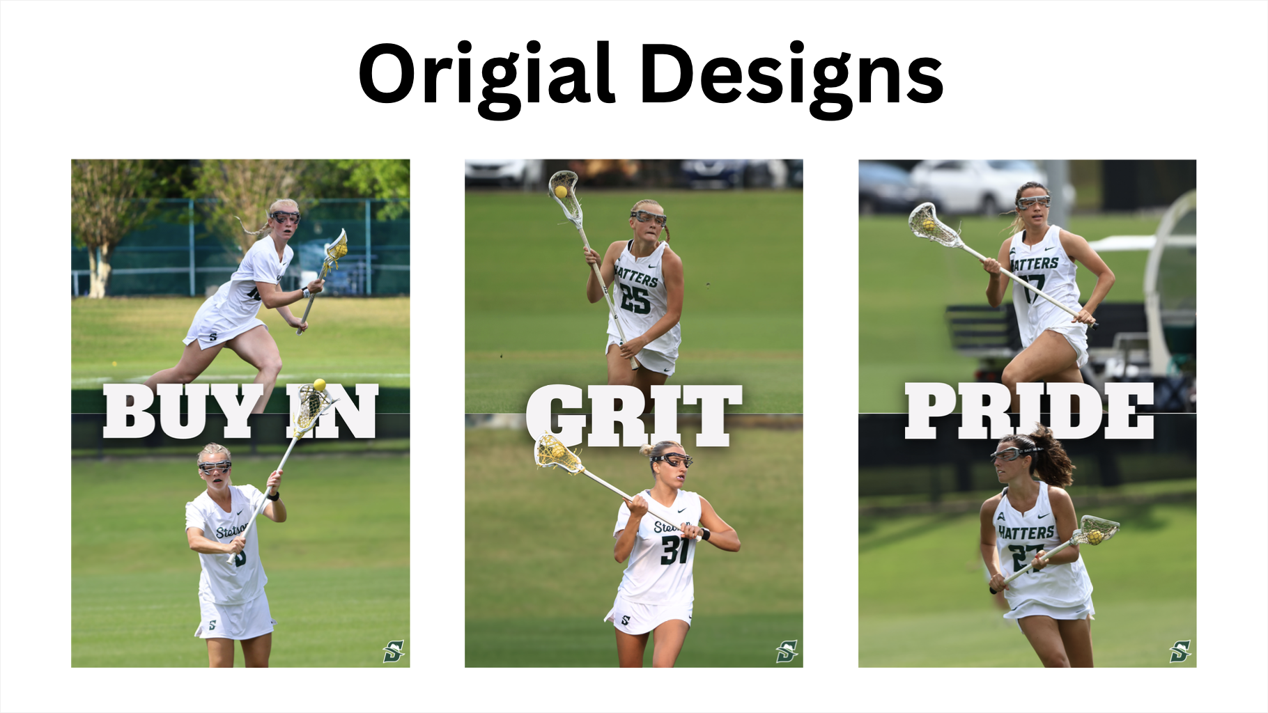
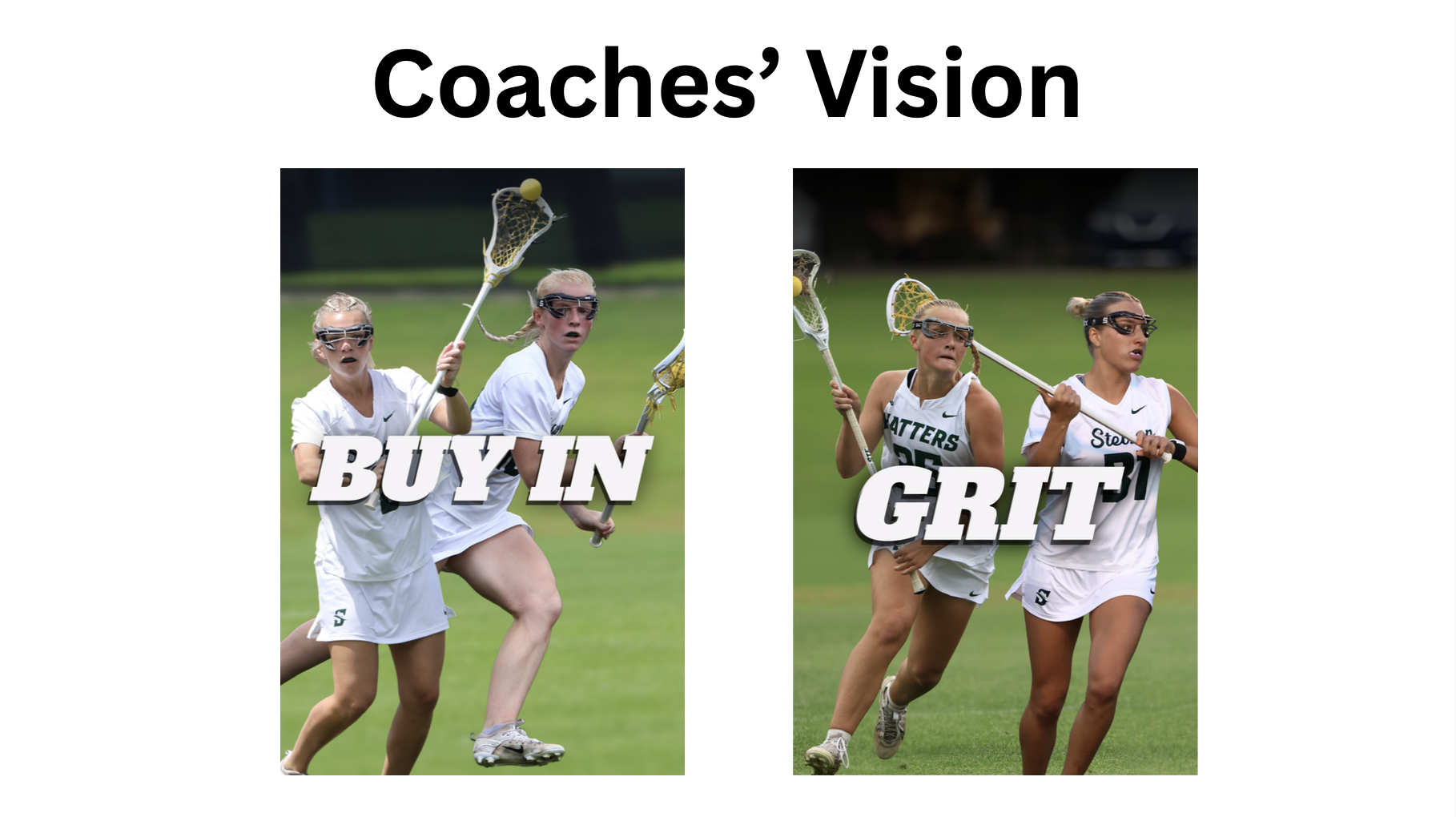
This week, a big focus of my internship was learning how to work with “clients” and balance their ideas with my creative ideas. I learned that sometimes you have to put the client’s vision first, even if it is not exactly what you think is best creatively. At the same time, I also learned that part of being a designer is knowing when full creative control from a client could hurt the final product and when it is important to guide them toward a stronger visual outcome.
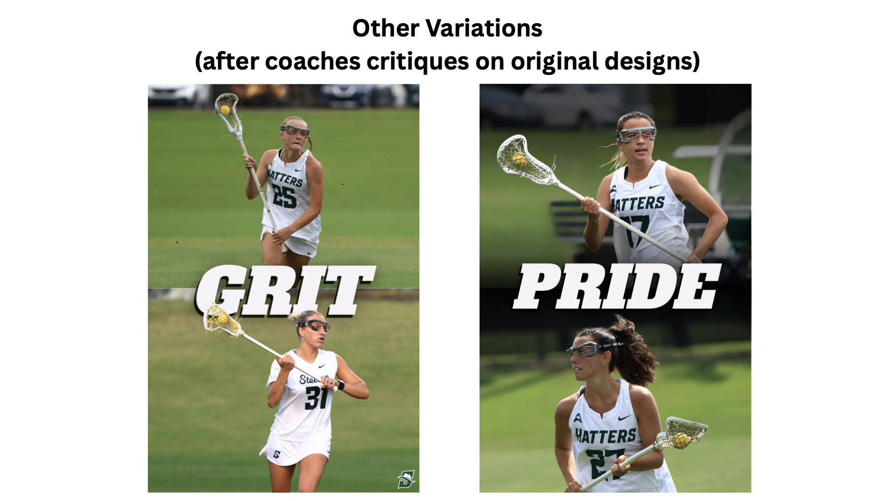
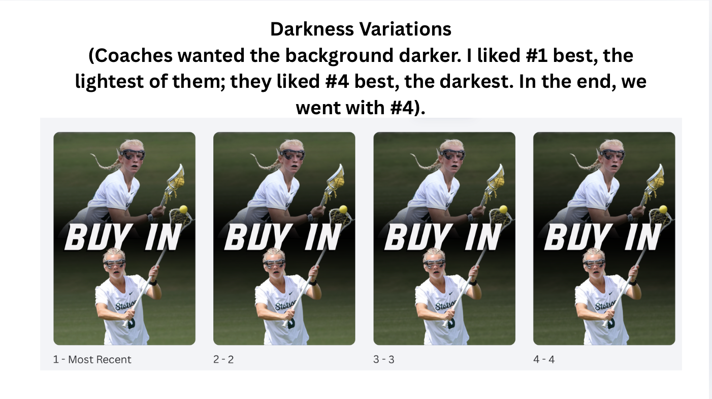
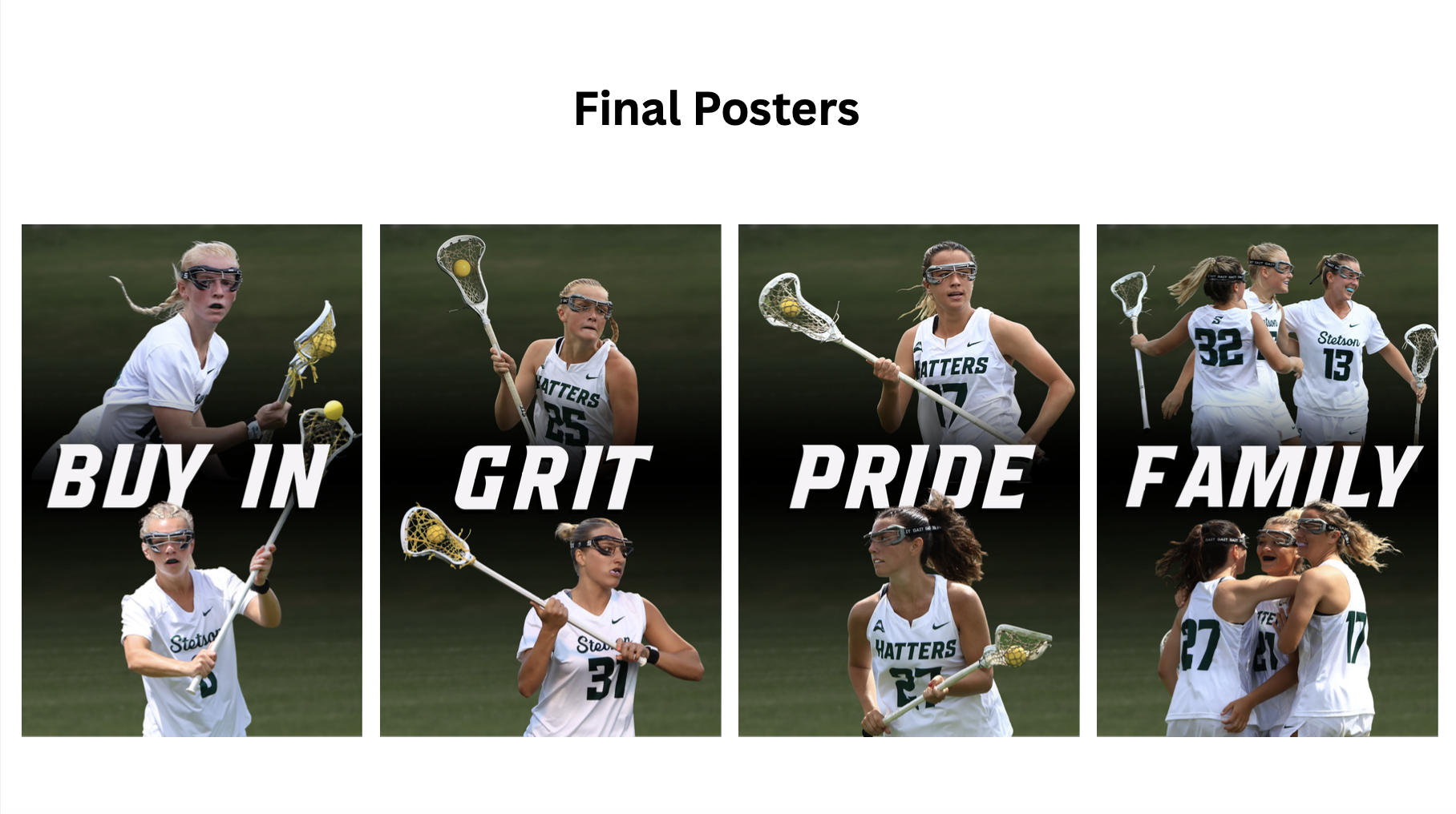
One of the main projects I worked on this week was designing lacrosse posters for outside the coaches’ offices. These use the Stetson Lacrosse “Culture Words.” I created multiple versions, including my original design, a version based on the coaches’ vision, feedback and ideas from others, and the final approved design. Seeing all of the variations side by side was helpful in understanding how designs evolve through collaboration and feedback. The final product is the compromise; however, I still personally like my original version the best.
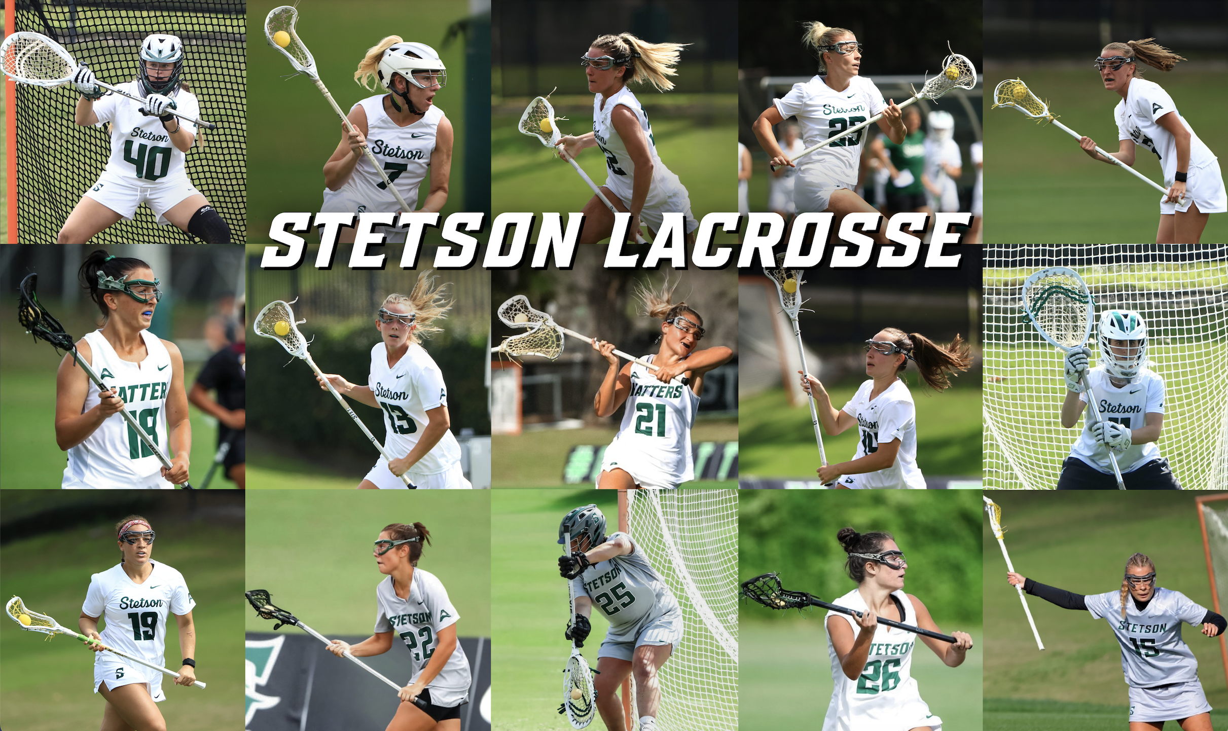
I also worked on a collage style poster, which came with its own set of challenges. I had a limited number of photos and athletes I was allowed to use, and the images came from different photographers over several years. Because each photographer edited their photos differently, it was difficult to create a cohesive look across the entire poster. To fix this, I had to individually adjust nearly every photo’s exposure, contrast, saturation, and overall tone to create a more consistent “filter” and visual style. This process was time-consuming, but it taught me a lot about color correction and how small adjustments can help unify a design.
Overall, Week 2 pushed me to think more critically about collaboration, creative decision making, and consistency in design.