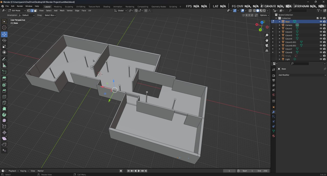
This week, I spent a lot of time on the new assignment that my supervisor gave me – creating a 3D model of the Museum’s gallery space. I received the blue prints of the Museum and started from there. This will be used to better plan future exhibitions, it will give the artists and curators an idea how much space is available to display pieces of art. My supervisor wants a version that can be easily saved as a PDF. I think I will point her to the many online 3D viewing software, such as Meshy.com. Of course, I will make sure it works with what I use, Blender 3D. Below is a preliminary photo of the model.
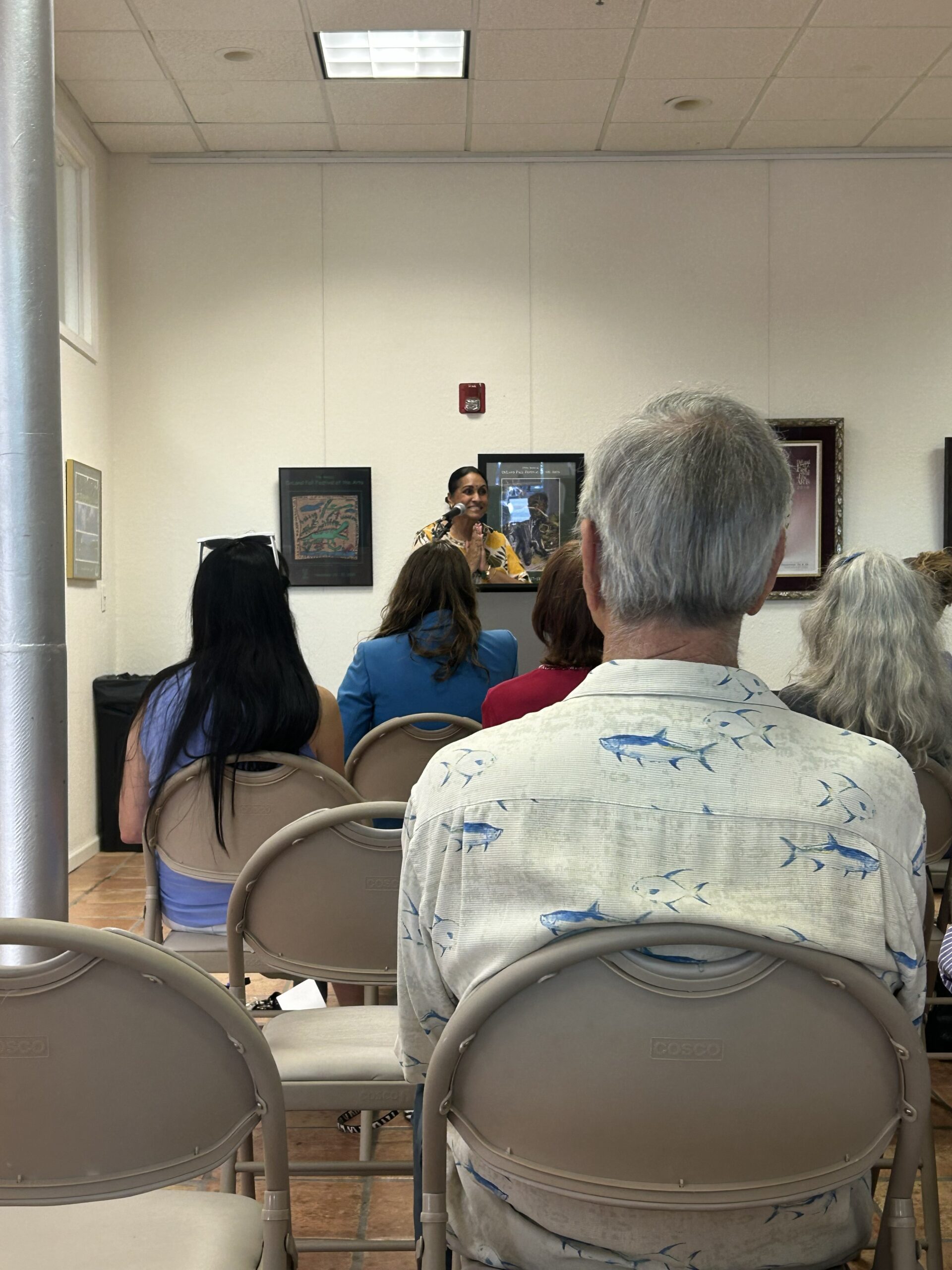
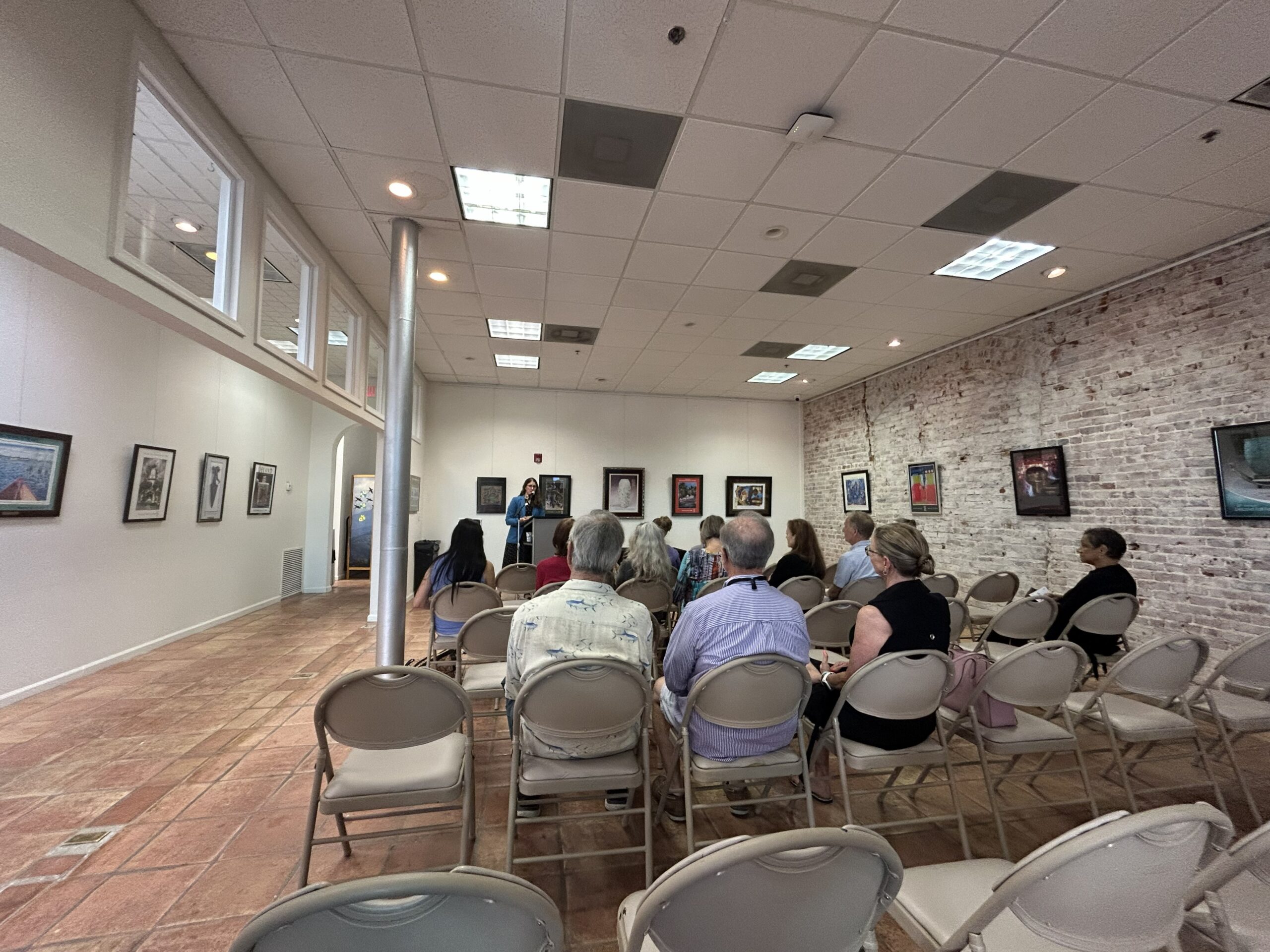
4/24 – I also attended the lecture about Biodiversity & Environmental Justice with Dr. Rajni Shankar- Brown and documented it with photos for the museum. Very interesting topic.
Finally, a few of the volunteer video interviews I helped with on March 26 are now starting to show up on facebook. I cannot take credit for the final product, but the video interviews themselves were taken by me.
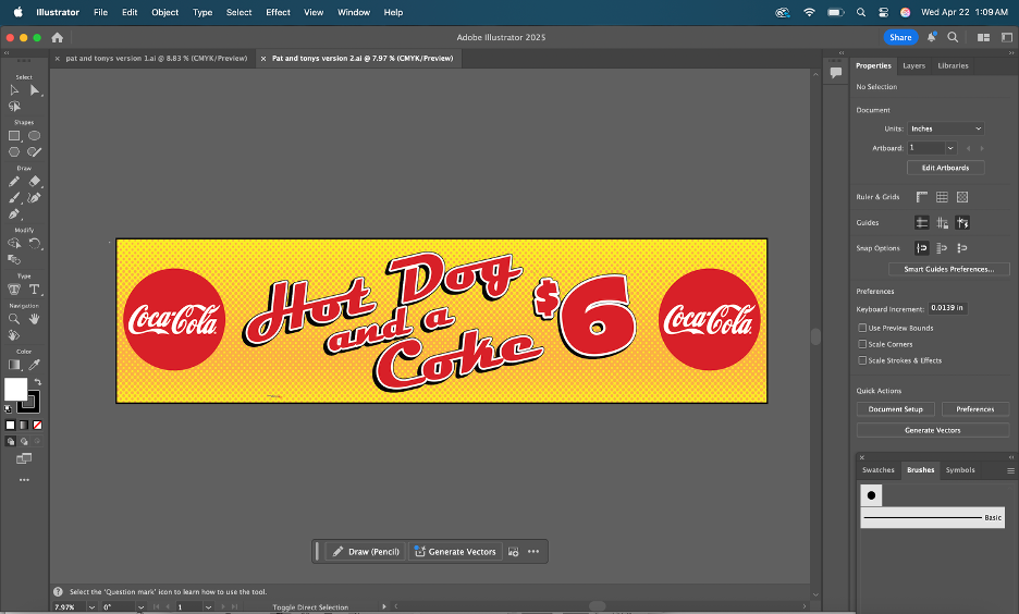
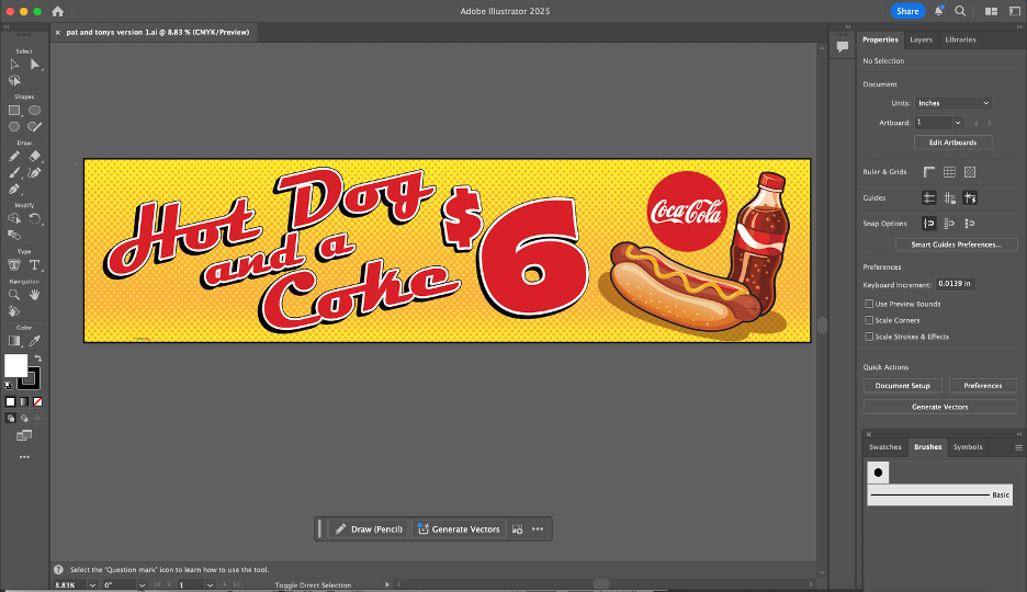
This project put me in charge of editing a proof that Bridget created for “Pat & Toni’s Sweet Things”, a local candy and ice-cream parlor downtown. The proof was built in CorelDRAW, a platform very similar to Adobe Illustrator with a focus on being suited for larger-format projects (specifically when working at sizes where certain Adobe workflows become less convenient).
The assignment was my introduction to CorelDRAW, so it took some time to get used to the interface and fully understand how the tools worked. After a bit of work, I decided on switching my software over to Illustrator to get most of the work done, afterwards bringing it back to Corel for the finishing touches. There were some issues though; some of the elements hadn’t transferred over properly and there were many duplications of some of the shapes. Some of the graphics were grouped together, but other elements like the orange dotting of the background appeared as individual objects.
When I straightened out my issues with Corel, I ended up settling on two versions of the ad I created. The first was the original request of the client, being two Coca-Cola logos on either side. The other was my interpretation; I made my own graphic for the soda with different shapes and moved some things around the banner. We ended up sending both versions to our client. The client ended up spending an extra $100, ordering a second banner in addition to the first one that we made. The second banner was my design with the custom graphic I had created! Working through the requested revisions helped me get a better sense of how ImageWorks handles client feedback.
After a couple of weeks, the advertisements had been printed. It felt so rewarding to see my design being used on such a large scale for promotional purposes. The time I spent working on this banner was extremely helpful in sharpening my graphic design skills.
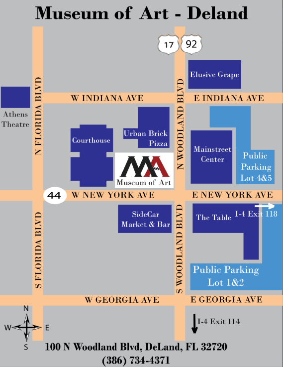
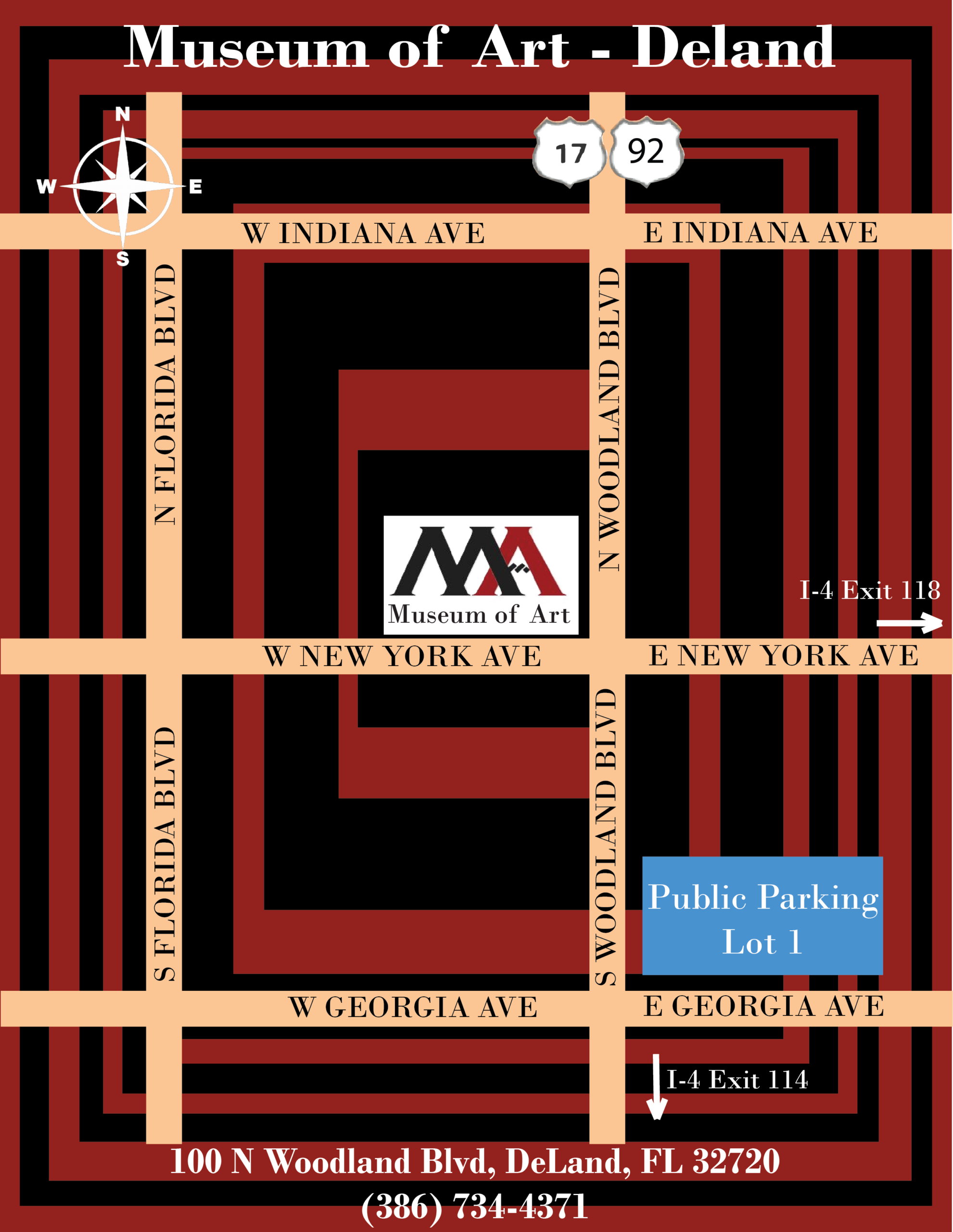
Between final projects in the other classes and the internship, it was a busy week last week. My supervisor asked me to revise the parking map – remove the background and add more landmarks – so I did. Lesson learned: Don’t make too many assumptions even if the initial instructions are vague and always seek feedback to finalize the work. See below final version, clean and easily understandable:
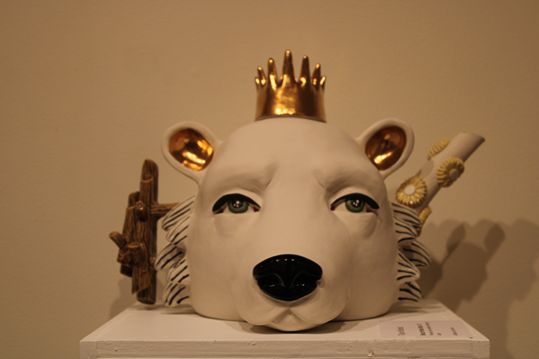
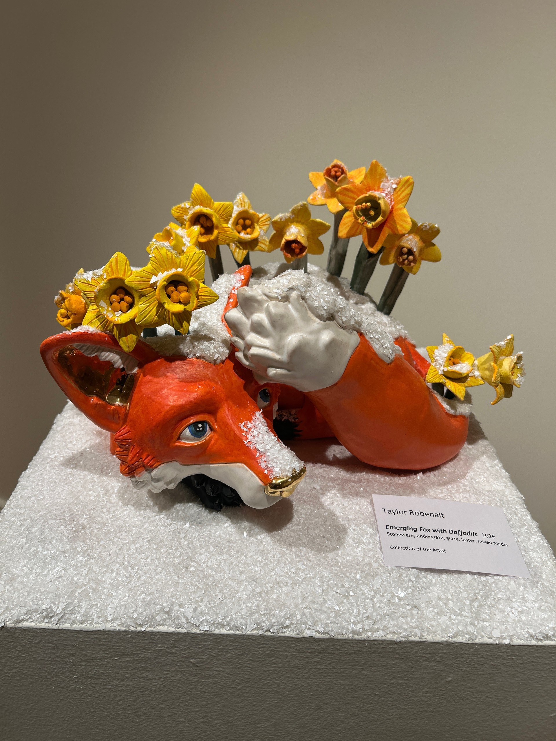
April 10 – Documented the exhibition by the Artist Taylor Robenalt. Took photos of all her artwork on display. She is fantastic. I learned that she is a professor at Ringling College of Art and Design in Sarasota. I felt very good moving through the art gallery despite the lack of any information concerning modern art forms because there was nothing complicated about it. It is hard not to like the energy and uniqueness of her sculptures. There were a lot of animals and other components that made her exposition bright and alive. Everything in there looked like it had a soul and was somehow fairytale-like. If to say what impressed me about the exposition, firstly I should point out its sincerity. I did not have any knowledge about sculptural art before visiting the exposition, however, it struck me and left an impression I could not get rid of. My favorite piece is this one – for its dual purpose as a tea kettle:
April 14 – Planning meeting with my supervisor – I received an interesting challenge to create a 3D model of the gallery so that future events can be planned better.
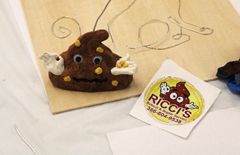
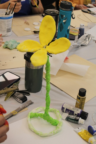
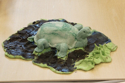
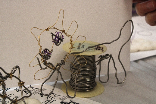
April 17 – Attended Art for All event, this time making art from metal wires and clay. Discover where art, community, and creativity come together with our Art for All event series. On select Fridays, enjoy free Museum admission all day plus a free guided art activity. Bring your family, invite your friends, or make it a date night. Art for All invites everyone to explore, create, and enjoy art together. Adult attendants used wire to create items like flowers, animals and other items. I documented the artwork in photos. There was some great artwork done in the 3 hours.
The last two weeks were pretty busy as I got more involved in the classes at the Museum and other assignments. We met to define the parking map for the Museum. I took a few hours to put my first draft together in Adobe Illustrator. I wanted to make it ‘artsy’ and used the museum logo colors (black and burgundy) as a focal background. See below my draft, still has to be reviewed by my supervisor.
This week, I helped out in two classes. Setting up art supplies and documenting the classes with photos.
Classroom – Lisa Carlson Abstract Gel Print Class Tue 4/7/2026 1:00 PM – 3:00 PM Classroom – Creativity and Well Being Workshop Sat 4/11/2026 12:30 PM – 3:00 PM
I also attended the Artist demo workshop at Stetson in cooperation with the Museum of Art. Taylor Robenalt has her own exhibition at the Museum of Art. The last event was called Art of Surprise Fri 4/10/2026 10:00 AM – 1:00 PM and mostly showed Taylor Robenalt’s work, which I documented in photographs.
Next week will be more classwork support again – Gel Printing and Storytime
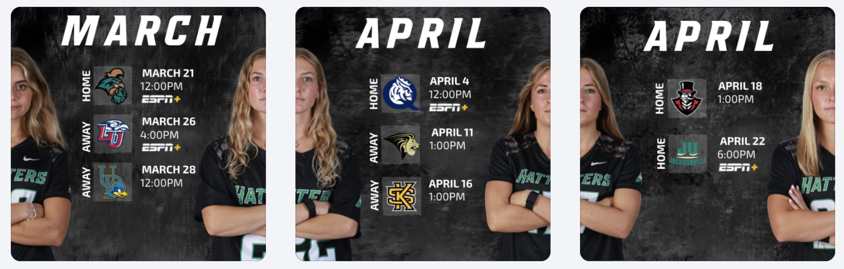
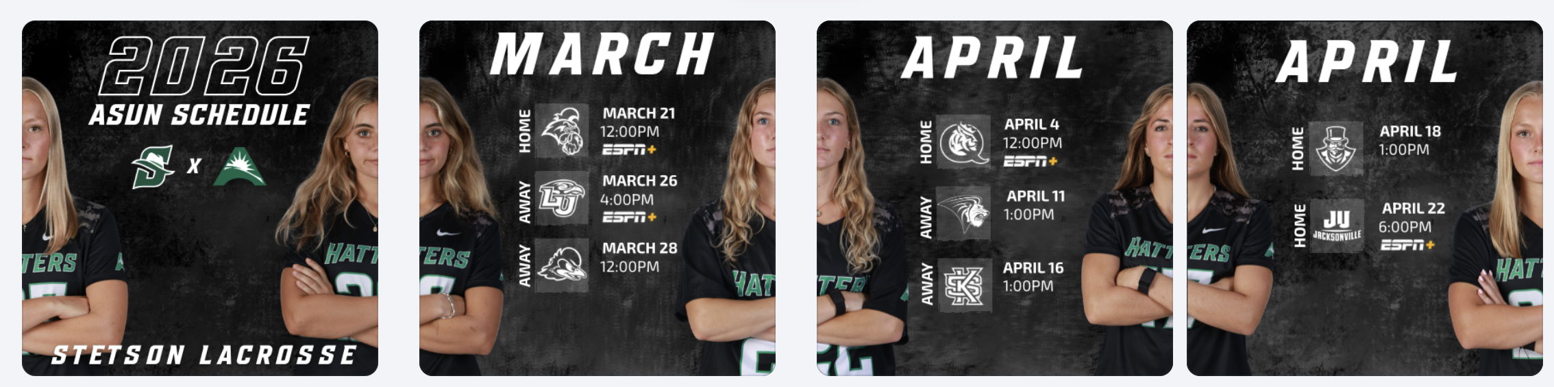
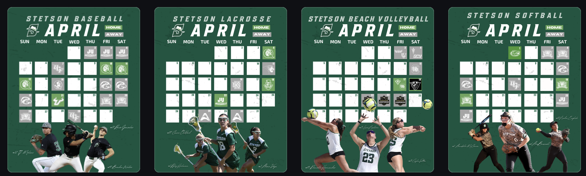
During these weeks, I worked on creating April schedule graphics for multiple spring teams, as well as an ASUN women’s lacrosse schedule post. One of the biggest design decisions I made was switching the opposing team logos from their original colors to all white. While the original versions added more color, I realized that using white logos created a cleaner look and kept the overall graphic more consistent with Stetson’s brand. It also helped the feed feel more cohesive when viewed as a whole.
Reworking the Lacrosse Hype Video
I also had the opportunity to rework a lacrosse hype video. The original version did not include actual game footage, so I took it apart and rebuilt it by adding game clips and other details to better represent our team.
This process helped me think more critically about storytelling through video. Instead of just creating something visually appealing, I focused on making sure the content felt authentic to our team and captured the energy of real gameplay. It showed me how important it is for hype content to reflect actual performance, not just aesthetics.
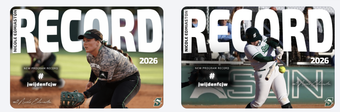
Record Graphics Templates
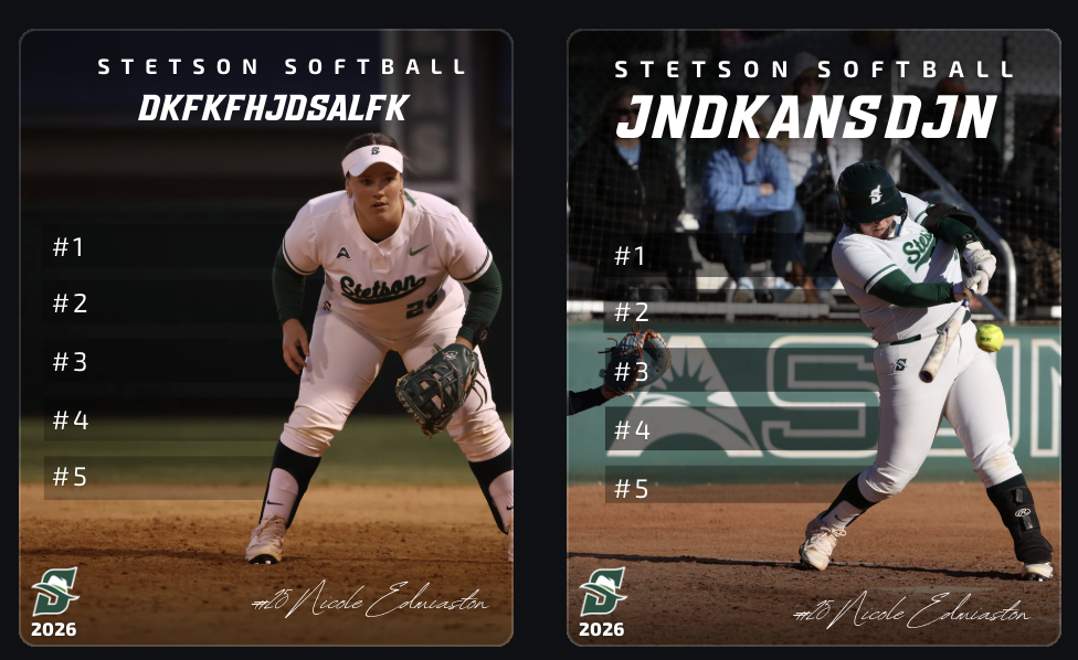
Another major project was creating record post templates, primarily using softball as my base. I took inspiration from record graphics I created last year for lacrosse, but this time I had to strictly follow Stetson’s official fonts and branding guidelines.
This was something I struggled with creatively. I personally felt that some non-Stetson fonts looked stronger, especially in the horizontal designs, but I had to prioritize brand consistency over personal preference. It was a good reminder that working in sports design isn’t just about what looks best individually, but what aligns best with the overall brand.
Even with that challenge, I built these templates so they can be reused across teams, allowing other designers to easily plug in new photos and update information. This made the project not just creative, but also functional for long-term use.
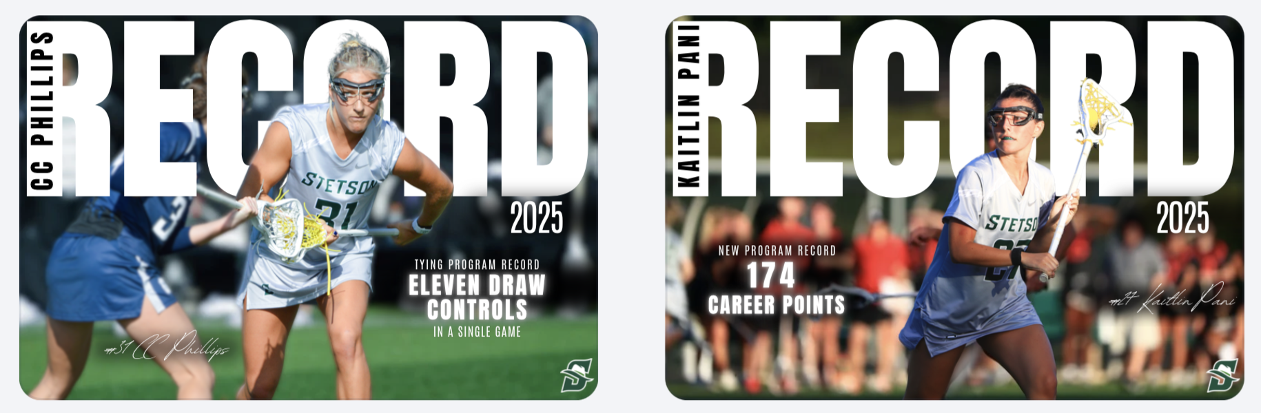
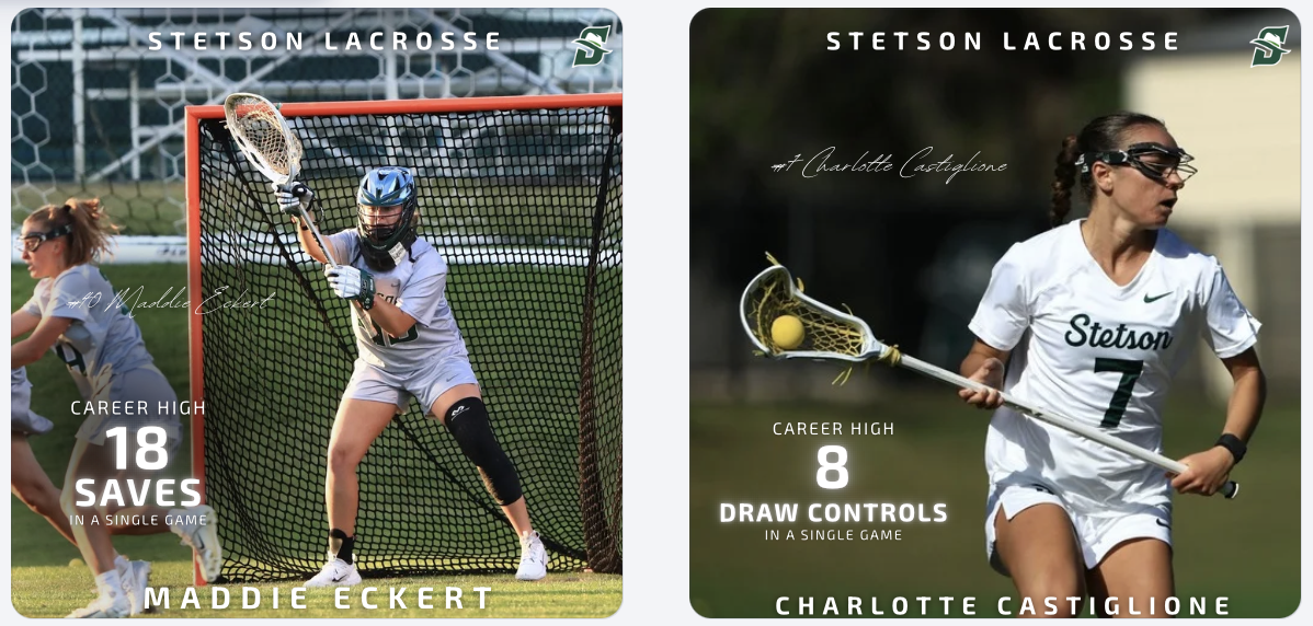
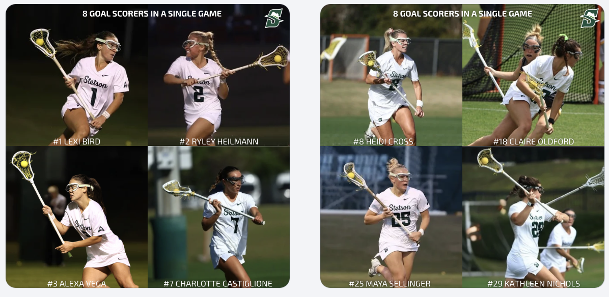
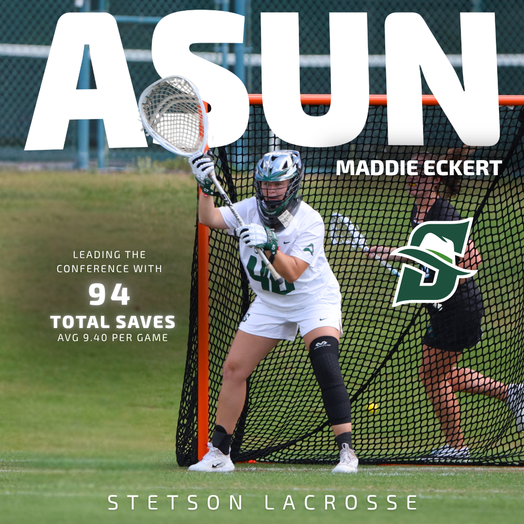
Player Feature Content
In addition to creating templates, I designed and posted multiple record and milestone graphics for lacrosse, including career-high performances and a team post highlighting eight different goal scorers in a single game. These posts help recognize player achievements, build team hype, and give fans shareable moments from games.
Game Day Content & Engagement
In addition to graphics, we received a lot of strong game photos and videos from two recent wins, so I focused on posting more photo-based content. These posts help capture real moments and keep the audience engaged in a more immediate and authentic way compared to only using designed graphics.
Balancing polished graphics with real game content showed me how important variety is in maintaining an engaging social media presence.
These two weeks challenged me to balance creativity and brand consistency. Whether it was adjusting logo colors, working within font guidelines, or building reusable templates and emphasizing that strong design in sports marketing is about more than just visuals, it’s about creating content that fits within a larger system while still telling a compelling story.