This project put me in charge of editing a proof that Bridget created for “Pat & Toni’s Sweet Things”, a local candy and ice-cream parlor downtown. The proof was built in CorelDRAW, a platform very similar to Adobe Illustrator with a focus on being suited for larger-format projects (specifically when working at sizes where certain Adobe workflows become less convenient).
The assignment was my introduction to CorelDRAW, so it took some time to get used to the interface and fully understand how the tools worked. After a bit of work, I decided on switching my software over to Illustrator to get most of the work done, afterwards bringing it back to Corel for the finishing touches. There were some issues though; some of the elements hadn’t transferred over properly and there were many duplications of some of the shapes. Some of the graphics were grouped together, but other elements like the orange dotting of the background appeared as individual objects.
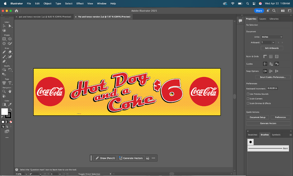
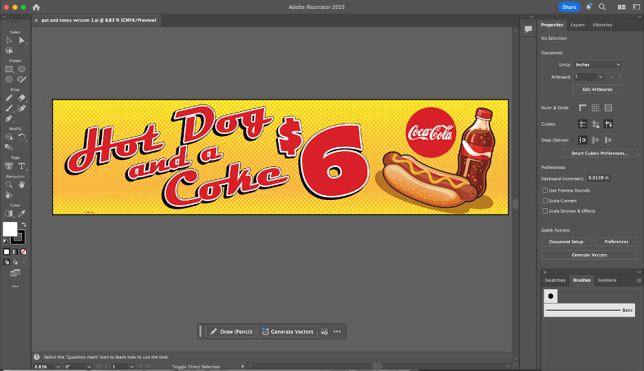
When I straightened out my issues with Corel, I ended up settling on two versions of the ad I created. The first was the original request of the client, being two Coca-Cola logos on either side. The other was my interpretation; I made my own graphic for the soda with different shapes and moved some things around the banner. We ended up sending both versions to our client. The client ended up spending an extra $100, ordering a second banner in addition to the first one that we made. The second banner was my design with the custom graphic I had created! Working through the requested revisions helped me get a better sense of how ImageWorks handles client feedback.
After a couple of weeks, the advertisements had been printed. It felt so rewarding to see my design being used on such a large scale for promotional purposes. The time I spent working on this banner was extremely helpful in sharpening my graphic design skills.
Last week, I officially started my internship at ImageWorks, a print and graphics shop in Orange City. When I applied, the position was listed as a “Printing Production Internship”. The role included prepping files, running printers and cutters, quality checking products, and helping with packaging and shipping.
When I met with Sherri (the CEO and manager of ImageWorks), she explained that my role would be more flexible than the listing. ImageWorks is run by Sherri and a team of four employees. She thoroughly described to me the different roles and tasks that take place at the shop and encouraged me to personally assess the skills I wanted to learn, based on how helpful they would be to my future career. My work has not only felt meaningful for the business, but essential to bringing me closer to my career goals post-graduation.
Meeting The Team:
On my first day, Sherri gave me a tour of the shop and walked me through the roles of the employees that work there, including:
Production and installation (run by 2 employees): running large-format printers, operating embroidery machines, and doing installations. The installs range from adding phone numbers and logos to vehicles to wrapping walls inside local businesses.
Graphic design (Bridget): By designing artwork for signage and print projects, the graphic designer turns the client requests into files and designs that are ready to be printed.
Sales + customer service (Kimberley): Managing client communication, customer orders, and various other sales.
Day 1: Online Business Listings
On the first day, Sherri showed me the desk I’d be working at. She had set up an Outlook account for me with the ImageWorks domain name. Sherri explained that ImageWorks had been around for 26 years and was well established as a business in Orange City; however, she mentioned the company’s online presence was not as optimized as it could be. She asked of me to set up business listings for the company on platforms like TripAdvisor, YellowPages, LinkedIn, and other major review sites. She sent a list of 150 directories and platforms to claim and standardize business listings to my new email. I was instructed to chip away at them over time, 3 or 4 listings a day, in order to increase the reach of the company. I kept my progress in a shared Excel spreadsheet that she had created in order to organize account names, passwords, and status on each website. I completed 3 listings (Open Street Map, HERE Map, MapQuest) on my first day. After completing the registration for those websites, I asked if I should wear a specific uniform to the office. She guided me to a website used for bulk ordering blank clothing. Sherri told me that she had chosen gray for the company shirts, but that I could select my own style of shirt and add however many that I needed to the company cart. I selected 2 heavy cotton shirts and one crewneck sweatshirt in heather gray and added them to the cart. She told me that when they arrived, I would learn to use the large industrial embroidery machine for the first time by embroidering the company logo onto my selected shirts.
Selecting Shirts for Embroidering
Day 2: Stetson Baseball Wrap Project (1/23)
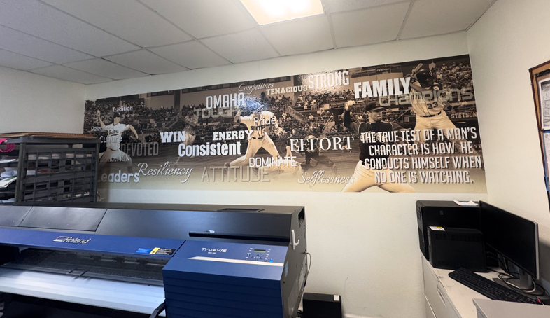
On my second day with ImageWorks, I was introduced to Bridget, the team’s lead graphic designer. Sherri told me that my task for the day would be working with Bridget on a project for the Stetson Baseball team. A few years ago, Stetson Baseball had ordered a large wall wrap (a huge sticker) for the men’s locker room. The wrap had a sepia filter over photos of Stetson baseball players in various action shots, with a background of a drone shot of the stadium. Motivational words in different fonts and sizes were added on the top of the graphic.
Photo of the Previous Wall Wrap
Stetson Baseball had recently ordered another wrap, in the same style, with current players to replace the old ones. They had sent 30 photos of the players for use in the wrap. Since the wrap was going to be very large (about 36 feet by 10 feet), I needed the players to be in very high resolution. I went through the photos and checked the sizes on each in Adobe Photoshop to determine the largest ones. Since there weren’t strict instructions for the editing and masking, I created my own process to accomplish the task. It’s best described through the following bullet points:
After importing, I duplicated the original photo layer to keep a clean backup / unchanged layer.
I used Photoshop’s select subject tool and then applied the mask.
I cleaned up the edges of the mask using the polygonal lasso tool.
If needed, I used the defringe tool to remove color spill along the edges.
I put the cutout into a group and applied the mask to the entire group (which is important for upscaling in the next step). I did this so that the upscaled version would have the same mask.
I upscaled the image using Topaz Gigapixel (I experimented with different AI upscaling tools; I found that this was the best one for the purpose of my project) with face recovery checked and upscaling at 2x scale.
I applied the camera raw feature, and used smart sharpen to make the details more defined.
On certain players, I masked parts of the faces and adjusted the curves to reduce shadows from their baseball caps.
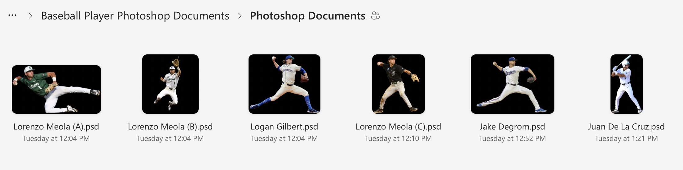
I zoomed in very close to check for any mistakes in the masking or issues with the AI upscaling, then uploaded the .psd files to a shared folder in OneDrive for Bridget to view.
Screenshot Showing my Layers and Process of Editing
Edited player image 1 of 3, prepared for large-format print
Edited player image 2 of 3, prepared for large-format print
Edited player image 3 of 3, prepared for large-format print
Day 3: Building a File Organization System (1/27)
On the third day (1/27), I realized that I needed a better system to organize the files for the wrap project. Previously, I had been saving each photoshop document and emailing them individually to Bridget, but that was turning into too many emails as I revised each document; I wanted to have a shared folder where I could upload the final versions and replace the files if I returned to them and cleaned them up further.
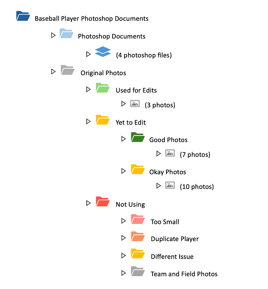
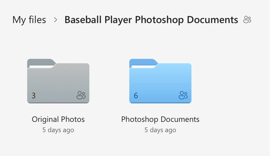
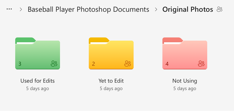
I created a shared folder in OneDrive with many subfolders that held the original photos sorted into categories and my completed photoshop documents. I went through the 30 original photos and checked each one for print suitability based on resolution, sharpness, lighting, motion blur, and whether there was enough usable space for a full body cutout. I sorted the photos into three categories (Approved/Use, Secondary/Conditional, and Do Not Use), flagged anything that would require heavy upscaling, and separated duplicates or near-duplicates of the same player so the final wrap would have more variety. Then I reorganized the OneDrive project folder, so unedited originals were separated from already used originals, created additional folders for images we weren’t using (too small, redundant, or low quality), and standardized the naming so it was consistent. I also color-coded the folders. Once I had cleaned everything up, I shared the folder to Bridget’s email.
Though this process sounds simple, it took almost 3 hours. I am not an organized person by any measure, and the task of sorting and color coding was monotonous and exhausting. It was necessary though, and the new file organizing system makes it very easy to see how much of the project remains.
Here is a visual I made to show the organization system in more detail:
Visual of File Organization System
And here are some screenshots of the actual file system itself: