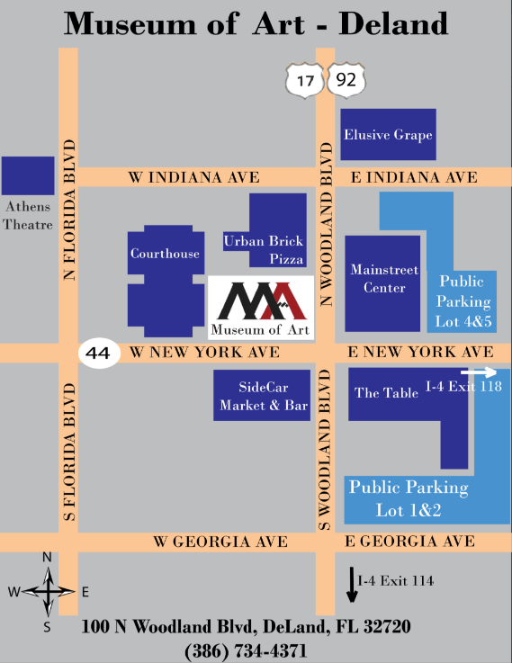
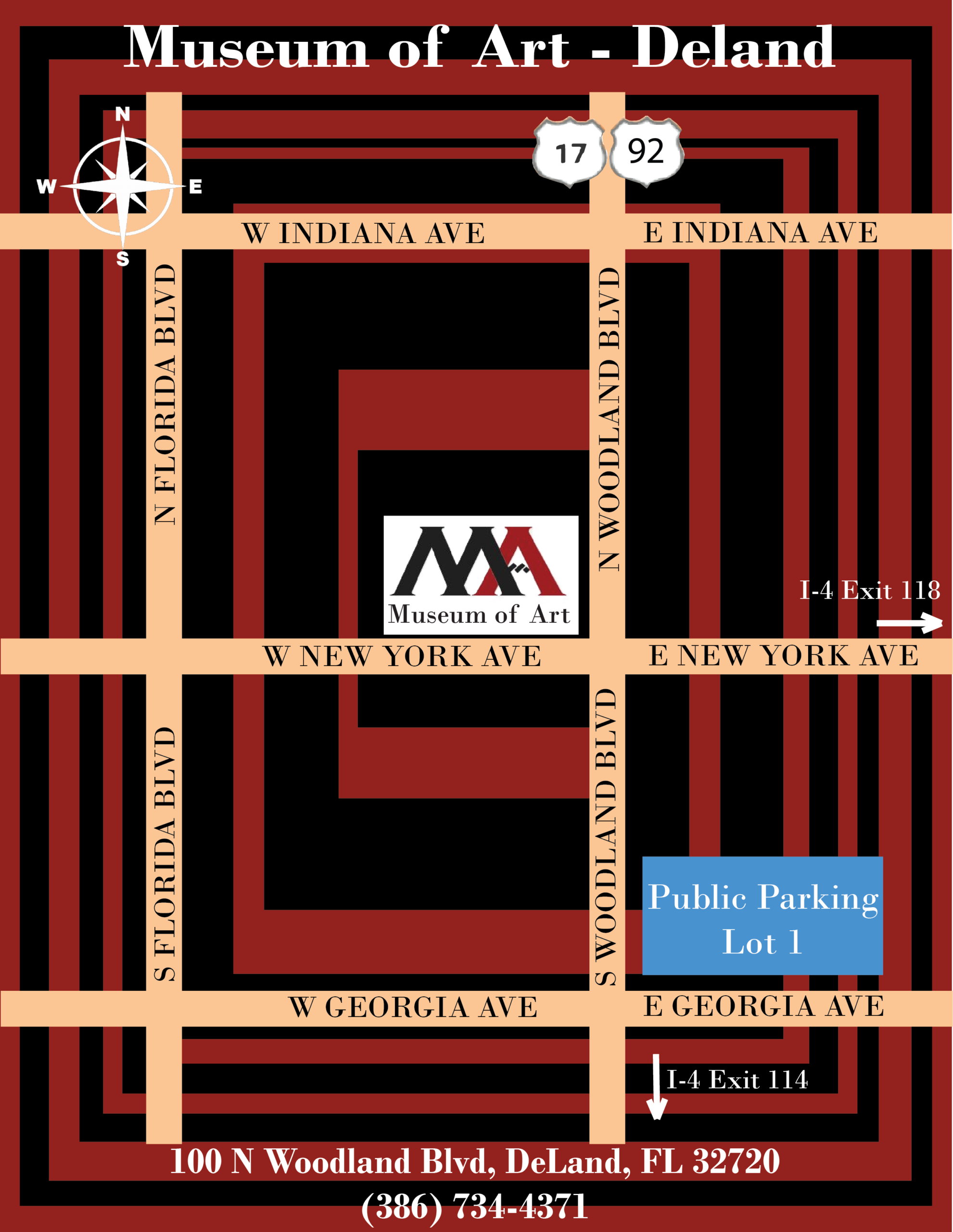
Between final projects in the other classes and the internship, it was a busy week last week. My supervisor asked me to revise the parking map – remove the background and add more landmarks – so I did. Lesson learned: Don’t make too many assumptions even if the initial instructions are vague and always seek feedback to finalize the work. See below final version, clean and easily understandable:
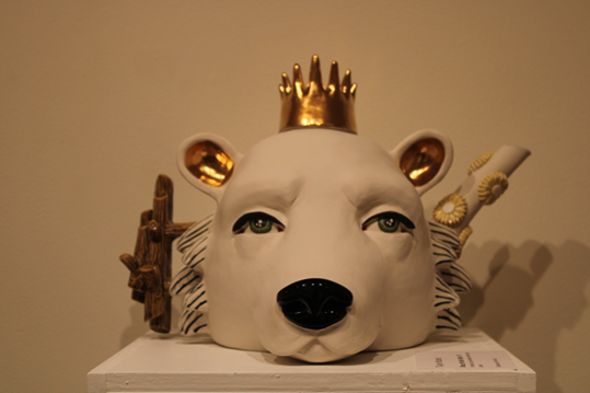
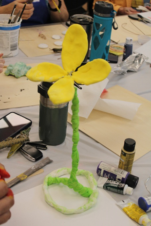
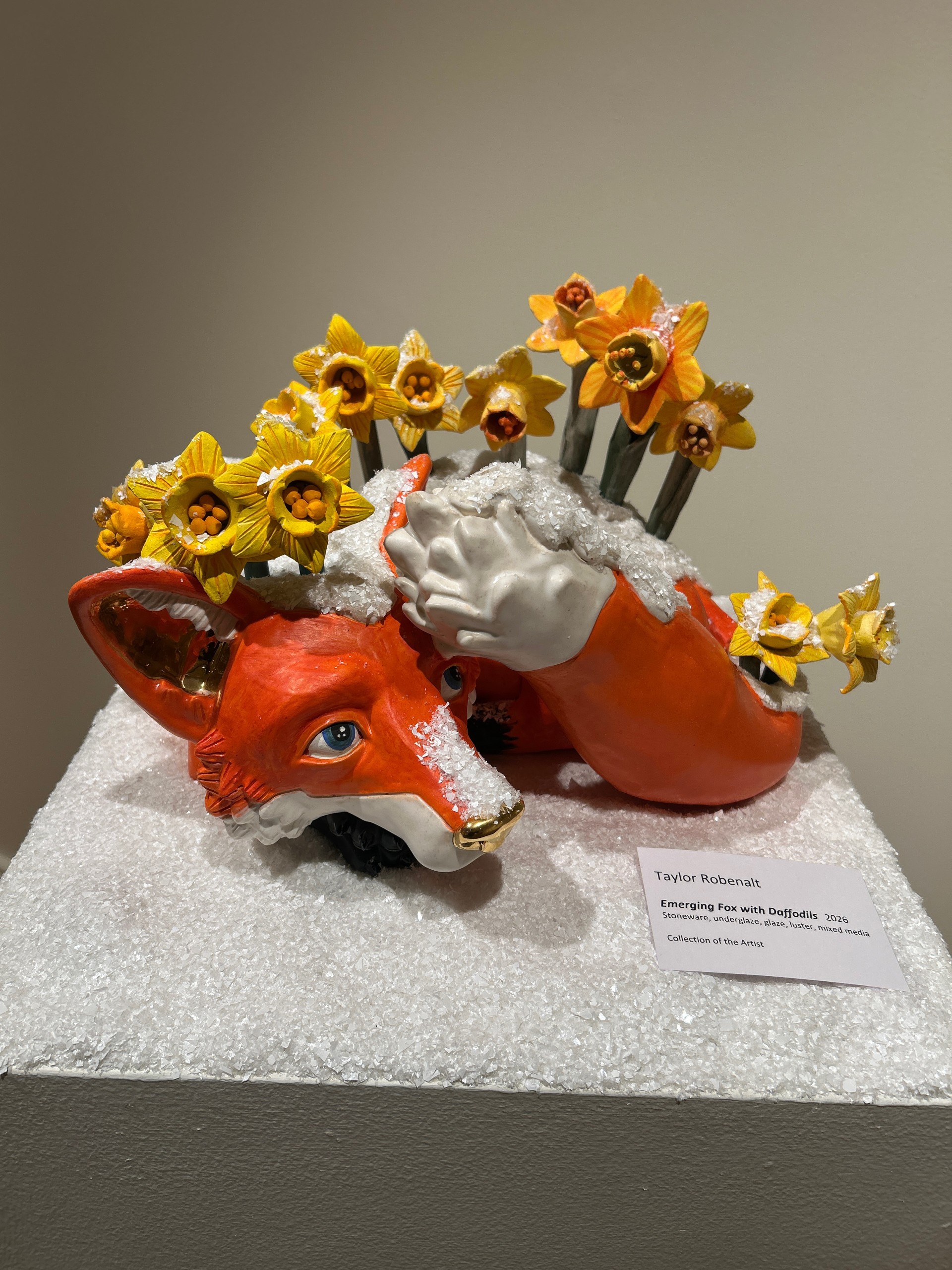
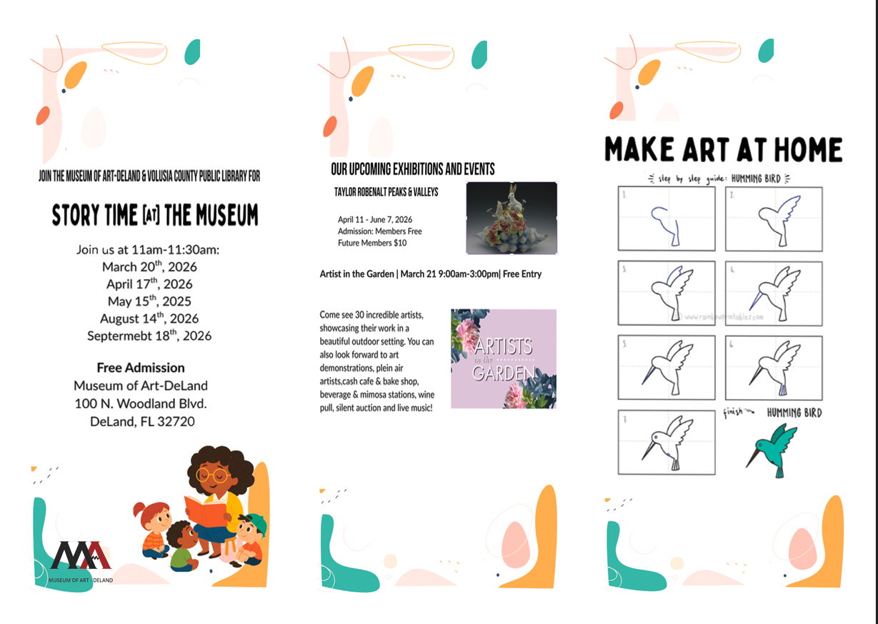
April 10 – Documented the exhibition by the Artist Taylor Robenalt. Took photos of all her artwork on display. She is fantastic. I learned that she is a professor at Ringling College of Art and Design in Sarasota. I felt very good moving through the art gallery despite the lack of any information concerning modern art forms because there was nothing complicated about it. It is hard not to like the energy and uniqueness of her sculptures. There were a lot of animals and other components that made her exposition bright and alive. Everything in there looked like it had a soul and was somehow fairytale-like. If to say what impressed me about the exposition, firstly I should point out its sincerity. I did not have any knowledge about sculptural art before visiting the exposition, however, it struck me and left an impression I could not get rid of. My favorite piece is this one – for its dual purpose as a tea kettle:
April 14 – Planning meeting with my supervisor – I received an interesting challenge to create a 3D model of the gallery so that future events can be planned better.
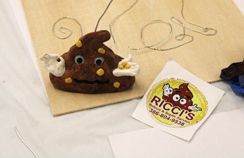
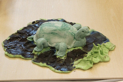
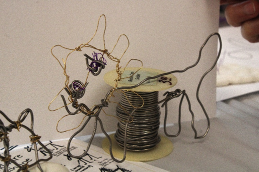
April 17 – Attended Art for All event, this time making art from metal wires and clay. Discover where art, community, and creativity come together with our Art for All event series. On select Fridays, enjoy free Museum admission all day plus a free guided art activity. Bring your family, invite your friends, or make it a date night. Art for All invites everyone to explore, create, and enjoy art together. Adult attendants used wire to create items like flowers, animals and other items. I documented the artwork in photos. There was some great artwork done in the 3 hours.
The last two weeks were pretty busy as I got more involved in the classes at the Museum and other assignments. We met to define the parking map for the Museum. I took a few hours to put my first draft together in Adobe Illustrator. I wanted to make it ‘artsy’ and used the museum logo colors (black and burgundy) as a focal background. See below my draft, still has to be reviewed by my supervisor.
This week, I helped out in two classes. Setting up art supplies and documenting the classes with photos.
Classroom – Lisa Carlson Abstract Gel Print Class Tue 4/7/2026 1:00 PM – 3:00 PM Classroom – Creativity and Well Being Workshop Sat 4/11/2026 12:30 PM – 3:00 PM
I also attended the Artist demo workshop at Stetson in cooperation with the Museum of Art. Taylor Robenalt has her own exhibition at the Museum of Art. The last event was called Art of Surprise Fri 4/10/2026 10:00 AM – 1:00 PM and mostly showed Taylor Robenalt’s work, which I documented in photographs.
Next week will be more classwork support again – Gel Printing and Storytime
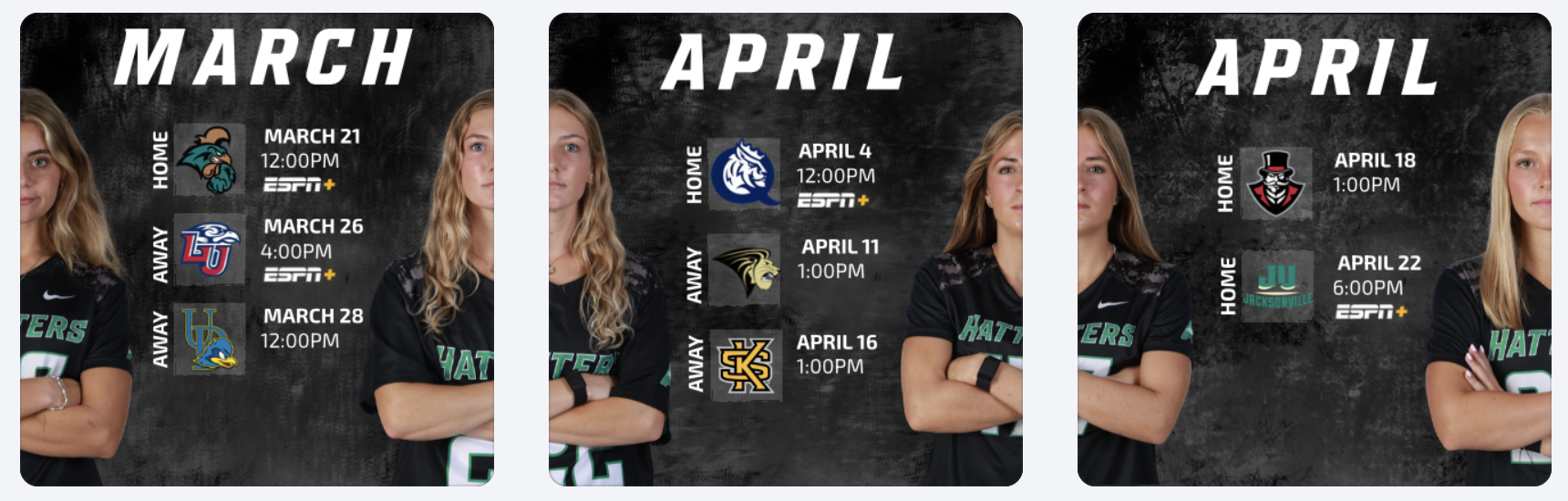
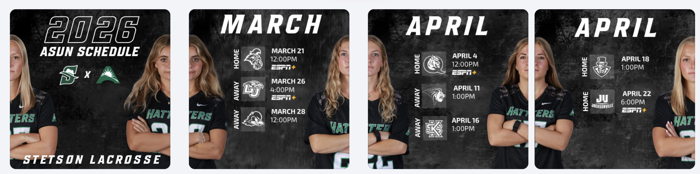
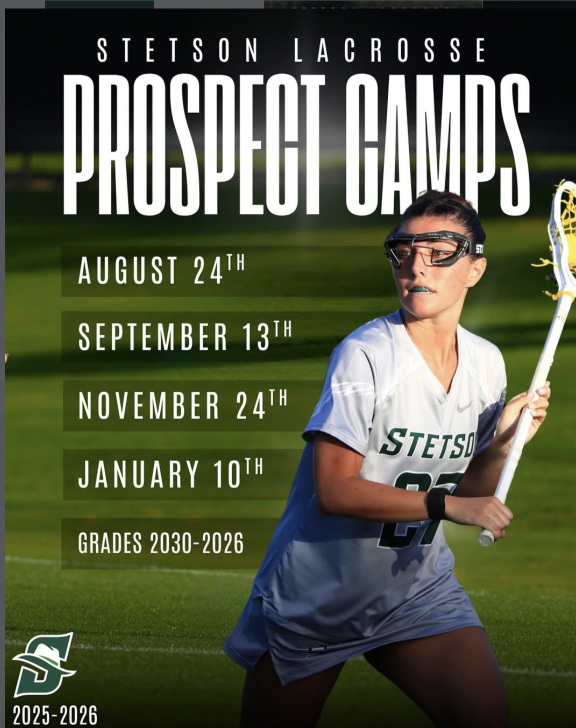
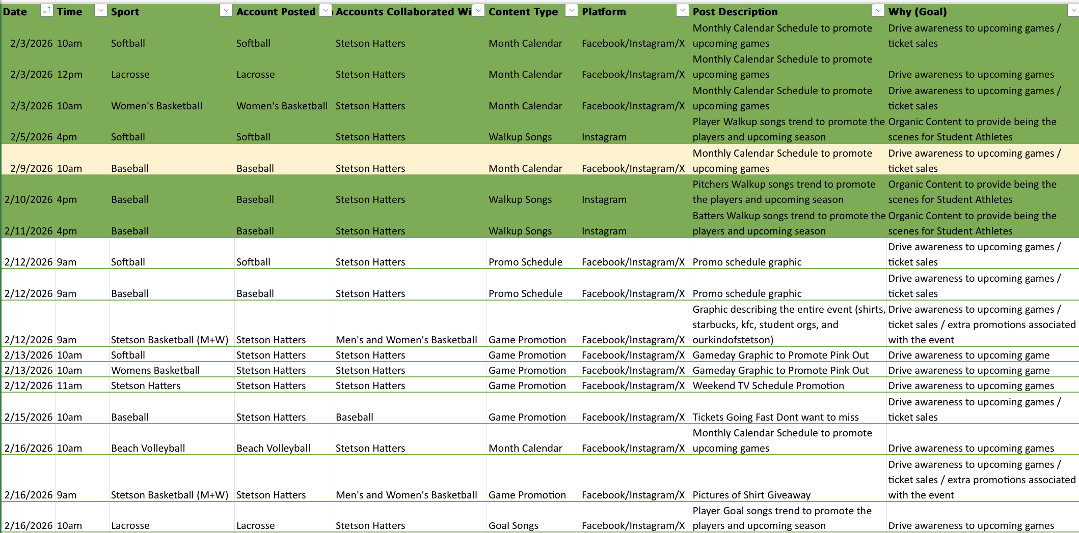
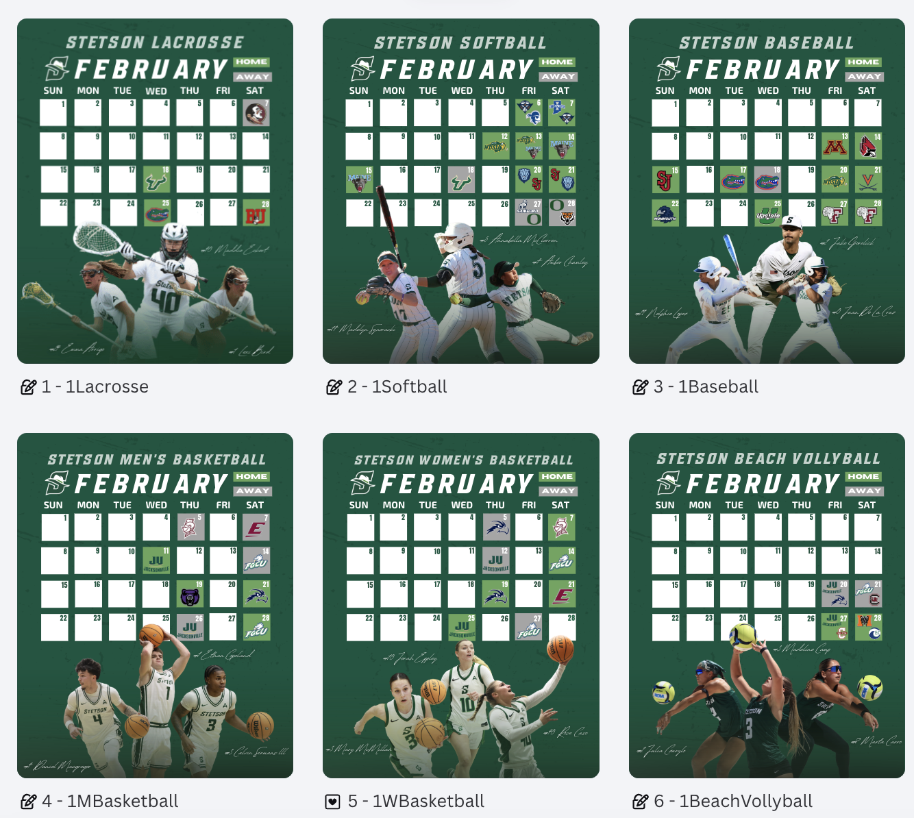
During these weeks, I worked on creating April schedule graphics for multiple spring teams, as well as an ASUN women’s lacrosse schedule post. One of the biggest design decisions I made was switching the opposing team logos from their original colors to all white. While the original versions added more color, I realized that using white logos created a cleaner look and kept the overall graphic more consistent with Stetson’s brand. It also helped the feed feel more cohesive when viewed as a whole.
Reworking the Lacrosse Hype Video
I also had the opportunity to rework a lacrosse hype video. The original version did not include actual game footage, so I took it apart and rebuilt it by adding game clips and other details to better represent our team.
This process helped me think more critically about storytelling through video. Instead of just creating something visually appealing, I focused on making sure the content felt authentic to our team and captured the energy of real gameplay. It showed me how important it is for hype content to reflect actual performance, not just aesthetics.
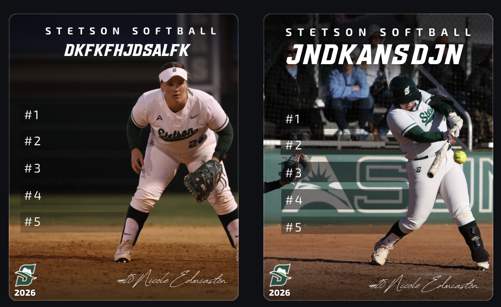
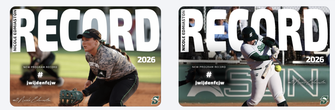
Record Graphics Templates
Another major project was creating record post templates, primarily using softball as my base. I took inspiration from record graphics I created last year for lacrosse, but this time I had to strictly follow Stetson’s official fonts and branding guidelines.
This was something I struggled with creatively. I personally felt that some non-Stetson fonts looked stronger, especially in the horizontal designs, but I had to prioritize brand consistency over personal preference. It was a good reminder that working in sports design isn’t just about what looks best individually, but what aligns best with the overall brand.
Even with that challenge, I built these templates so they can be reused across teams, allowing other designers to easily plug in new photos and update information. This made the project not just creative, but also functional for long-term use.
Player Feature Content
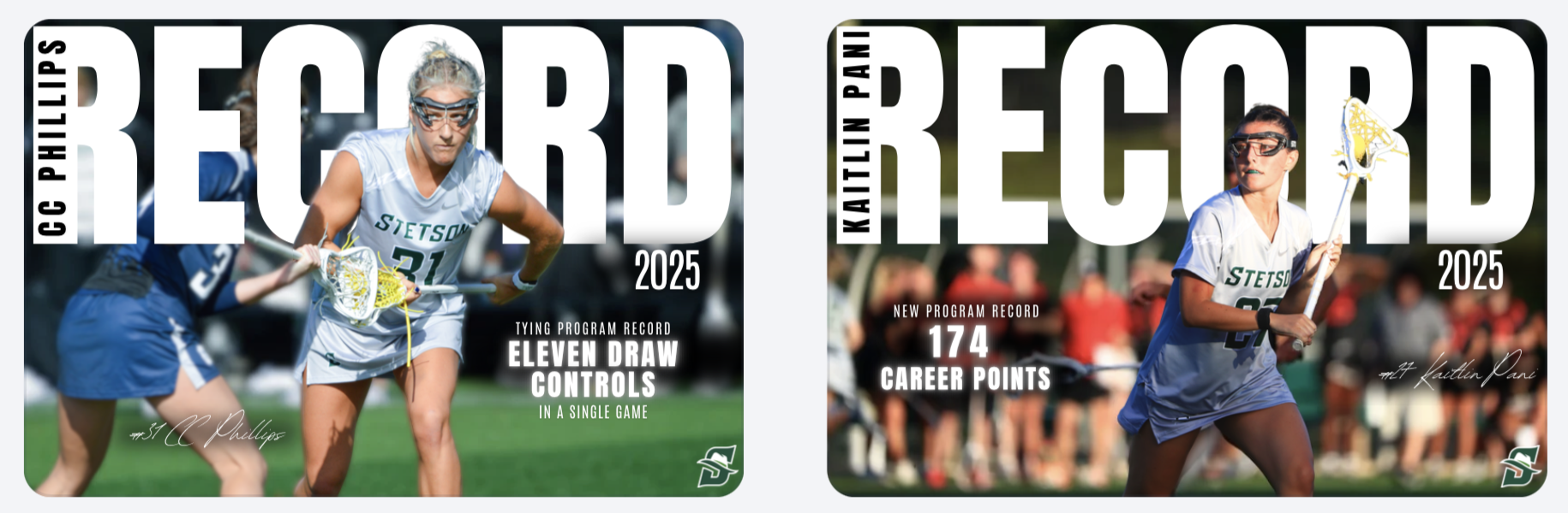
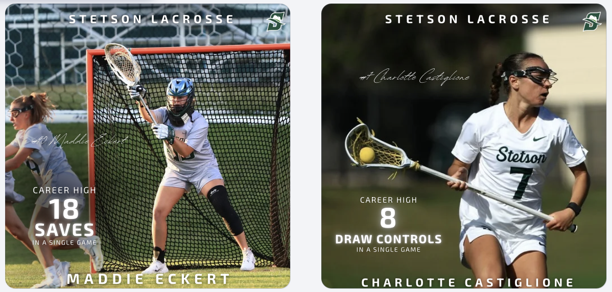
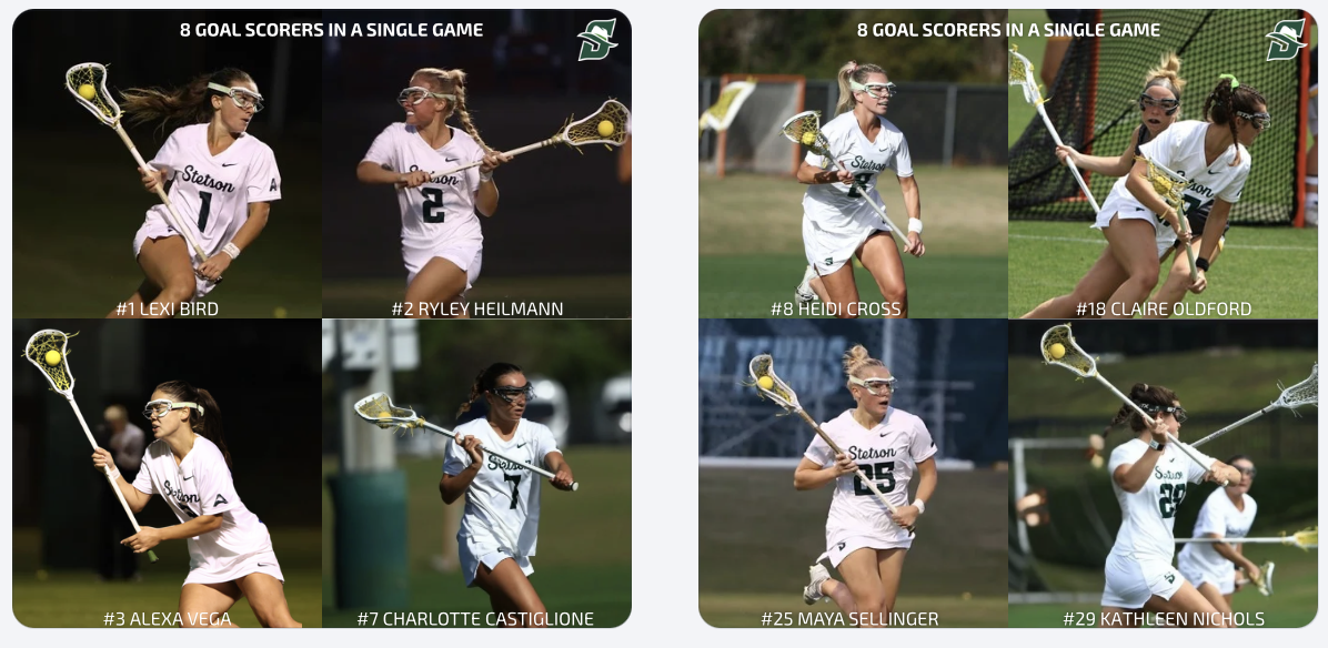
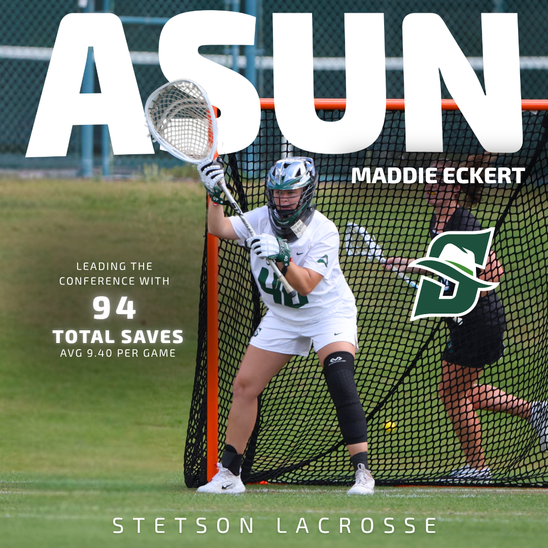
In addition to creating templates, I designed and posted multiple record and milestone graphics for lacrosse, including career-high performances and a team post highlighting eight different goal scorers in a single game. These posts help recognize player achievements, build team hype, and give fans shareable moments from games.
Game Day Content & Engagement
In addition to graphics, we received a lot of strong game photos and videos from two recent wins, so I focused on posting more photo-based content. These posts help capture real moments and keep the audience engaged in a more immediate and authentic way compared to only using designed graphics.
Balancing polished graphics with real game content showed me how important variety is in maintaining an engaging social media presence.
These two weeks challenged me to balance creativity and brand consistency. Whether it was adjusting logo colors, working within font guidelines, or building reusable templates and emphasizing that strong design in sports marketing is about more than just visuals, it’s about creating content that fits within a larger system while still telling a compelling story.
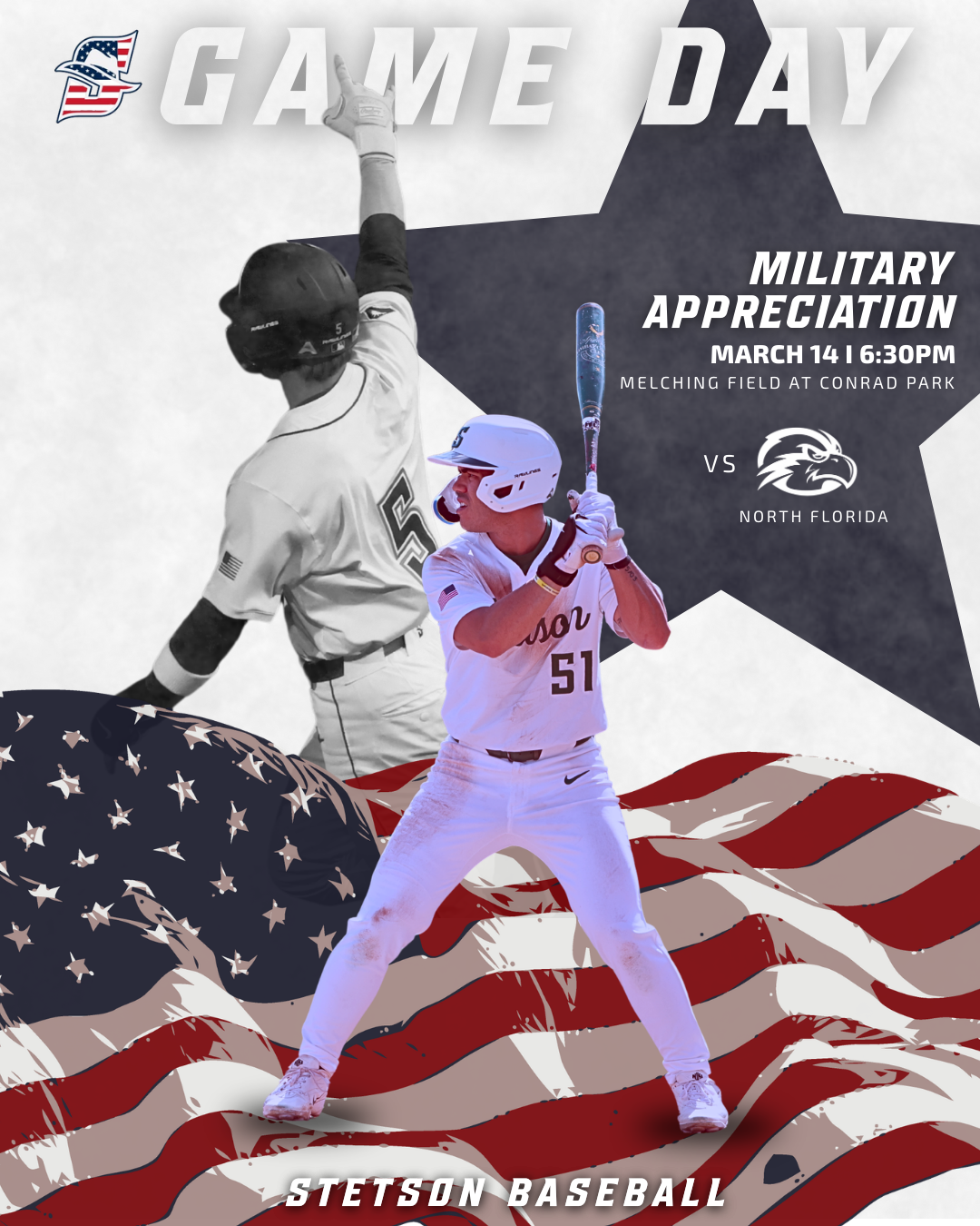
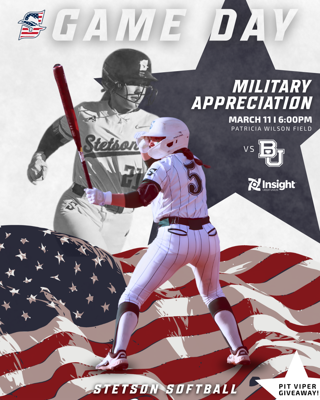
During these weeks I worked on creating Military Appreciation game graphics for both Stetson softball and baseball. This project took a little longer than some of the others because I could not find many strong inspiration graphics to reference beforehand. When I have a clear visual reference, the design process tends to move faster, but when I have to build something more from scratch it requires a lot more experimenting.
Because of that, I spent time testing different layouts, colors, and composition options before settling on the final design. I also sometimes second guess myself during the design process, but this project reminded me that it is important to trust the process and wait until the full design comes together before judging it too early.
One thing that helped was designing both the baseball and softball versions. Once I developed a direction for one sport, I could adapt similar elements for the other while still keeping the designs unique to each team. Using the American flag, muted background imagery, and the star shape helped highlight the Military Appreciation theme while still fitting within the Stetson Athletics style.
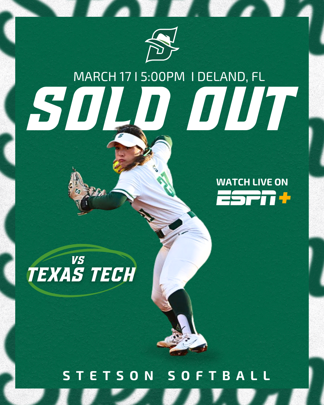
Sold Out Softball Graphic
Another graphic I created during these weeks was the sold-out announcement for the Stetson softball game against Texas Tech. At first, both versions of the graphic were designed without borders, but the overall result looked a little too plain.
To improve the design, I added the same border style that we often use on our lacrosse game day posts. This small adjustment added another visual layer to the graphic without making it feel overly busy. I liked that the border helped frame the design and made the post feel more polished while still keeping the focus on the “Sold Out” message.
Overall, I was really happy with how these graphics turned out. They are simple but effective, and the added border detail helped elevate the final look.
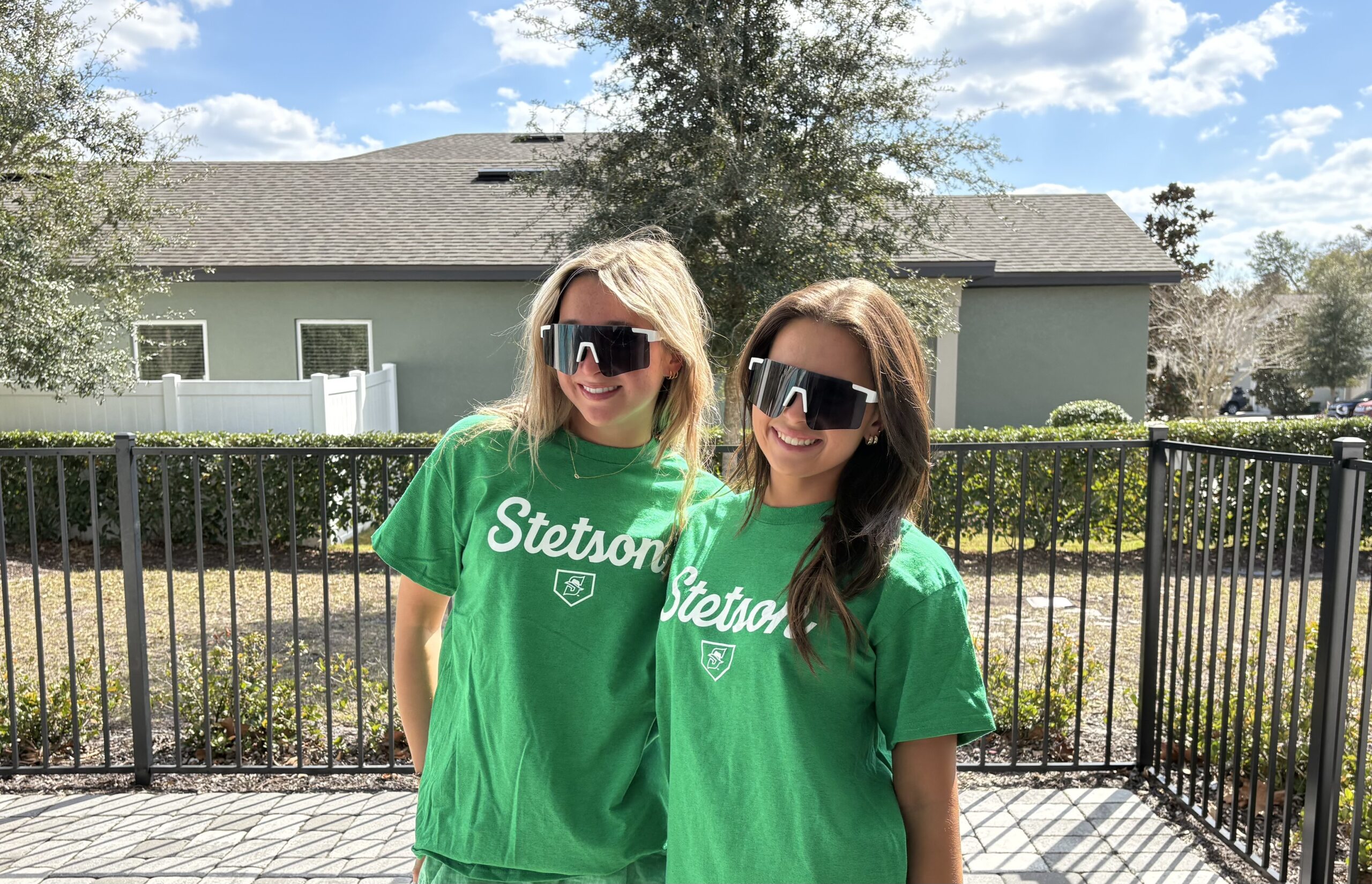
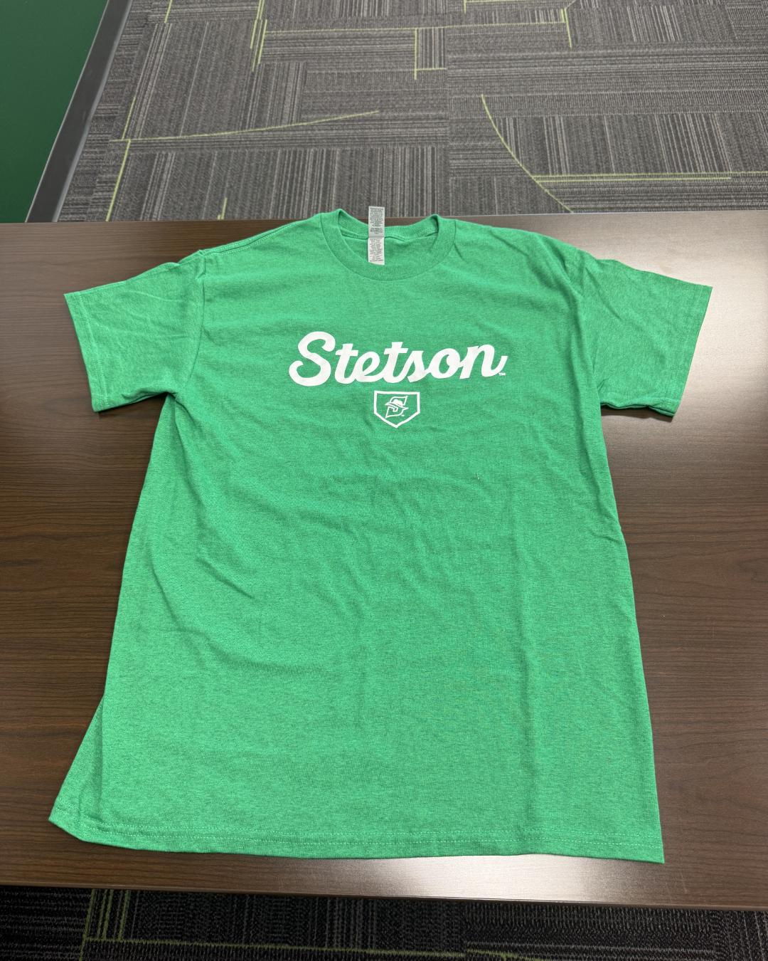
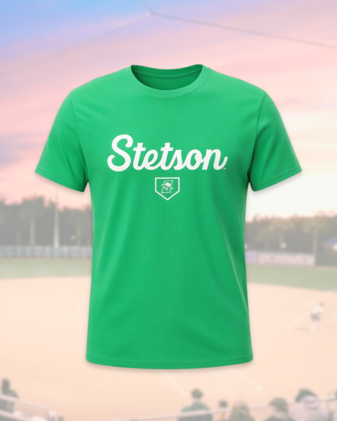
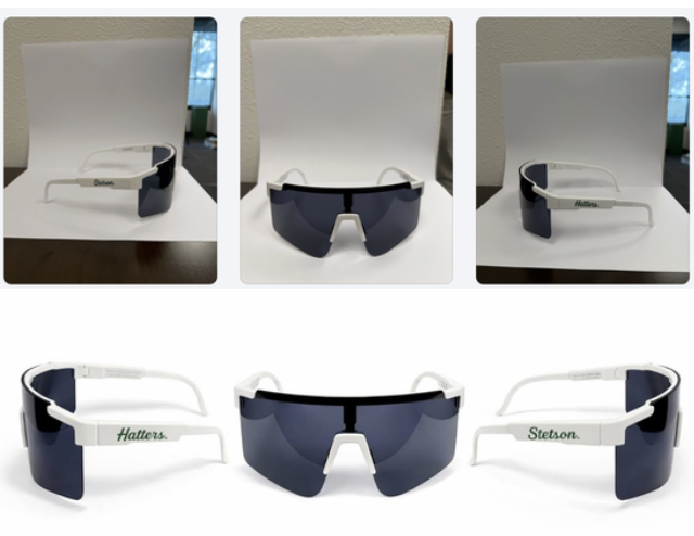
Giveaway Photos: Pit Vipers & T-Shirts
For softball giveaways, I also helped take photos of friends modeling the Pit Viper sunglasses and the Stetson giveaway t-shirts. Similar to the basketball shirt photos I took earlier in the semester, the goal was to capture images that show the giveaway items being worn rather than just photographed on their own.
Having real people model the giveaways helps the posts feel more engaging and gives fans a better sense of what the items actually look like. It also makes the content feel more natural and lifestyle-focused rather than purely promotional.
Learning AI Editing Techniques
One of the most interesting parts of these weeks was learning how another member of the social media team edits giveaway photos using AI tools. I did not take or edit the final photos myself, but I followed along as he showed me the process.
He demonstrated how he uploads the original images into ChatGPT and other AI editing platforms and then uses extremely specific prompts to transform the photos into polished promotional edits. Seeing this process was really interesting because the original images were fairly simple, but with the right prompts the AI could generate very professional-looking visuals.
It was helpful to see how detailed the prompts need to be in order to get the results you want. This showed me how AI tools can be used as another creative resource in the design process rather than replacing creativity entirely.
Conclusion
Weeks 8 and 9 helped me continue developing my design process and understanding of sports marketing content through projects like Military Appreciation graphics, sold-out posts, and photographing giveaways. I also gained insight into how tools like AI and different creative approaches from the team can enhance content creation and shape my future work.
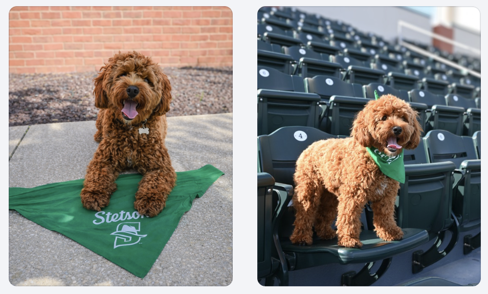
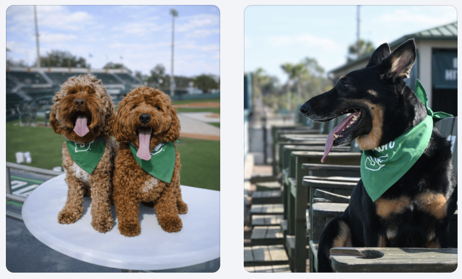
This week I finished editing and posting the photos we took for the Bark in the Park promotion. The dogs wearing the green bandanas in the stadium setting helped make the promotion feel authentic and exciting rather than just another graphic post.
If you want to see more pictures from Bark in the Park, you can view the full gallery here: https://flic.kr/s/aHBqjCMHr2
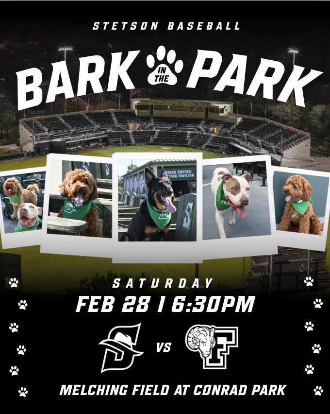
Bark in the Park Promotional Graphic
In addition to the first Bark in the Park announcement graphic and the photos, I also created a day of Bark in the Park promotional graphic. For this design, I pulled inspiration from a few different ideas I found on Pinterest. In one post, I saw a layout using photo frames lined up across the graphic, which I thought would work well for showcasing multiple dogs. In a separate design, I found inspiration for the way the stadium image was used as the background.
One part of the design that took some extra time to figure out was the bottom section of the graphic. I had the text written but I could tell that something still felt missing. I experimented with a few different sticker-style elements and decorative details until I finally came up with the idea of adding a line of paw prints along both the sides of the design. Once I added those, the graphic felt much more complete and visually balanced.
I am really happy with how the final design turned out, especially because it combined multiple ideas and went through a few rounds of creative problem solving before reaching the final version.
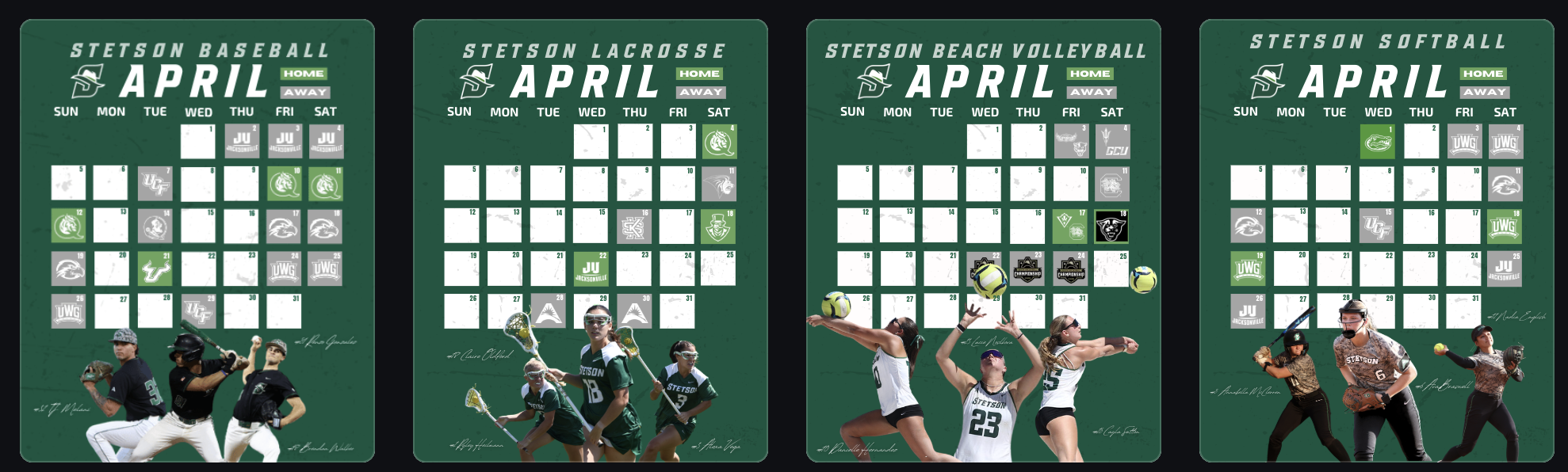
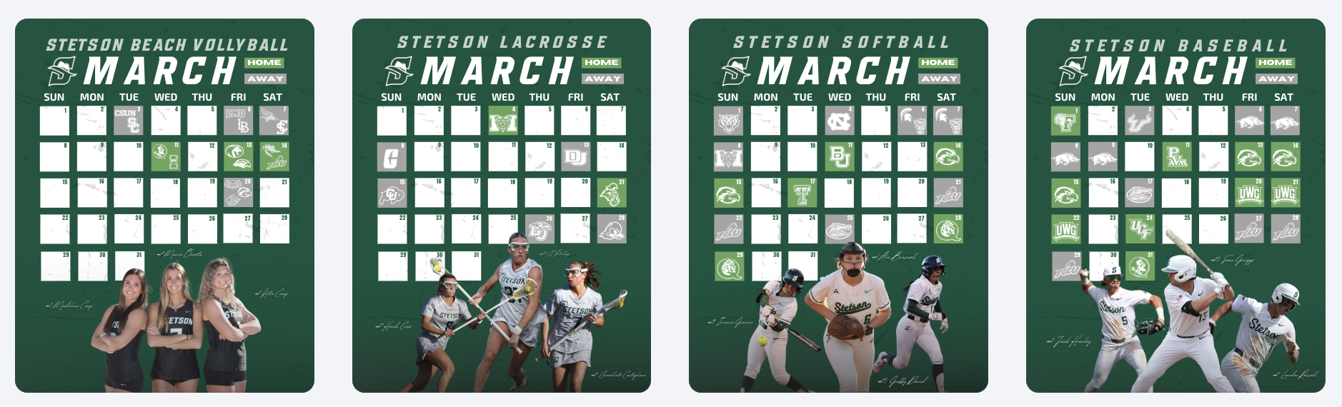
March Spring Schedule Graphics
Another project I worked on this week was creating the March schedule graphics for several Stetson teams. We have been using a consistent template for monthly schedule graphics, which makes the process much more efficient while still keeping everything visually cohesive across sports.
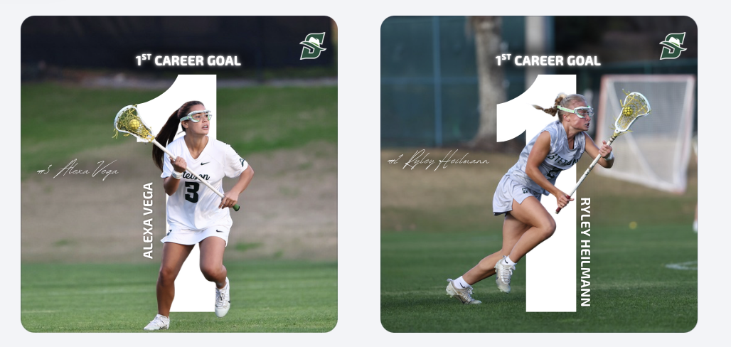
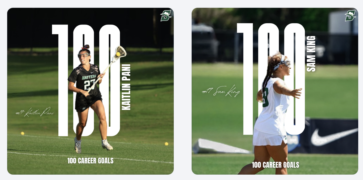
First Career Goal Graphics
I also created graphics celebrating players’ first career goals for the lacrosse team. Design-wise, I pulled the idea from a graphic I made last year that I really liked. I definitely do not like this design with just the “1” as much as I liked the “100” design. I wish I would have had more time to mess with it more before it became a template for other people’s 1st career goal posts.
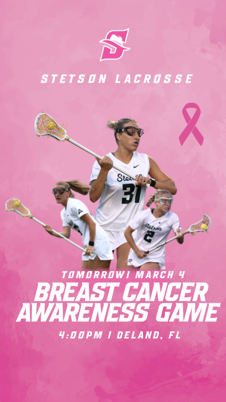
Breast Cancer Awareness Story Graphic
For our Breast Cancer Awareness game, I created a special Instagram story graphic to post the night before the game. I wanted the design to highlight breast cancer awareness while still fitting within the Stetson Lacrosse brand.
We decided to post this graphic the night before instead of the same day as the game-day post so that both pieces of content could have their own purpose. The story graphic focused more on awareness and the cause, while the official game-day post the next day focused more on the matchup while still including the awareness elements.
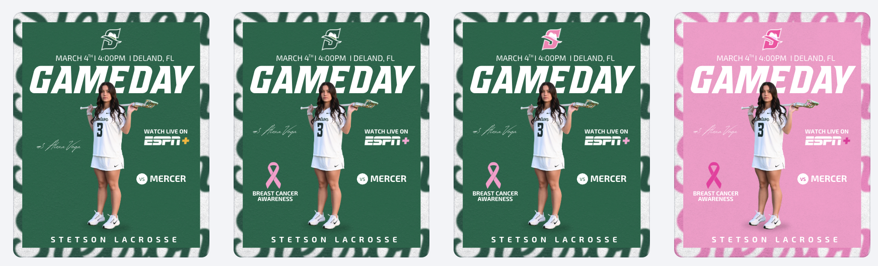
Breast Cancer Awareness Game Day Post Development
For the official game-day post, I experimented with several versions of the design to find the right balance between a traditional game-day graphic and a breast cancer awareness theme. I tried subtle changes at first, such as smaller pink accents and ribbon elements, but eventually experimented with a fully pink version of the graphic.
After reviewing the options with my coaches, we decided that the full pink design was the strongest because it clearly communicated the purpose of the game while still keeping the structure of the original game-day layout. This process helped me understand how design experimentation and feedback play an important role in creating the final product.
Conclusion
Week 7 focused a lot on the full lifecycle of sports marketing content, from photographing and editing event photos to creating graphics that promote games, celebrate players, and highlight important causes. It was rewarding to see how each piece of content serves a different role, whether it is promoting fan engagement, recognizing athletes, or supporting a larger awareness campaign. Working on these projects continues to help me better understand how these postings all work together to build the Stetson Athletics brand and enhance the fan experience.
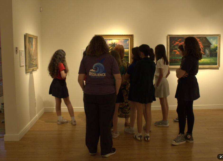
Thursday March 12 – Documented a visit by a school group from Maitland – visit lasted several hours
Monday March 16 – Spent several hours to redesign a tri-fold flyer for the museum. The flyer was laid out in Canva, unfortunately, that program does not export to Photoshop so I had to recreate some of the design elements manually.
This week March 26 – looking forward to documenting interviews both video and sound. Also, March 27 first meeting to create a new parking guide for the museum.
Submitted my class schedule to the internship advisor. Leaving for a Study Abroad trip to Greece tomorrow for a week with the International Business class but when I come back, this internship will become fast and furious!
Last week, I officially started my internship at ImageWorks, a print and graphics shop in Orange City. When I applied, the position was listed as a “Printing Production Internship”. The role included prepping files, running printers and cutters, quality checking products, and helping with packaging and shipping.
When I met with Sherri (the CEO and manager of ImageWorks), she explained that my role would be more flexible than the listing. ImageWorks is run by Sherri and a team of four employees. She thoroughly described to me the different roles and tasks that take place at the shop and encouraged me to personally assess the skills I wanted to learn, based on how helpful they would be to my future career. My work has not only felt meaningful for the business, but essential to bringing me closer to my career goals post-graduation.
Meeting The Team:
On my first day, Sherri gave me a tour of the shop and walked me through the roles of the employees that work there, including:
Production and installation (run by 2 employees): running large-format printers, operating embroidery machines, and doing installations. The installs range from adding phone numbers and logos to vehicles to wrapping walls inside local businesses.
Graphic design (Bridget): By designing artwork for signage and print projects, the graphic designer turns the client requests into files and designs that are ready to be printed.
Sales + customer service (Kimberley): Managing client communication, customer orders, and various other sales.
Day 1: Online Business Listings
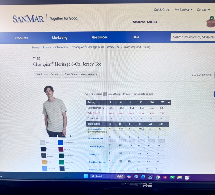
On the first day, Sherri showed me the desk I’d be working at. She had set up an Outlook account for me with the ImageWorks domain name. Sherri explained that ImageWorks had been around for 26 years and was well established as a business in Orange City; however, she mentioned the company’s online presence was not as optimized as it could be. She asked of me to set up business listings for the company on platforms like TripAdvisor, YellowPages, LinkedIn, and other major review sites. She sent a list of 150 directories and platforms to claim and standardize business listings to my new email. I was instructed to chip away at them over time, 3 or 4 listings a day, in order to increase the reach of the company. I kept my progress in a shared Excel spreadsheet that she had created in order to organize account names, passwords, and status on each website. I completed 3 listings (Open Street Map, HERE Map, MapQuest) on my first day. After completing the registration for those websites, I asked if I should wear a specific uniform to the office. She guided me to a website used for bulk ordering blank clothing. Sherri told me that she had chosen gray for the company shirts, but that I could select my own style of shirt and add however many that I needed to the company cart. I selected 2 heavy cotton shirts and one crewneck sweatshirt in heather gray and added them to the cart. She told me that when they arrived, I would learn to use the large industrial embroidery machine for the first time by embroidering the company logo onto my selected shirts.
Selecting Shirts for Embroidering
Day 2: Stetson Baseball Wrap Project (1/23)
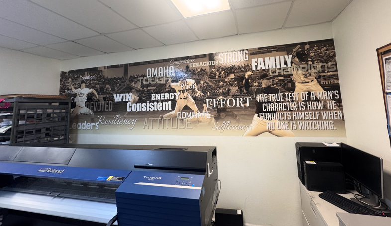
On my second day with ImageWorks, I was introduced to Bridget, the team’s lead graphic designer. Sherri told me that my task for the day would be working with Bridget on a project for the Stetson Baseball team. A few years ago, Stetson Baseball had ordered a large wall wrap (a huge sticker) for the men’s locker room. The wrap had a sepia filter over photos of Stetson baseball players in various action shots, with a background of a drone shot of the stadium. Motivational words in different fonts and sizes were added on the top of the graphic.
Photo of the Previous Wall Wrap
Stetson Baseball had recently ordered another wrap, in the same style, with current players to replace the old ones. They had sent 30 photos of the players for use in the wrap. Since the wrap was going to be very large (about 36 feet by 10 feet), I needed the players to be in very high resolution. I went through the photos and checked the sizes on each in Adobe Photoshop to determine the largest ones. Since there weren’t strict instructions for the editing and masking, I created my own process to accomplish the task. It’s best described through the following bullet points:
After importing, I duplicated the original photo layer to keep a clean backup / unchanged layer.
I used Photoshop’s select subject tool and then applied the mask.
I cleaned up the edges of the mask using the polygonal lasso tool.
If needed, I used the defringe tool to remove color spill along the edges.
I put the cutout into a group and applied the mask to the entire group (which is important for upscaling in the next step). I did this so that the upscaled version would have the same mask.
I upscaled the image using Topaz Gigapixel (I experimented with different AI upscaling tools; I found that this was the best one for the purpose of my project) with face recovery checked and upscaling at 2x scale.
I applied the camera raw feature, and used smart sharpen to make the details more defined.
On certain players, I masked parts of the faces and adjusted the curves to reduce shadows from their baseball caps.
I zoomed in very close to check for any mistakes in the masking or issues with the AI upscaling, then uploaded the .psd files to a shared folder in OneDrive for Bridget to view.
Screenshot Showing my Layers and Process of Editing
Edited player image 1 of 3, prepared for large-format print
Edited player image 2 of 3, prepared for large-format print
Edited player image 3 of 3, prepared for large-format print
Day 3: Building a File Organization System (1/27)
On the third day (1/27), I realized that I needed a better system to organize the files for the wrap project. Previously, I had been saving each photoshop document and emailing them individually to Bridget, but that was turning into too many emails as I revised each document; I wanted to have a shared folder where I could upload the final versions and replace the files if I returned to them and cleaned them up further.
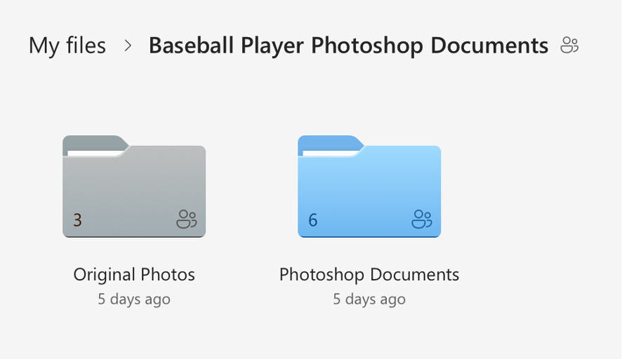
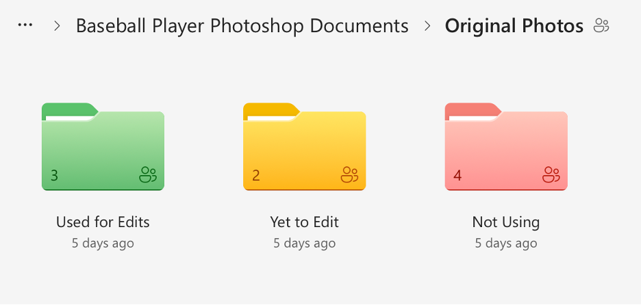
I created a shared folder in OneDrive with many subfolders that held the original photos sorted into categories and my completed photoshop documents. I went through the 30 original photos and checked each one for print suitability based on resolution, sharpness, lighting, motion blur, and whether there was enough usable space for a full body cutout. I sorted the photos into three categories (Approved/Use, Secondary/Conditional, and Do Not Use), flagged anything that would require heavy upscaling, and separated duplicates or near-duplicates of the same player so the final wrap would have more variety. Then I reorganized the OneDrive project folder, so unedited originals were separated from already used originals, created additional folders for images we weren’t using (too small, redundant, or low quality), and standardized the naming so it was consistent. I also color-coded the folders. Once I had cleaned everything up, I shared the folder to Bridget’s email.
Though this process sounds simple, it took almost 3 hours. I am not an organized person by any measure, and the task of sorting and color coding was monotonous and exhausting. It was necessary though, and the new file organizing system makes it very easy to see how much of the project remains.
Here is a visual I made to show the organization system in more detail:
Visual of File Organization System
And here are some screenshots of the actual file system itself:
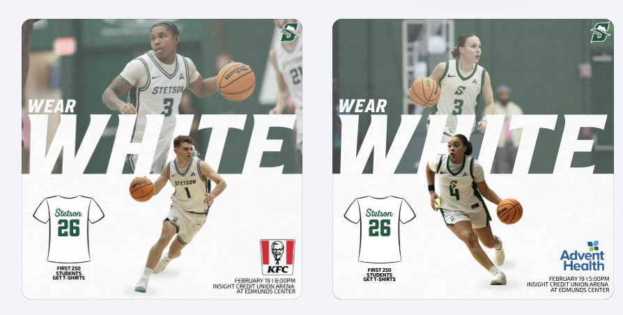
For the White Out game, I created a promotional graphic and gained deeper insight into how sponsorships directly influence design decisions. I had to carefully consider sponsor placement, logo sizing, and overall composition to ensure partner recognition was clear while still aligning with Stetson Athletics’ visual identity. It required balancing brand consistency with contractual visibility obligations.
Becoming more aware of sponsorship integration made me realize how much responsibility social media carries in fulfilling partnership agreements. These posts are not just for fans but also serve as deliverables that provide value to sponsors. Every logo placement and tag has a strategic purpose behind it.
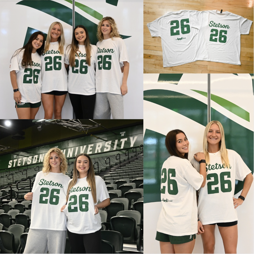
To promote the White Out theme and shirt giveaway, I photographed and edited images of the giveaway shirts as well as fans wearing them. Being involved in both the digital promotion and the in-game execution allowed me to see how pre-game content translates into real-life activation. It was rewarding to watch something I helped promote online become a visible part of the fan experience at the event.
Seeing My Work on Larger Platforms
One of the most exciting parts of this internship has been seeing my graphics posted beyond just the lacrosse account, especially on the main Stetson Athletics page and the Stetson Baseball account, which has a much larger following. Knowing that my designs are now reaching a broader audience has made the work feel more impactful and professional.
It has also made me more conscious of detail. With larger audiences comes greater visibility, and that pushes me to be even more intentional with branding, alignment, spacing, and overall look.
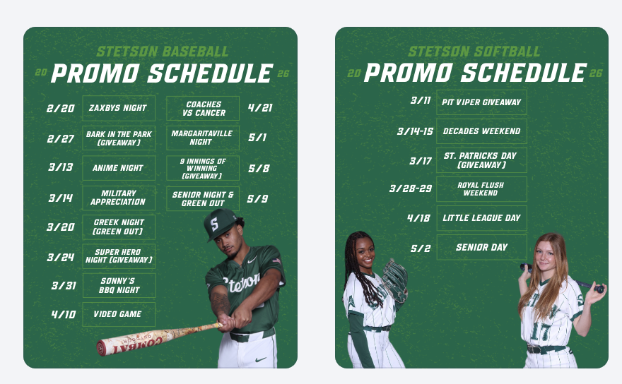
Promotional Event Graphics
This week, I created promotional schedule graphics for both baseball and softball highlighting their themed games and giveaways. These graphics give fans a clear overview of the season’s promotional calendar and help build anticipation in advance rather than promoting events one at a time.
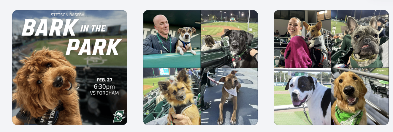
Preparing for Bark in the Park
I also created a “save the date” style graphic for Bark in the Park to begin building early awareness. In addition, we planned a throwback collage post using photos from previous years to highlight the atmosphere and encourage attendance. This approach shifts the promotion from simply announcing a date to selling the experience.
Bark in the Park Photography & Giveaway Promotion
This year’s giveaway is dog bandanas, so to help promote that announcement, my friend and I brought my roommate’s dogs and my own dog to the baseball field to model the bandanas. Photographing them in the stadium setting made the content feel more authentic and engaging than a simple product image. (I haven’t edited those photos yet, so stay tuned. I’ll be sharing them in next week’s post!)
Conclusion
This week really showed me how much thought goes into everything we post, from sponsor logos to hyping up events before they even happen. Seeing my work on bigger accounts and then watching it come to life on game day made everything feel way more real and rewarding.
Over the past two weeks, our workflow has felt especially organized. We have been working off structured schedules for graphics and broader marketing initiatives, which has helped me better understand not just what we are posting, but why we are posting it. Instead of approaching each graphic as a standalone design, I have started thinking more intentionally about the purpose, whether that goal is ticket promotion, engagement, sponsorship visibility, or overall brand awareness.
Fan Engagement Graphics
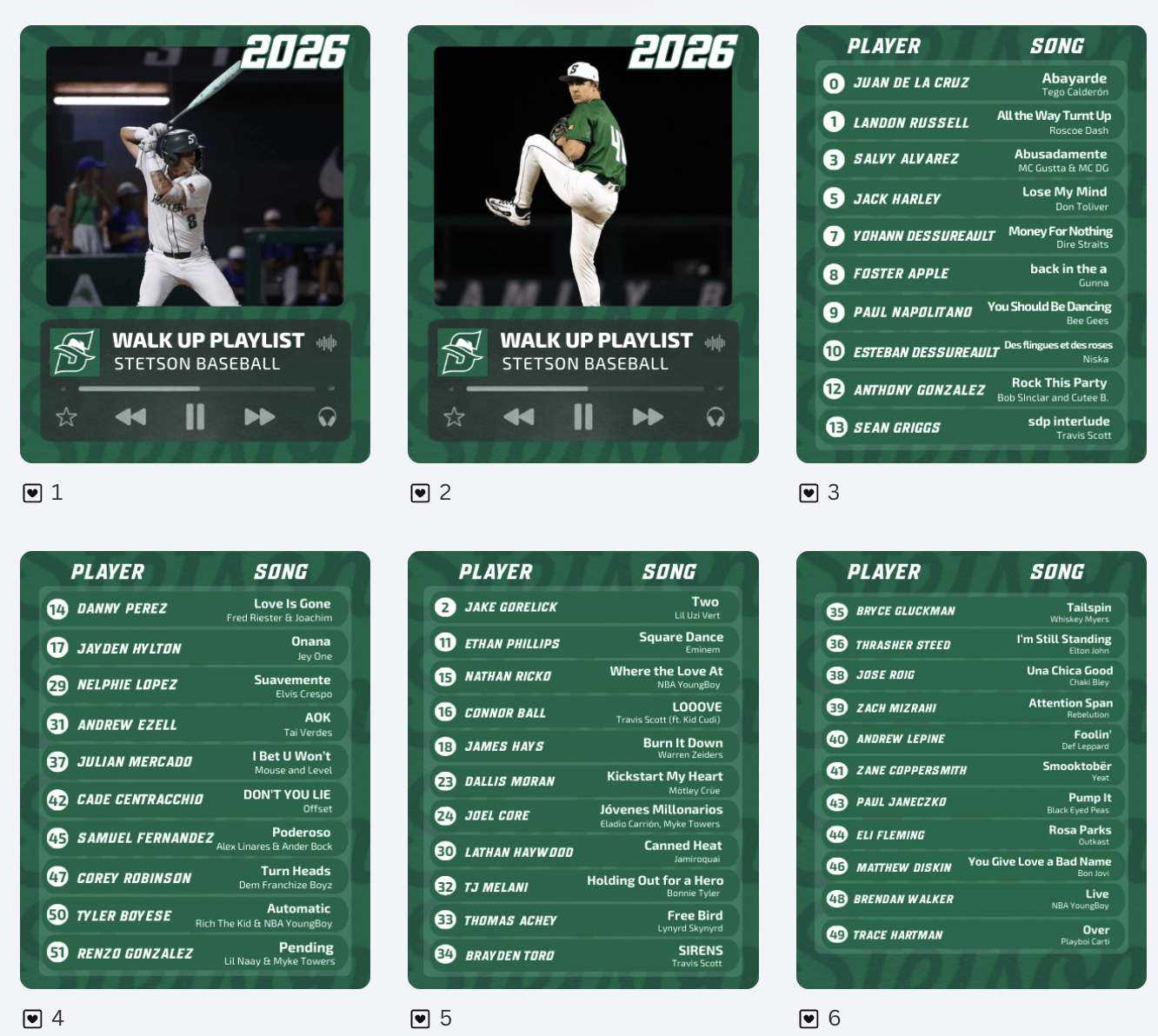
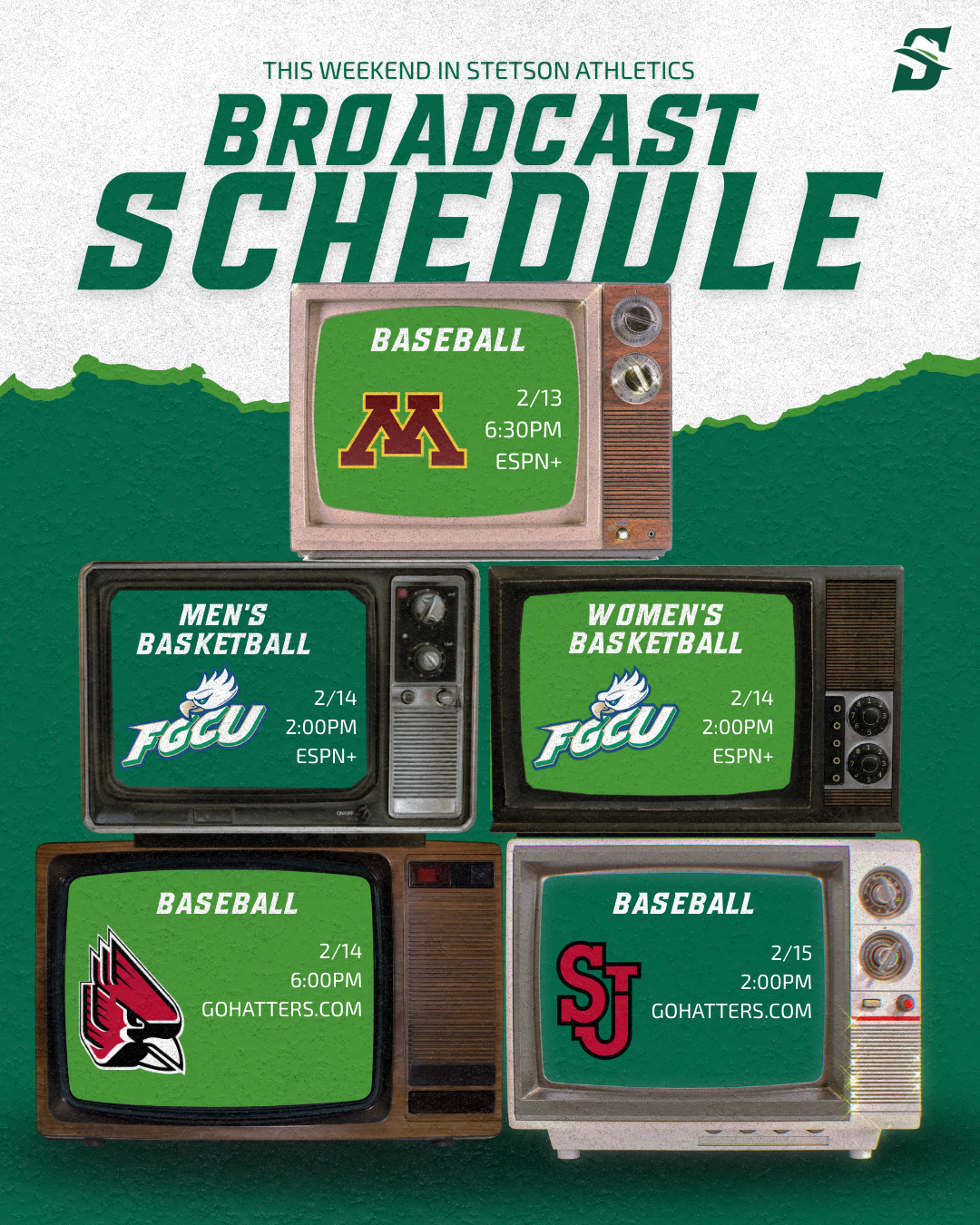
One of the projects I worked on was creating walk-up song graphics for softball and baseball. These posts are a great example of engagement-driven content. They allow fans to connect with players on a more personal level. I also created a broadcasting graphic to clearly communicate where fans could watch games. This graphic will hopefully help drive viewership.
Learning That Not Every Graphic Is Needed
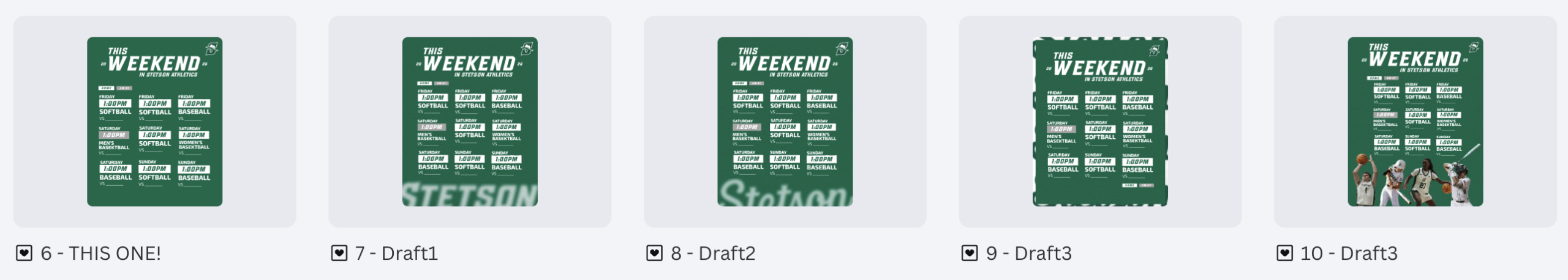
I spent several hours creating variations of a “This Weekend in Stetson Athletics” graphic. I experimented with layout, spacing, and color balance to make it visually strong and informative. After reviewing it with my supervisor, he decided the graphic was ultimately unnecessary. At first, it was slightly frustrating because of the time invested. However, it was an important lesson in efficiency and strategy. Not every idea, even if well-designed, aligns with the overall marketing plan, and the number of posts and information being pushed at once needs to be balanced.
Template Designs Across Spring Sports
One of the larger projects over these two weeks was creating schedule graphics for all spring sports. It was time-consuming but manageable because I was able to build off the lacrosse schedule template I had already created. Adjusting layouts, sport-specific colors, and details while maintaining brand consistency. This project reinforced the importance of creating adaptable templates. When working within an athletics department that supports multiple teams, efficiency and consistency go hand in hand.
Conclusion
Weeks 4 and 5 helped me grow in areas beyond just design skills. I strengthened my understanding of strategic planning, sponsor integration, template content systems, and evaluating the necessity of content before investing time into it. I am beginning to think more like a digital marketer within collegiate athletics, rather than just a graphic designer.